Founders of digital health startups often invest months in extensive research, meticulous feature refinement, and keeping up with the latest trends and best practices. Yet, despite these efforts, they still encounter challenges in terms of User Adoption, Engagement, Retention, and achieving positive outcomes.
Because they don’t use suitable (or use incorrectly) healthcare ux research methods. Right approach emphasizes a deep understanding of users, their unique journeys, needs, and frustrations.
For instance, during the development of our very first project, we adopted a deliberate and unhurried pace, constantly seeking and incorporating user feedback with different research methods.
And after this we realized the importance of structuring the feedback collection process.
Doing so allows for the accumulation of comprehensive insights, minimizes redundant work on features and UX/UI, and ultimately enhances the overall product development experience.
But what user research methods are included in this user-oriented approach? In this article, we will systematically list the various approaches and specify when and in which cases each one should be used.
And at the end of the article, we provided a guide that you can use as a template for conducting high-quality research, along with a QFD matrix (Quantitative research method).
By the way, before we dive into our article, for keeping track of emerging technology trends in healthcare industry, you can explore our selection of 100 resources (books, guides, websites, and influencers) about Product Management, UX, Technology, Healthcare market trends, and Product Marketing.
Download List of 100 resources for digital health startup founders & managers
I. Qualitative User Researches
Methods of this nature cannot be digitized (due to a small amount of data), and they generally have a lower statistical probability of addressing specific needs compared to quantitative research.
However, why do we still use them? Qualitative research is valuable for forming and confirming hypotheses about your product, its features, and the effectiveness of the UX/UI approach.
We simply cannot conduct quantitative research because it requires closed-ended questions and the digitization of a large amount of data from user respondents.
To generate these closed-ended questions, we must first ask open-ended questions and understand what questions even exist. For this, we will need…
1. Desk Research for Hypothesis Formation
In simple terms, it involves using search engines like Google, Bing, Yahoo! Or engaging with market representatives if you have access to them.
You will need to use the search bar and explore various existing studies to identify the current needs of consumers (your potential users) in your market niche (for example, Mental Health).
Let’s say we live in Sweden and want to revolutionize the Mental Health market there. Who would benefit the most from our future product? So, we begin our search…
And we found it! Take a look at this report on Mental Health Conditions among young people in Sweden. The majority of respondents are afraid to openly discuss their mental health issues.
Moreover, many teenagers with mental disorders do not receive professional aid.

Barriers are partly to blame:
Barrier #1: low-level awareness of what professional care options are available.
Barrier #2: stigmatization of mental illness: fear of what others might think and a preference to seek help from family rather than professionals.
Barrier #3: Parents’ little knowledge regarding mental health (if the child prefers their help over professionals), as evidenced by various surveys.
And now we have uncovered the problem that need to be solved.
Moreover, we have successfully created a User Persona for our target audience (young people in need of Mental Health assistance but hesitant to speak up). Now, we need to think about where they might be found.
For instance, we can look directly at our competitor’s products: thematic communities or groups on social media platforms (Facebook, LinkedIn, or other social networks related to our product’s competitors), thematic forums, and reviews about our competitors’ products.
Or we can take it a step further and use logic: there are many young people in… schools!
But how do we confirm this logic? Again, we search on Google: “in reality, schools have to employ a competent doctor, a school nurse, a school social worker, and a psychologist which may be troublesome.”
But! The Swedish SHT has been criticized by OECD and Swedish School Inspectorate, pointing toward a sharp national understaffing.
Well, it seems like we are heading in the right direction. But how do we practically confirm that this product can solve the problem identified during Desk Research?
2. Customer Development for Uncovering Insights
Once you have identified who your users are, what problems they face, and where to find them, it’s time to conduct the most time-consuming part – CustDev (also known as “Deep Interviews”).
Deep Interviews involve direct one-on-one communication with the consumer (sometimes it can be a group interview) with the aim of confirming their needs (that we read about) and discovering new ones. These interviews can take the form of video calls, written exchanges, or face-to-face meetings in real-time.
They should last at least 40 minutes, with a normal deep interview lasting around one to one and a half hours. Make sure to read the book “Mom Test” by Rob Fitzpatrick. It is a must-read and one of the few books that we strongly recommend reading from cover to cover.

Below, we will present the most popular questions from the book and practical experience. To conduct a deep interview, you can use the following guide. At the end of the article, we will provide an example that you can use as a reference when formulating questions.
So, what do we need to learn about the consumer?
In our case, these questions should be asked for both B2C (young people) and B2B (schools):
1. Solution: how do they currently solve the problem? For example, the one with the difficulty of obtaining anonymous Mental Health support within the school environment. The school doctor doesn’t address the issue of anonymity and fear.
2. Need: when did they first realize the problem and how (to understand what content to use inside the app and be closer to the user)?
3. Search & Journey: how did they learn about the solution to the problem (if they found one)?
4. Competitors: among which solutions to the problem do they usually choose (who are the competitors), why do they choose them, and what is lacking in them (in terms of features and advantages)
5. Doubts: do they have any doubts when making a choice (ask them to describe their doubts)?
But these are not the only questions! This is just the foundation. Everything else depends specifically on your product.
By doing this, we learn about how the awareness of the problem and the choice of a solution occur (to build the right Journey in the app) + which features or other aspects (like UX design) potential users considered while choosing a solution, what solution it was, and what it lacks (to understand what needs to be created).
Based on Desk Research & CustDev, we can now create a prototype for further User Testing with something already prepared. In our case, we understand that we need to create something anonymous and it can be anonymous communication (for example, a chat with specialists).
But if we want to make a chat we should find out preferences and favored apps of the Target Audience. And through interviews with the target audience, we were able to identify that the most user-friendly app with a chat feature is WhatsApp. So we see that such a user research can benefit for UX in healthcare apps.
Also, to have an understanding of the system and what actions we need to take before conducting Usability Tests for healthcare apps, read our article about the Google Process, where we explain how we came up with the idea of the anonymous chat feature.
User Tests are mentioned there as well, but we have detailed and explored other types of research more extensively in this article.
3. And Methods of Usability Testing in the Development of Healthcare Applications
Here, we provide a ready-made prototype to our target audience and ask them to perform certain tasks, based on which we record the test results.
Usability Tests for healthcare apps allow us to better understand where there may be UX/UI errors and what features are not used. In fact, we do UX research in healthcare apps. How to run it?
1. Choose a format:
– Such tests can be conducted both online and offline;
– A prototype can be made using Figma or Invision.
2. Identify the target audience:
– Within the current database;
– In other locations where your potential users stay, such as Facebook groups with discussions of valid problems, thematic websites and forums, or communities/blogs of your competitors.
The thing to keep in mind: Separate tech-savvy users from others to determine whether, for example, older people can also use your product.
3. Prepare questions and tasks, such as using a specific button in the app.
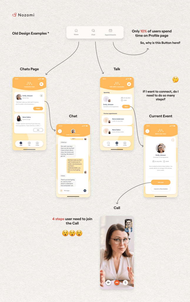
For example, in Allbry we noticed that only 10% of users used the Profile button and couldn’t find this option quickly. Therefore, we can ask users to specify which sections they need (to understand if there will be a “profile” among them).
4. Record the test results:
– Were the tasks completed?
– Were there any navigational issues?
– Did users remember the brand’s primary colors after the test session?
If the initial prototype received a negative experience from users, then we go to the second round. Completion of the second round takes place with ready-made materials and feedback. Due to this, the repeated stage lasts several times faster.
For example, after conducting Usability Tests for healthcare apps , we discovered a serious defocus and high cognitive load among users. Especially in the context of chats.
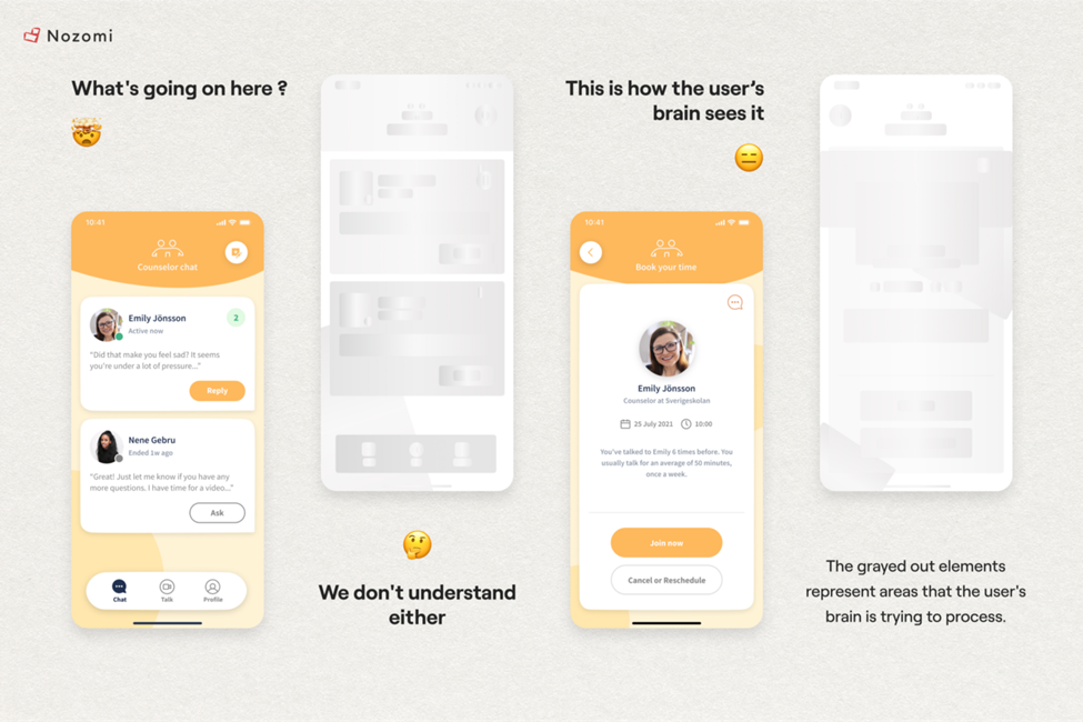
They couldn’t find the necessary information and features in the application, they took a long time to complete the tasks, and it was difficult for them to navigate.
As a result, there was an understanding of what should be paid special attention to and improved. So that later on, some aspects would not have to be reconstructed from the beginning in non-prototype development. It is the primary reason User Tests as one of the healthcare ux research methods for apps are essential.
II. Quantitative User Researches
In theory, quantitative research is needed to confirm the findings of qualitative user research in healthcare.
However, it is not mandatory to validate the conclusions if you see good results after User Tests. But if you want to ensure that your application can scale to a large number of people, you need to check whether a similar problem exists among a larger population.
The best approach is to bring in 100 people through advertising to your application (or landing page) and test whether there will be conversions to registrations and how high the retention and customer lifetime value (LTV) will be.
If we don’t want to wait and spend money on paid advertising, we can use surveys in the form of questionnaires (for this, TypeForm and Google Forms can be used).
Two key rules for surveying:
1. The questions should be closed-ended.
2. The sample size should ideally be at least 100 people.
But aren’t we just confirming conclusions for the sake of it? With the results of such a survey, we can improve our product: its features and UX design. Two methods can help us with that.
1. The Kano Model
The Kano Model is a tool that allows development teams to focus on optimizing only the most important features for users in relation to the product.
Such features were identified during in-depth interviews and user tests (such as chats and an anonymous mode). Now, additional surveying is needed to rank the importance or unimportance of certain features.
As a result, we can understand which solutions are optional and unnecessary, as this helps us save time, finances, and energy in their creation and maintenance.
For the Kano model, there are five types of attributes. Let’s take a closer look at them:
1. Must-Have Attributes: these are features that must be present for the product to be used (without them, the user will not use the product). For example, the ability to type text in chats.
2. One Dimensional Attributes: these are features that can be improved (performance features). For example, app loading time. The faster the app opens, the more satisfied the user will be.
These attributes allow us to calculate our capabilities: how much and how we can increase performance (without compromising animations and image quality or increasing the app’s size).
3. Attractive Attributes: these are features that provide a “WOW effect.” For example, the anonymity for young people – students. For B2B (schools), an attractive feature could be a convenient section with statistics sorted by gender, age, grade, and type of mental health problem.
4. Indifferent Attributes: these are features that users care little about or don’t care about at all. For example, sending photos.
5. Reverse Attributes: these are features that hinder the normal use of the product and cause user dissatisfaction. For example, a situation where too much data distracts the user. It’s essential to strike a balance.
Now that we have studied the types of attributes, let’s create a list of all characteristics/features/solutions of the product on which you want to focus users’ attention. We will design a survey and ask a question regarding each feature with six response options.
For example, is the video call feature important to you?
1. Yes, it is important (Must-Have attribute).
2. Somewhat important.
3. Moderately important.
4. Somewhat unimportant.
5. Not important (Indifferent attribute).
6. Undesirable (Reverse attribute).
You probably wonder, what about attractive and one-dimensional attributes? To identify attractive features, it’s worth asking a separate question listing various features that create a “WOW” effect.
In other words, simply enumerate different features in the question and ask where the “WOW” effect is present.
For one-dimensional attributes, you can also ask questions like, “Is it important to you that the app loads within one second? If not, what loading speed is considered acceptable to you?” Then provide options with different loading times in seconds.
Afterwards, we will sort the obtained responses into these 5 types of attributes.
Depending on the domain, we need to gather a specific number of respondent answers:
1. For B2B with a low average check and B2C – 100 responses.
2. For premium B2C and B2B with a high average check – 20-50 responses.
By collecting the required number of responses, we can identify which features should definitely be included in the final product, which ones generate excitement, and which ones may cause issues for the users of our solution.
2. QFD: Quality Function Deployment Analysis
After conducting the Kano analysis, we need to ensure that our developers are physically capable of creating a product that users will like and prioritize the creation and release of features.
Indeed, one feature may contradict another (for example, will there be enough data for statistics at schools with the presence of an anonymous mode) or it may be difficult to implement due to certain technical characteristics.
In all of this, the Quality Function Deployment Analysis (QFD) will help us. This methodology will allow us to understand which areas of product design are the most complex and time-consuming in terms of development and identify the elements of the application that require top priority attention.
In general, the Quality Function Deployment approach in healthcare apps has different ways of implementation and it can be both a qualitative method and a quantitative one. Here, we also use Quantitative User Research: a mass survey with questions regarding specific features of interest to us (but combining it with our capabilities and knowledge).
The reason for this choice is that the quantitative method of assessing user satisfaction is the most accurate. After all, if we limit ourselves to 10 people in the Customer Development process, it is unlikely that our data will be representative.
Now about what type of question should be.
For example, describe your current level of satisfaction with the “Anonymous Mode in Chat” feature:
5 (High level of satisfaction with the feature)
4 (Above average level of satisfaction with the feature)
3 (Average level of satisfaction with the feature)
2 (Below average level of satisfaction with the feature)
1 (Low level of satisfaction with the feature)
And then we ask the same question about our other features and move on to constructing the QFD:
1. Identify the columns of the QFD – technical characteristics (chosen by technical specialists).
For example: Fast Loading of the app, Notifications, UX/UI, Feedback system, Data Collection & Size of images and animations..
2. Select features and parameters from the user survey – the capabilities that interest users. Assign a weight (importance) to each feature, ranging from 1 to 5.
For example: Chat, Anonymous mode, High Quality of Animations & Fast loading. It’s worth noting that technical characteristics may coincide with features/parameters. For example, in technical characteristics, we simply indicated “Fast Loading” as a technical element, and in features/parameters, we specify the user’s need for this element – “Absence of long page loading times“.
3. Then, our team should rate the technical characteristics and user features/parameters important to users. If technical characteristics mutually reinforce each other, a circle with a line is used. If they weaken or are independent of each other, a triangle is used. If they minimally affect each other, an empty circle is used.
For this purpose, there are three levels of evaluation:
“Θ”: This is used when there is a cause-and-effect relationship between the feature and the technical characteristic. For example, “Fast Loading” and “Absence of long page loading times” have a positive relationship.
“Ο”: This indicates a medium relationship that implies mutual occurrence but not to the full extent. For example, a “Good Tutorial for App Journey” at the beginning of the application might influence the technical characteristic “Notifications for Students” since students will pay more attention to it. On the other hand, push notifications are often perceived as advertisements, so the relationship here is not fully present.
“▲”: This indicates a contradiction or lack of relationship. For example, “High Size of images and animations” and “Absence of long page loading times” are clearly contradictory.
4. Now multiply the scores by coefficients (formulas will be automatically inserted in the template), and assign the desired priority to technical characteristics.
5. Finally, everything is automatically summed vertically and horizontally.
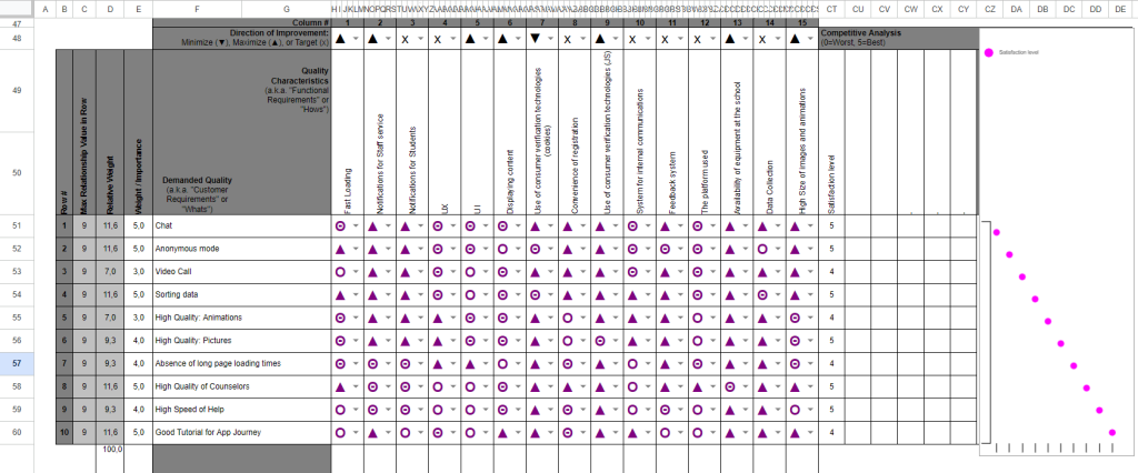
Example of QFD with technical characteristics and features:
Based on the example above and considering the presence/absence of relationships, the matrix automatically reveals the “Relative Weight,” which helps determine the priority of creating and releasing features.
And as promised, we attach a link to a guide for qualitative research here. Additionally, as a bonus, we provide a link to a resource where you can download QFD matrix templates here.
In the templates themselves, you will find an extended version of the matrix that you can use for a more in-depth dive into QFD.
——————————————————————————————————————————————

We hope our article was useful for you!
Who we are? We are a Digital Health Product Studio, who transforms healthcare digital experiences and sets new standards for delivering digital healthcare in a way that positively impacts people’s lives.
We assist healthcare startups in designing and developing digital products, while also helping healthcare organizations undergo transformative changes. If you are interested about our experience check our case studies by the link or check a book about our approach.
Or write to us now and we will discuss how we can help ensure that your product brings real benefits 🙂


