
First and above all, it must be clarified that the Proper Design Review is not based on personal (or subjective) impressions influenced by a specific designer’s feelings, tastes, or opinions. A good design is defined by specific rules and opinions of the application’s target audience.
These rules and UX research help achieve business goals, such as reducing user churn and increasing the overall number of registrations/visits/retention and engagement.
Let’s go over the strategy for starting UX research:
1. First and foremost, you must determine your target audience and form a focus group to test the application.
2. Next, define and test the main user flow (the entire path of the user journey in the application).
3. Following testing, the main pain points of users in the application that influence engagement can be identified.
How could these pain points be rectified while causing no harm? You only need to follow global design standards and study feedback from your target audience.
Regarding global design standards: the most challenging aspect here is user onboarding, so before the article, we suggest you take a look at our list of 20+ digital health onboarding examples that you can use as a foundation to enhance your digital health app.
Check Figma with 20+ examples of engaging Digital Health Onboarding
So let’s discuss a particular example regarding this topic.
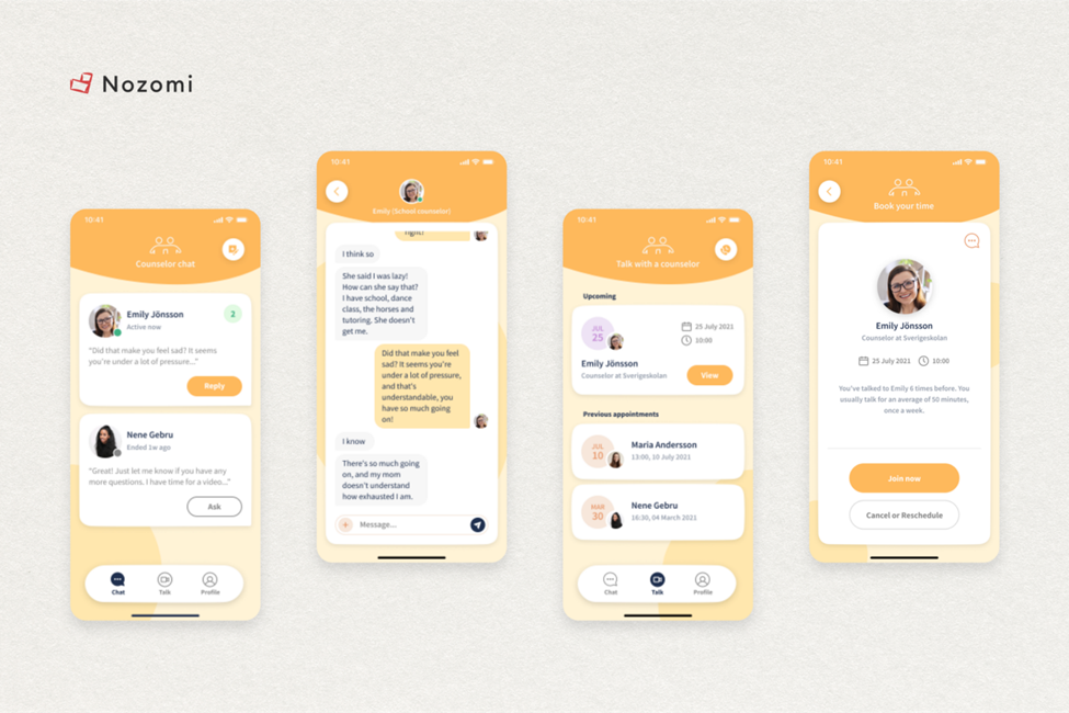
We will be conducting an Allbry Design Review today. Allbry is one of our ongoing projects.

Allbry is a company that provides a platform for students to get mental health help. They created platform with chats & calls for schools, which students could use to communicate for free with volunteer counsellors. Their goal was to proactively improve mental health by solving three major problems: accessibility, trust and anonymity.
Company hit a significant roadblock in its first version when it needed to build a platform that could scale to grow its user base.
Key business problems:
1. Inadequate scalability: The application is incapable of supporting a large number of students.
2. Low user engagement: the design needs to be updated and new features added.
Let’s get started with tests
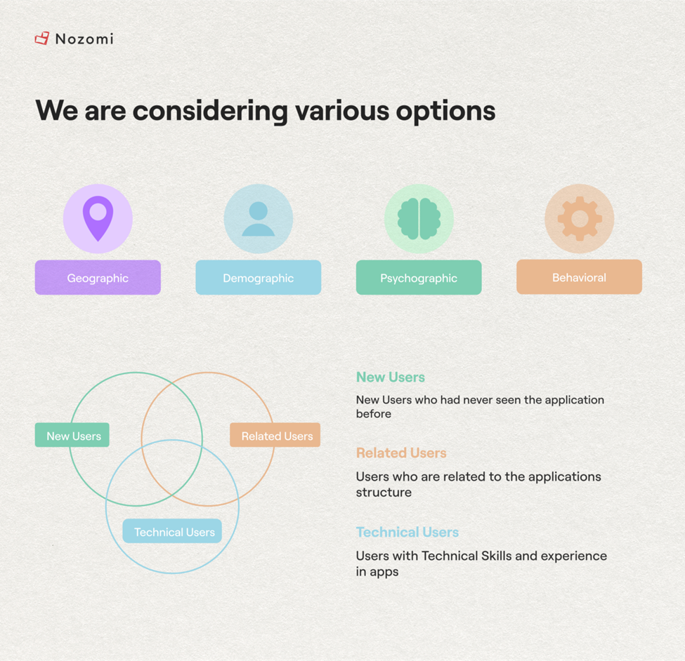
Before beginning the analysis, it is necessary to conduct local tests to determine the reasons for the target audience’s low involvement. All relevant factors were considered during the analytics, including geographical, demographic, physiological, and behavioral factors.
Furthermore, for testing, we use a focus group comprised of three types of target audience: new users (who have never used the application), experienced users and technically savvy users.
Results
As we can see, the high brand awareness due to the colour scheme’s adherence is a good indicator; however, does its current implementation positively influence the overall user experience?
Over half of all users:
1. Have difficulty finding the information they require, which, of course, negatively impacts their overall experience with the application.
2. Did not complete the tasks assigned to them or spent an excessive amount of time on their solution.
Both issues may cause users to abandon the application.

As we can see, improving the overall user experience while maintaining positive aspects such as brand recognition in the application is the main goal.
What is the significance of brand awareness?
It’s critical since users should always know which brand or company application they use.
It’s vital if you plan to release another product later and want them to adapt to it quickly. After all, it will impact trust and, as a result, the conversion rates of the new product.
Let’s look at how redesigning the application can help you improve test results
Since the Allbry app is intended to be used frequently, we mainly focused on its simplicity and convenience.
For instance, it’s not that big of an issue the first time for the user if some button is placed awkwardly and the finger can barely reach the desired button. However, if they use the app more than 5–6 times, they will eventually abandon it.
Let’s examine factors that make users interact with the app either more or less challenging
1. Visual Focus
The application’s design directs the user when they are on a specific page by letting them know where to obtain the information, they seek without adding any extra or unnecessary information to the user.
As we previously saw in the tests, 57% of consumers encountered issues with in-app navigation, and 53% took excessive time to complete simple testing activities. These results are indirectly impacted by focus.
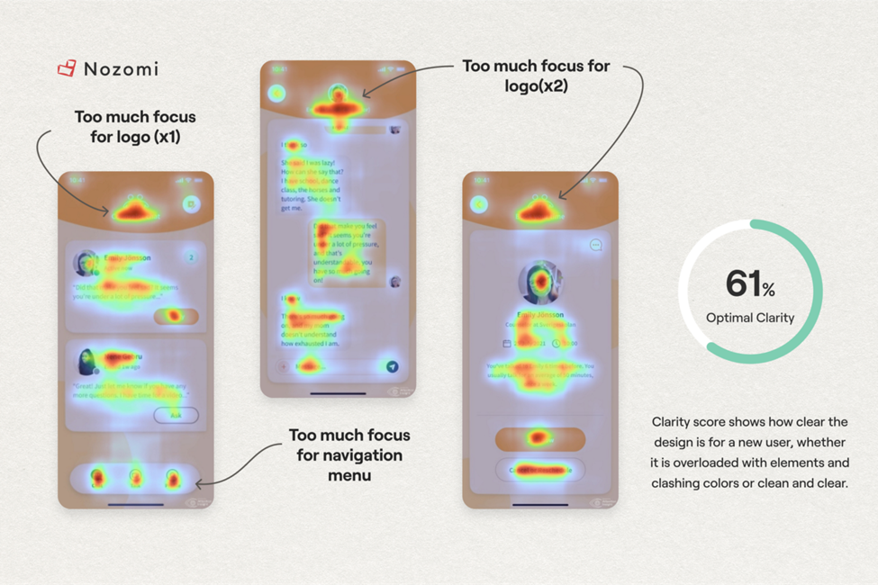
According to the heatmap data, the screen header and logo receive the most attention. As a result, the user is unaware of the side buttons. It becomes more challenging for the user to rapidly and efficiently navigate the application with more attention-grabbing components on the page.
Most likely, you or your friends experienced a similar scenario where you downloaded the application, focused on its design or structure for a considerable amount of time, your mood deteriorated, and you turned to a rival.
2. Cognitive load
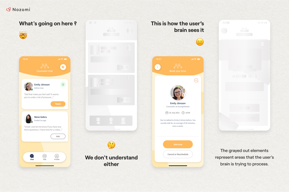
The threat that everyone overlooks is the cognitive load that users endure. For example, a phenomenon known as clip thinking has been produced by contemporary media culture and when someone uses clip thinking, they simply see individual segments of the information rather than the context and original meaning.
Users want to find a solution as quickly and swiftly as possible due to the amount of information out there, and they want to refrain from exerting themselves again.
Therefore, the user would have a better experience with the application if they process less information per unit of time.
The picture below compares an app’s content to how a user interprets information. Just picture the user simultaneously processing everything the phone displays to them.
Finally, we are beginning to consider ways to enhance the design.
UX Changes
1. Chats are one of the primary features. Considering the fact that students are our target audience, we performed analytics to determine which chat software is most popular with this demographic.
A little context: chats helped to communicate comfortably between students and counselors.
WhatsApp, Facebook Messenger, Telegram, Viber, and Line (mainly in Asia) were the top 5 applications.
The user can quickly and easily comprehend the new application if you look at all the software mentioned above because they all have almost the same UX pattern.
That is, if we implement UX strategies that users are already familiar with from other applications, we will make it much easier for users to get the information they need within the program.
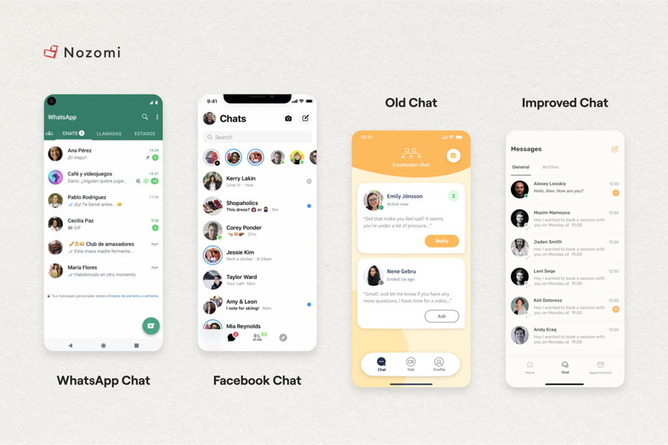
As we can see in the examples above, we used Patterns from a module called “Messages” that were familiar to our target audience to improve the design.
An example of the cognitive load caused by an unfamiliar arrangement of elements is shown below on the left.
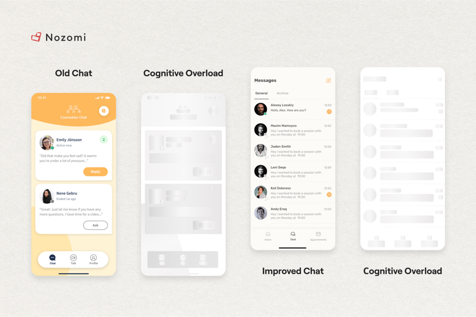
The familiar UX of this module will significantly reduce users’ cognitive load, accelerating and simplifying their search for the required information. User churn declines as a result, and engagement increases.
2. Intuitive Navigation. It optimizes the user flow and makes it simple to locate the data you require.
Consider the example that follows. Assume you’re in an online store and want to see what items you’ve added to your shopping cart.
You will look in the upper right corner for an icon that looks like a “Shopping Cart” because you are already accustomed to the fact that in most applications, this button is located precisely at the top right and has this specific icon.
However, if we ignore this fact and hide this button at the bottom left, replacing the “Shopping Cart” icon with a “Triangle,” the user will either miss it or spend a long time on it.
It directly impacts the experience and engagement of new users in the application. Let us now analyze the navigation issues:
Problem 1: Excessive Focus
The menu (footer) provides much room for creativity and plenty of options. However, in this case, the main issue is that it draws a lot of attention on any and all pages.
It would be best if you made the menu as neutral as possible while also making it intuitive for users. It hugely affects user engagement.
Problem 2: Lacking Specific Pages
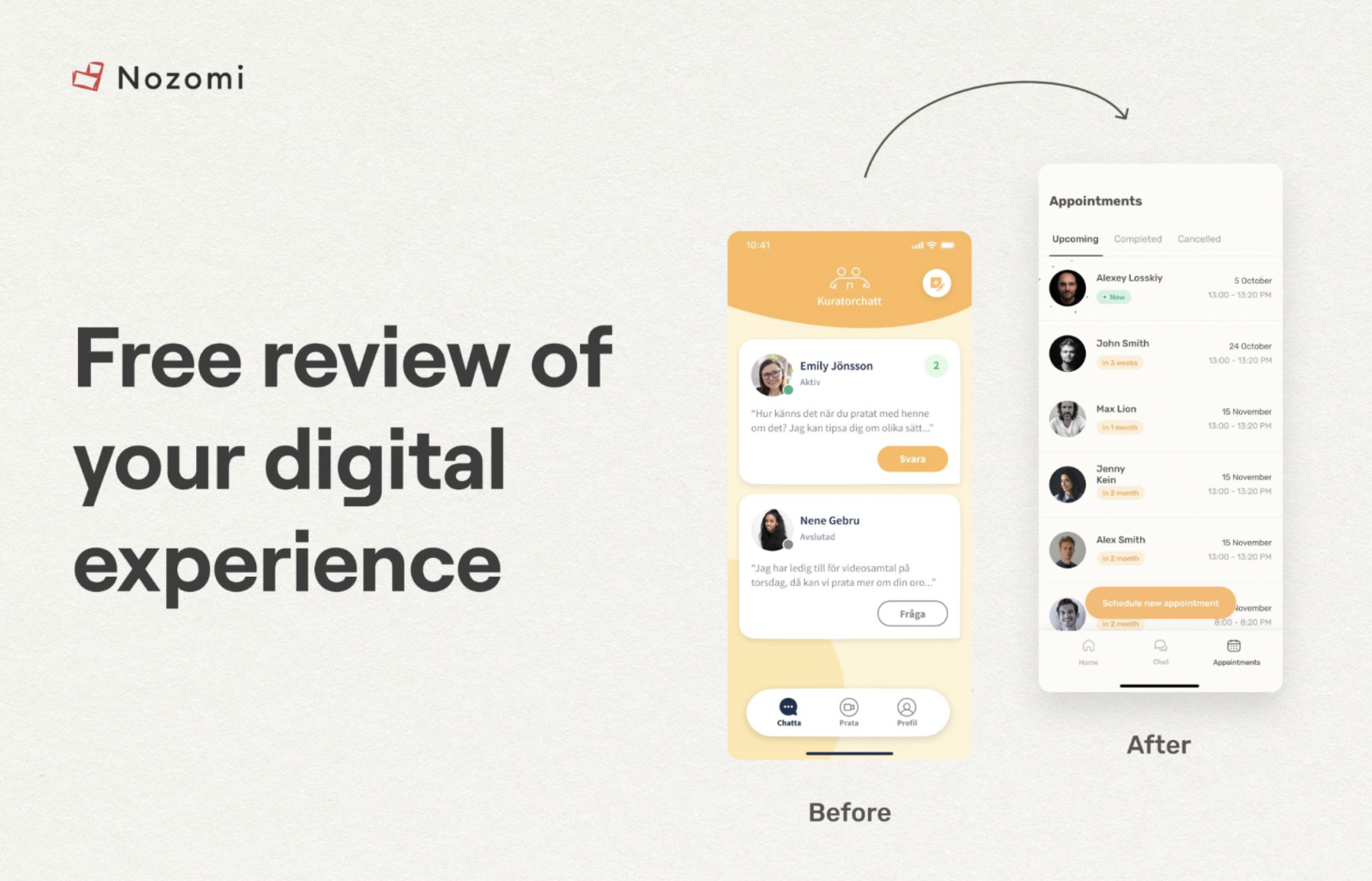
After collecting user feedback, we discovered that the majority of them need a “Main” page where they can see all existing / current calls and have quick access to them.
As a result, we’ve added a new button to the “Home” menu and a corresponding page.

Problem 3: Infrequently used element
The image above shows an old design with the “Profile” button, which is meant for the transition to the user’s page.
However, analytics show that users spend only 10% of their in-app time on the “My Profile” page.
As the menu footer should only contain switches to frequently used pages, we decided to move this button within the “Home” page to the upper right corner because it is a common user-friendly pattern.
Is it OK to leave the menu’s four buttons as they are? Well, it wouldn’t have a negative impact in the short term. However, frequent app use over time influences the cognitive load negatively. 3 elements are easier to concentrate on than 4, after all.
UI Changes
1. Colour scheme: The Rule of Three Colors, a tried-and-true design principle, has become widely accepted as a way to increase focus and decrease the cognitive load.
● There is a primary colour that serves as the brand’s logo colour. It draws attention to itself and serves as the brand’s visual reference.
● A secondary colour, usually dark/black, is responsible for the information on the page, the description text, and so on.
● An additional colour, usually white, which is used as the background image.
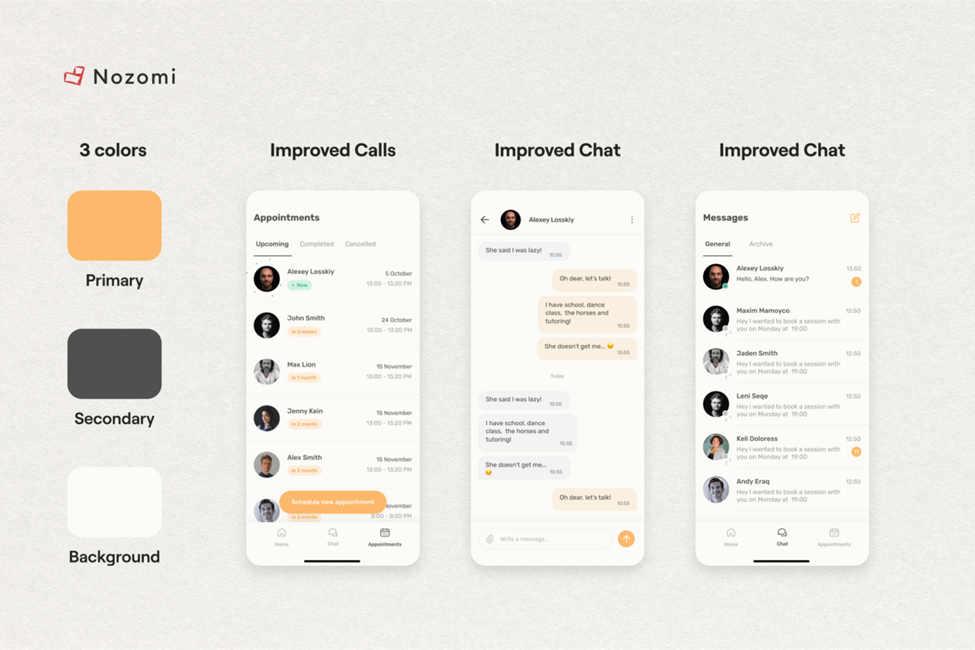
We preserved the brand identity and offloaded the app’s visual components, as you can see in the image above.
2. Visual Grid: It controls the logical arrangement of elements on the page and defines focus via composition.
The distance between semantic groups is always greater than between blocks within one semantic group. In other words, regardless of whether there is any description of the elements, the user intuitively understands which ones belong to which group.
Consequently, the user quickly understands where the necessary information is located, reducing cognitive load through focusing.
We should never forget that cognitive load can cause the user to stop using the application and look for a competitor.
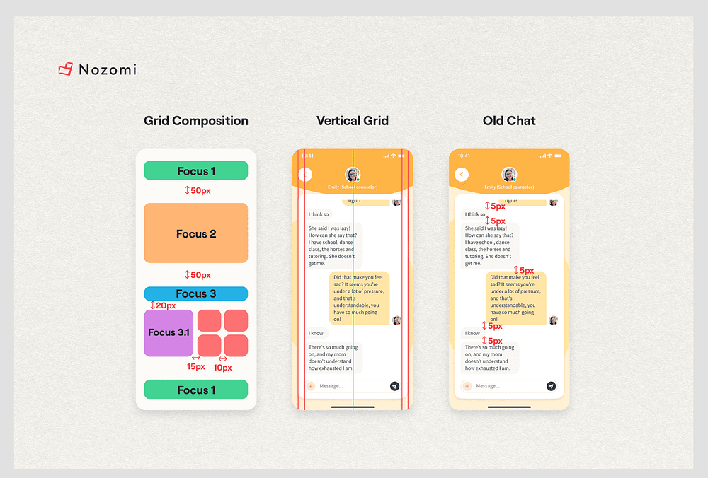
As we can see in the old design, there are no problems with the Vertical and Horizontal grids.
However, the rules regarding space inside blocks with textual information are not followed. As an outcome, the user is compelled to perceive a large amount of data, which increases cognitive load.
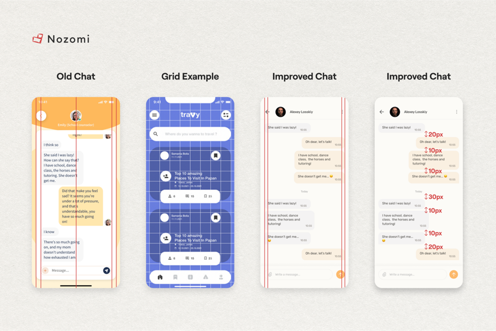
As seen in the images above, the updated design has preserved the Vertical and Horizontal grids and increased the spacing between the information blocks to make it simpler for the user to distinguish between what they see.
The clickable part worked as intended, and if you’d like to see a nice example, follow this link to the image.
Results and Testing on real users
It’s time to put the new design to the test and assess the results. Let’s go 🙂
We start with focus and cognitive load, two of our favourites.
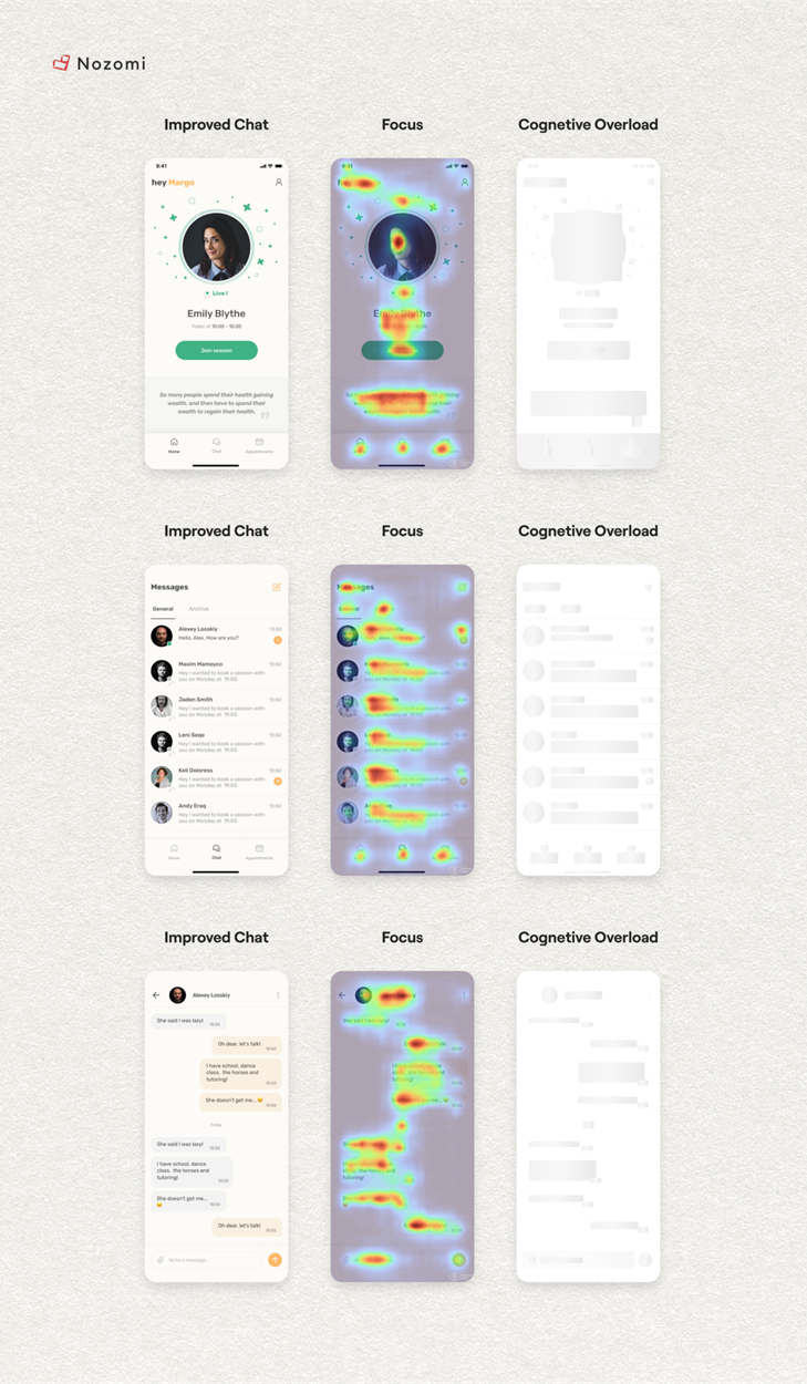
The heat map shows that the improved design does not affect the focus, as expected. The user’s focus falls exactly on those elements that should draw attention.
There are no issues with cognitive overload because all blocks are separated and do not cause user confusion or information overload.
What about the results compared to what the previous design had?
As the test results show, there is a decrease in the brand’s visual identity by 5% when removing a large number of saturated colours that caused user disorientation. Brand awareness, on the other hand, remained high.
According to testing, the platform’s navigation simplicity increased by 22%, and the platform could scale. As a result, the number of registrations and visits to the application grew.
In one month, the old version of the application had 100 students from Swedish schools. In six months, the new version of the app reached 10,000 Swedish student users.
The percentage of users who completed all tasks in a timely manner has increased by 32%. Users can now find the information they require more quickly.
As a result, indicators like engagement and registration rates have increased.
Let’s see the feedback from CTO Allbry — Haris:
In the new app, we notice that features are now self-explanatory and usually don’t need to the guided. The users quickly understand what to do in the app. In customer meetings and from user feedback, we often get feedback on how good it looks and how easy it is to use.
As you can see, this design review helped to discover a lot of business problems.
If you want to build a product which brings positive outcomes, It is necessary to have a clear understanding of how the UI/UX design should work and how to do it in a way that shows care and value.
But that’s only one component, another one – is technology. No matter how awesome you make your product look, if the development is poor and it starts glitching and lagging, all your hard work goes down the drain.
And to stay updated on the product (CX, UI, UX, Engineering) and process approaches used in the digital health market, as well as the current industry trends – subscribe to our monthly newsletter. We provide more detailed insights into creating Digital Health products, their components, and how to convince users to use healthcare products.