About 15% of the world’s population has some kind of disorder. There is a possibility that a certain% of people in your application may have other problems that need to be taken into account in the design.
Moreover, there are elderly people who may also find it difficult to use the product. And all of the mentioned individuals may simply not receive assistance due to our and your apps lacking certain elements that make them accessible for these groups.
By the way! Another reason for implementing accessibility that everyone tends to forget is the law. In most countries of the European Union, as well as in the United Kingdom, United States, Canada, Australia, Brazil, and India, accessibility standards are legally mandated.
That’s why it’s so important to make sure your product meets the highest standards of accessibility. You need to ensure accessibility in health apps and design according to WCAG guidelines and standards, which we will discuss in our article.
By incorporating these accessibility rules, Digital Health apps can enhance usability, inclusivity, and overall app user experience for individuals with disabilities or elderly people, ensuring equal access to healthcare resources and services.
But first, a bit of introductory information for a complete understanding of the topic: accessibility (equal access to a product for all users, including those with disabilities) is just a part of usability (the ability of a product to be understood, attractive, and easy to use).
By increasing the accessibility of a product, we also enhance its usability.
Therefore, to have a broader understanding of the topic and learn about other rules that can improve the Customer Experience (CX) of Digital Health apps, you can pre-read our article on how to simplify this very usability here.
Accessibility Solutions for Healthcare Apps
In our article, we will further discuss the 4 main principles of WCAG (web content accessibility guidelines) using Digital Health cases as examples.
At the end of the article, we have provided a checklist for WCAG guidelines Compliance. With the help of this checklist, you will be able to assess whether your product meets the standards and determine the level of compliance that suits you 🙂
I. Perceivable
What is the first role of web accessibility in health information access? To make your solution accessible means that users should have the ability to perceive it using their senses.
In simpler terms, if the content of your application is focused on visual experience, it should have an alternative that includes auditory perception or any other sensory modality.
What could be the problem here?
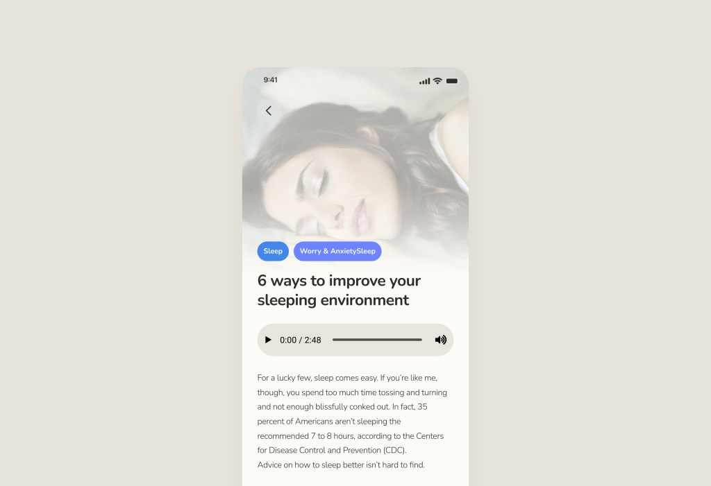
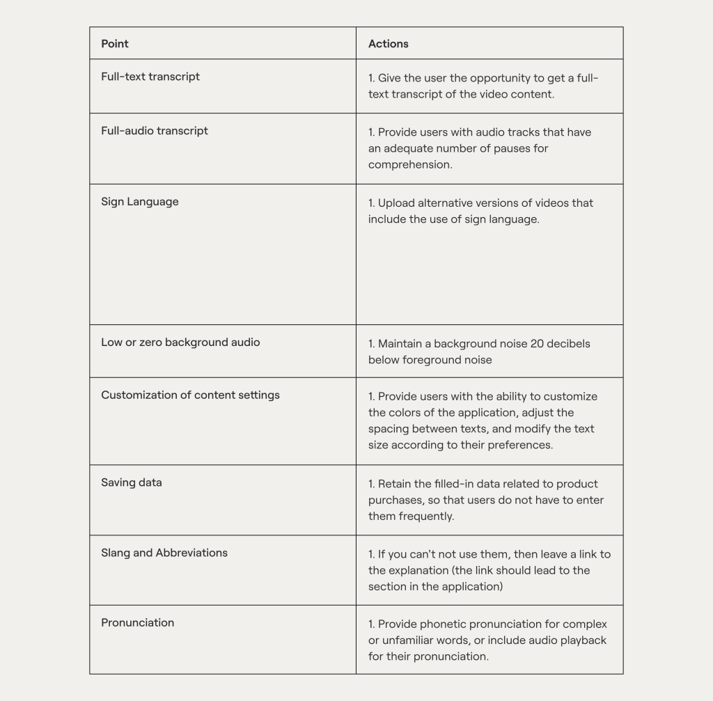
1. Lack of audio alternatives. Some solutions may not provide an audio alternative to the text content displayed on the screen for those with visual impairments.
As an example, in the applications we develop, we utilize an audio track for blogs. For instance, in the Medium app, where there is a significant amount of text and we don’t have the ability to enlarge it, we provide an alternative to the user:
2. Lack of visual/textual alternatives or subtitles. It is the same concept as the previous point but in reverse.
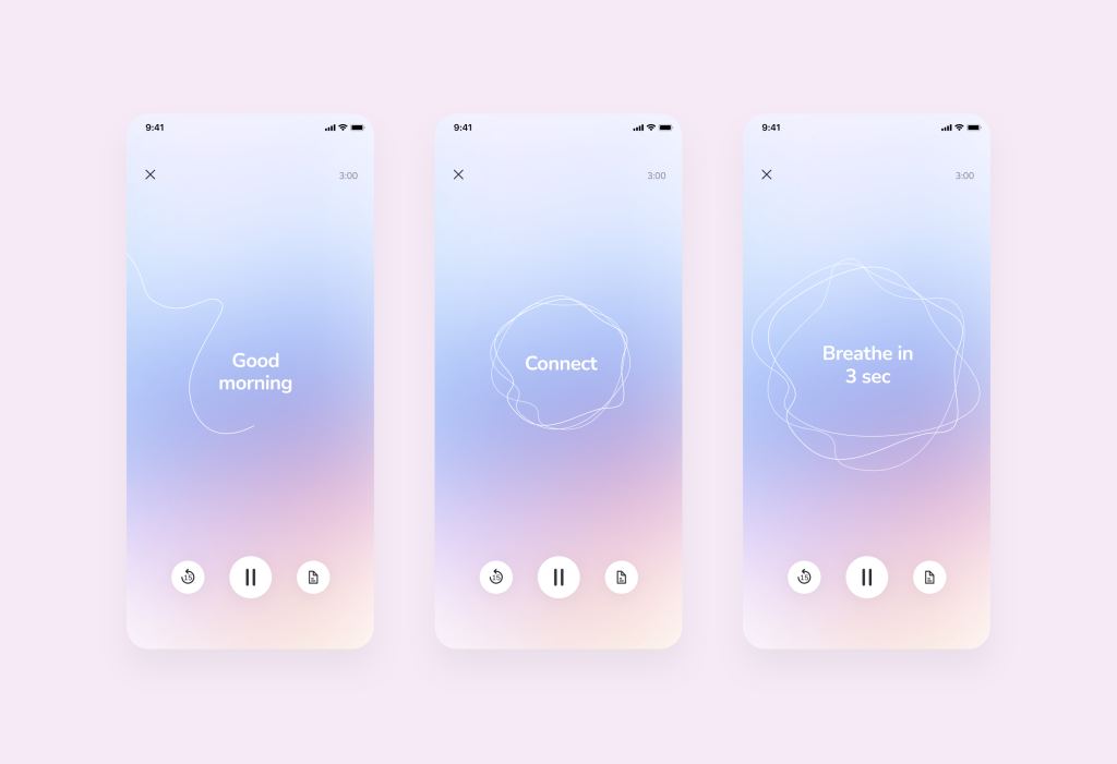
For example, in Microshift (an app that helps people shift into a reflective state and transform it into a habit with meditative circles), we added textual elements to the main video track to provide instructions on what to do during meditation.![]()
Learn case study how to build mental health platform for Swedish startup
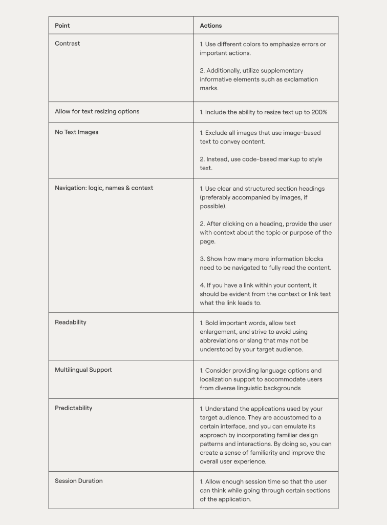
3. The app must ensure the availability of color: there must be sufficient color contrast.
These are the foundational principles of WCAG. People with color perception issues have difficulty distinguishing certain colors. Therefore, it is important to ensure color contrast and preferably include text or symbolic cues to convey information.
You may recall that when you enter your login and password on a website, incorrect fields are often highlighted in red, accompanied by exclamation marks. This serves as a symbolic cue.
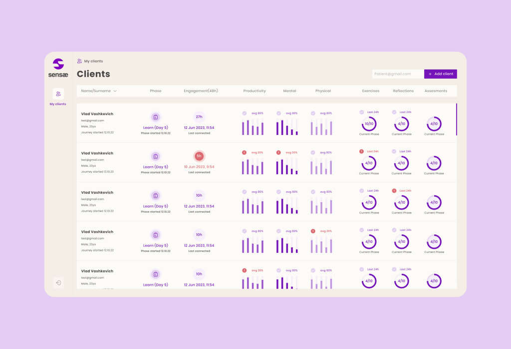
Sometimes, these symbolic cues are even more important than color itself. As an example, we can mention Sensae (a mental wellness platform helping people manage stress and anxiety using AI). In the analytics of the desktop and mobile versions of the application, we used a contrasting red color to indicate missed exercises by the user.
Learn case study hot to build AI health platform for Danish company
However, we didn’t forget about the exclamation marks that will accommodate users who have difficulty distinguishing colors.
II. Operable
This principle requires not just minimal, but full functionality of the entire application, regardless of the disabilities of your target audience.
1. Time can also be a factor that affects your health and product experience. Surely you remember that your banking application automatically logs you out after a certain period of time.
At such moments, you might wonder what the WCAG standard is, why do they do this, and why is the same required in Digital Health apps? Imagine being an elderly person or having visual impairments. If you forget to log out of your application and someone such as your grandchild, friend, enemy, or a random person takes your phone and starts pressing buttons, it could lead to unpleasant consequences.
It would be unfortunate if your grandchild transfers all your money or changes your health exercise program to something more challenging. That’s why some products automatically log users out after a certain period of time.
On the other hand, based on user tests with your audience, you should determine how much time is needed for users to complete specific tasks in the application. For example, if a user was filling out a form and simultaneously searching on Google for an answer to a question, but the application logged them out, it would be considered not operable.
We have written an article on conducting User Tests as part of building the right development process here.
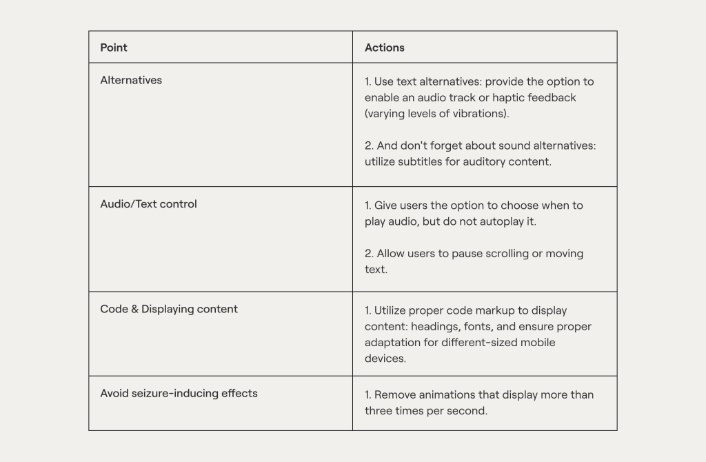
2. Be aware that the application can trigger seizures (!!). While not a common problem, it can occur with inexperienced developers who do not know how to handle visual content and animation properly.
Would you like your animation to cause seizures in users? Of course not! However, there are individuals who can genuinely feel unwell if the animation on your page flickers more than three times per second.
As a precaution, we won’t show a bad example, but we will provide a link to a tool that can help you evaluate the compliance of your visualization.
3. Next, make the navigation intuitively understandable. This point applies to all categories of users and is crucial for users to understand your application. However, we couldn’t omit it because without this foundation, people won’t be able to navigate the application effectively 🙂
Here are a few basic rules, particularly important for users with disabilities:
1. Use clear and structured section headings (preferably accompanied by images, if possible).
2. After clicking on a heading, provide the user with context about the topic or purpose of the page.
3. Show how many more information blocks need to be navigated to fully read the content.
4. If you have a link within your content, it should be evident from the context or link text what the link leads to.
Learn how we’ve built digital health app for eating disorder therapy
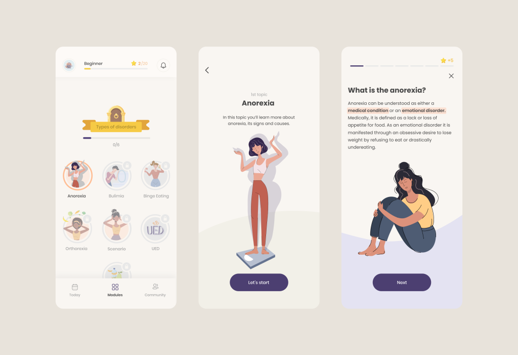
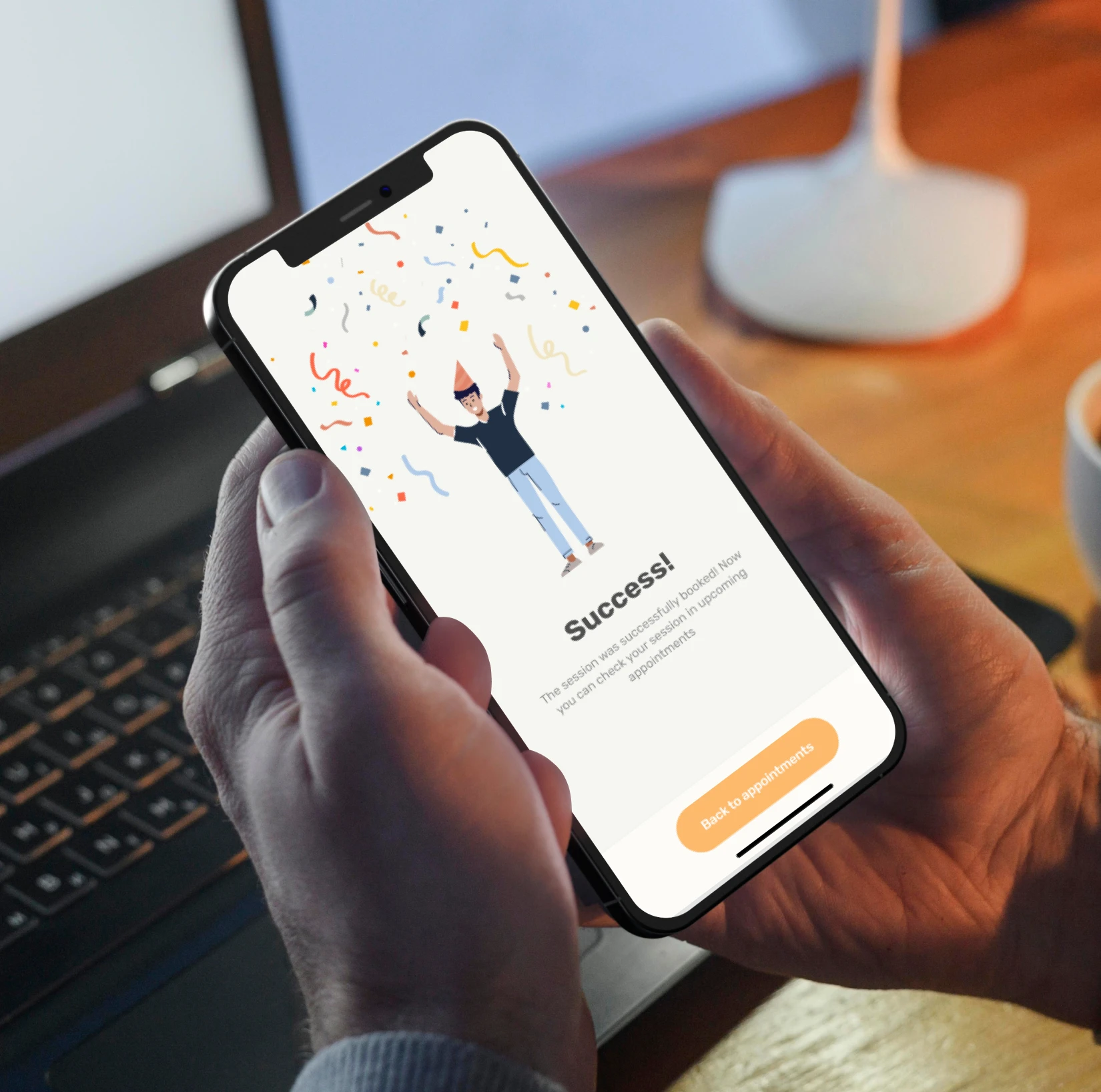
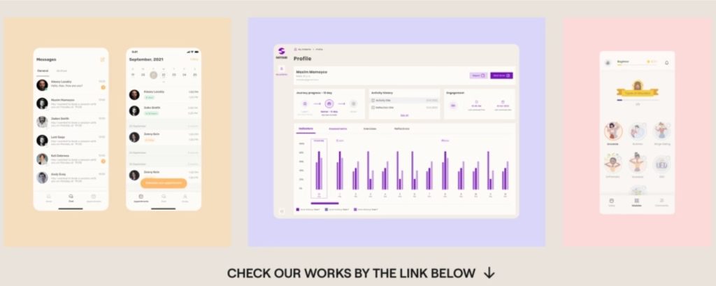
In the image, we presented an example of good navigation with ProgressMe (an app that helps young people suffering from eating disorders).
If you want to learn about other navigation principles, you can refer to our article on onboarding practices here, where we have outlined five sequential stages to make the user’s introduction to the app as simple as possible.
III. Understandable
All information and the mobile interface should be accessible and easy to perceive for any individual, regardless of their health condition. This is really important for WCAG.
1. Ensure readability. Follow the standard practices: highlight important words in bold, provide the ability to enlarge text, and avoid using abbreviations or slang that may not be understood by your target audience.
And don’t forget about Multilingual Support. Consider providing language options and localization support to accommodate users from diverse linguistic backgrounds. Otherwise, already at the stage of acquaintance with the application, the user will not know where to go.
2. Make Predictability. Users don’t want interfaces to surprise them. They want everything to behave as expected. Therefore, it is important to better understand the applications that your users are using.
In general, when incorporating features that users frequently interact with in other applications, it is advisable to utilize familiar design patterns.
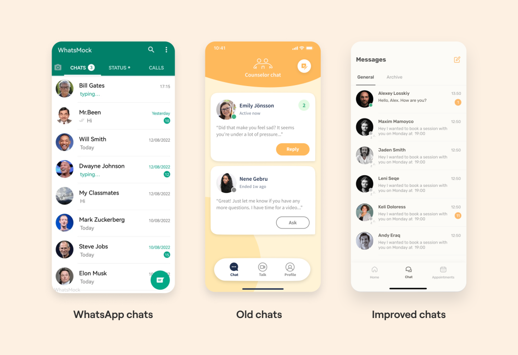
For instance, if your app includes chat or video call functionality, it is more effective to adopt a user experience similar to that of WhatsApp rather than reinventing the wheel. By doing so, users can effortlessly access the information they require.
In Allbry (telemedicine app that helps to improve mental health of users with counselor chats) we reduced the cognitive load of users by implementing the same chats logic as in WhatsApp. And it’s really improved accessibility in this health app.
How did we get to this? For this purpose, we conducted a study on the preferences of our target audience and performed User Tests, as mentioned earlier, to confirm usability.
3. Input assistance: show error handling and feedback. Here you should implement clear and descriptive error messages & feedback for form validation (or critical actions) to assist users with disabilities in understanding and resolving issues effectively.
A simple example from daily practice is when you encounter a message saying, “You entered the password incorrectly, check if Caps Lock is on.”
But what if the user has poor vision? This is where haptic feedback comes into play.
Haptic Feedback: one effective way to engage users on a deeper level is through haptic feedback. By incorporating tactile sensations, such as gentle vibrations or touch responses, digital health apps can create a more immersive and engaging user experience.
Let’s explain again using the example of Allbry, where we implemented vibration for negative scenarios: when an error occurs, the vibration is sharp, which prompts the user to pay attention to what should not be done.
On the contrary, a gentle vibration is used (while logging in to the application or performing a task).
Learn how we’ve built telemedicine mental health platform for Swedish startup
IV. Robust
Many people confuse this point with reliability, which we described using the example of a grandmother and grandson.
However, in reality, it refers to the application being reliable enough for technologies, mobile devices, and web browsers to interpret it correctly.
In other words, a reliable design is resistant to coding errors that may distort the content and other displayed elements in the application. So how to do mobile medical applications accessible to patients and other type of target audience?
There is only one important point here that applies to applications: ensure that your code is well optimized.
For example, if your application’s code lacks proper opening and closing tags, the content of the application may be:
– displayed differently on various devices;
– not displayed at all;
– or appear unreadable.
A correctly formatted HTML code, adhering to all markup language specifications, ensures that the structure of accessible content remains as intended on all platforms and devices.
V. WCAG Guidelines Compliance Checklist
And as promised, we have attached a checklist to assess the compliance of your application with WCAG (web accessibility guidelines). Below, we have provided three lists based on the level of compliance.
Please note that we did not repeat items in subsequent sections. This means that to comply with Level 3, you should also consider all the elements from the first two lists.
1. Level A is necessary if you want to make only some basic changes to your application without extensively rethinking the UX logic of the application.
This approach makes the application accessible to some (but not all) users:
2. Level AA of WCAG (web accessibility guidelines) makes your application accessible to almost all users:
3. While it may seem that everyone should strive for AAA level, for most visitors, such an approach can be a bit overwhelming.
In such cases, adding a multitude of different features to the application (some of which were not mentioned in the main text) can risk overloading the application with too many features.
That’s why many companies aim to meet only A and AA levels. However, if you want to achieve the highest level of compliance, then:
——————————————————————————————————————————————
Who are we? We are a Digital Health Product Studio, who transforms healthcare digital experiences and sets new standards for delivering digital healthcare in a way that positively impacts people’s lives.
We assist healthcare startups in designing and developing digital products, while also helping healthcare organizations undergo transformative changes. If you are interested about our experience check our case studies by the link or check a book about our approach.
If you are interested about our experience check our portfolio with case studies: https://studio.nozomihealth.com/work
Or write to us now on m@nozomihealth.com and we will discuss how we can help ensure that your product brings real benefits