
According to Statista in the US, the number of adults, who use digital health apps for health emergencies did not exceed 4%, for tracking illness and medication – 5% and for measuring health metrics – 8%
And all because Digital Health apps have poor adoption, which completely destroys the potential, growth of the application and especially patient outcomes.
We will discuss the last point in more detail, as due to the complexity of adaptation, patients (or simply health enthusiasts) do not receive the necessary assistance or treatment. And if the potential to help/cure a person is missed due to poor UX/UI, it is likely that the user simply did not understand how to use the product.
To illustrate this problem, let’s take a specific but real confirming example.
One of our team members had a moment in his life when they entered a medical app to search for symptoms, but couldn’t figure it out when the interface presented them with 17 diseases corresponding to the symptoms.
At that moment, it became unclear: should he go through the entire list and spend time navigating “forward/back” between the main page and the disease description, or was there a sorting option where the disease most likely matching the symptom was shown first?
In such moments, one feels like giving up, making an appointment with a doctor offline, and forgetting about the app that ruined the mood.
And that’s it! The person has lost the opportunity to receive assistance through the digital app. And remembering the statistics mentioned above, now we understand why such a low percentage of people are using them.
If there are many users facing this issue, bad patient outcomes, the churn rate, and slack user engagement due to a complex UX will be significant.
That’s why simplicity in design is crucial for digital health apps. It reduces cognitive load, builds trust, improves performance, enables adaptability, and most importantly treats people.
The product should be simple, cause you’re designing for those who may not be tech/med-savvy or individuals with diverse backgrounds, abilities, and age groups.
For example, you should consider ux accessibility principles in health apps (elderly people or individuals with disabilities who require subtitles, text alternatives, etc.). You can learn more about this in the WCAG 2.1 standards.
Everything depends on the product type, but let us give you common tips and show real examples on how to make the design in your app simpler and more convenient for users.
And by the way, simplifying complexity is just one of the 5 principles of UX design that we use in our development practice.
We have described the role of the other 4 UX/UI design principles of the healthcare app development in our book, which you can download using the link below 🙂
Book: Nozomi UX Rules for Effective Digital Health Products
I. Prioritize Information
When designing UI/UX for a complex problem, it’s important to prioritize information. Because including all the information at once can overwhelm users.
How to resolve it? User need to see visual hierarchy or sequence
To simplify the user experience, use a visual hierarchy to guide them and highlight the most important details.
Visual hierarchy organizes design elements by importance, making it easier for users to navigate and find the information they need. Clear and concise language is crucial in explaining complex concepts and empowering users to make informed decisions.
In such moments, it makes sense to show the user right from the beginning which stage of using the app they are at and what they should specifically do at that moment.
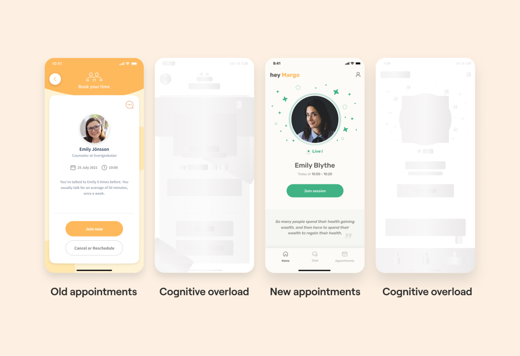
For instance, take a look at the example above: the two left images demonstrate that the interface is overloaded and it is unclear what to focus on. In contrast, the right images show a visual hierarchy on the screen.
With a user-friendly design interface on the right, the user will find it easier to navigate and understand how to access medical assistance. As a result, we can effectively provide him with the help he needs because he has reached the necessary stage in the app without any UX obstacles.
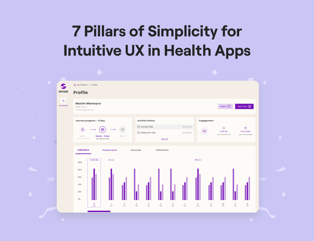
Another example: in the journey towards achieving their objectives, users encounter crucial elements that propel them closer to their desired outcomes. It is essential to identify these key points and emphasize them to capture the users’ attention.
By making certain elements stand out from the surrounding content, they become more memorable. Utilizing techniques such as bold typography or distinctive colors helps highlight important information within a sea of similar data.
This visual distinction ensures that users can easily identify and focus on the significant details, guiding them along their path to success.
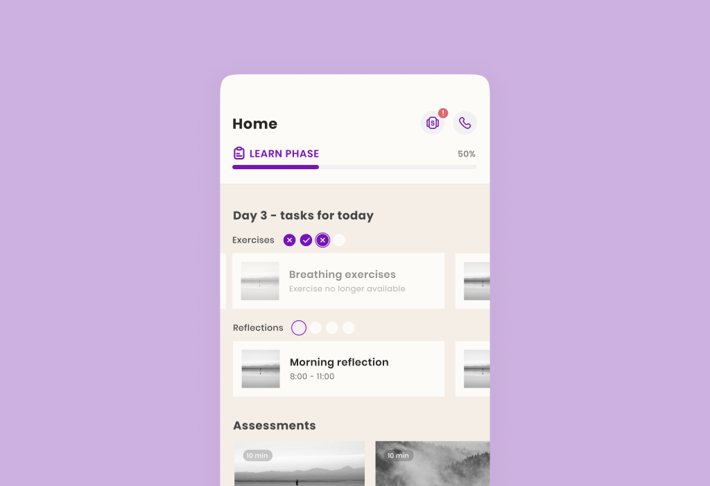
In the example with Sensae, we indicated the level of completion with purple checkmarks/crosses, emphasizing progress (completed/not completed).
By doing so, we improve the user’s focus and increase their engagement rate. So by taking small steps, the user will begin to take more diligent care of their health, thanks to the digital health app.
In general, prioritizing information is most important during the user’s initial interaction with the app. Therefore, it is worth adopting the best onboarding practices. For this purpose, we have even created a figma file that you can check out at this link 🙂
II. Use Familiar Patterns
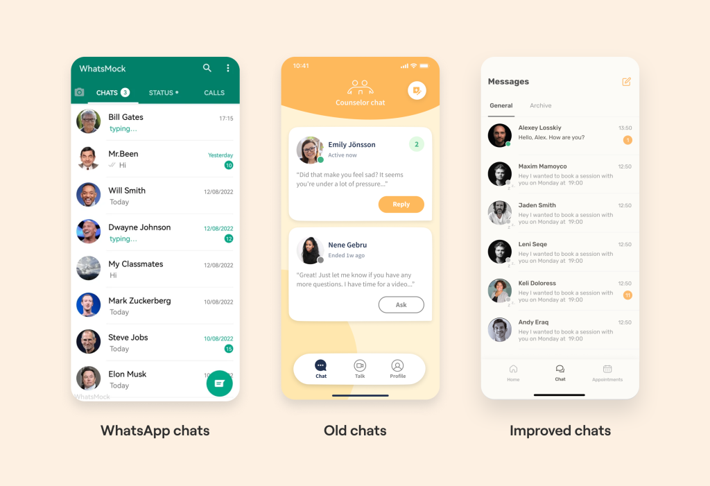
Use familiar patterns for features which users use on a daily basis in other apps. For example, if you have chats or video calls in your app, it’s better to not reinvent the wheel, but make the UX of this feature similar to WhatsApp. It’s much easier for users to get the information they need.
In Allbry we reduced cognitive load by implementing the same chats logic as in WhatsApp. How did we get to this?
Considering the fact that students are our target audience, we performed analytics to determine which chat software is most popular with this demographic.
A little context: chats helped to communicate comfortably between students and counselors. WhatsApp, Facebook Messenger, Telegram, Viber, and Line (mainly in Asia) were the top 5 applications.
Consequently, the speed of communication has increased (due to the familiarity of the interface) and the effectiveness of psychological assistance to users.
That is, if we implement UX strategies that users are already familiar with from other applications, we will make it much easier for users to get the information they need within the program. And that’s it: we have created a user-friendly design in the health app.
III. Use the 3-click Rule to provide Intuitive Navigation
It was introduced by Apple, the main idea of which is: the user must access the necessary information within 3 clicks from the moment the application is opened. If the user makes more than 3 clicks and cannot complete the desired action, then this increases their cognitive load.
Let’s now take a look at how we’ve created a proper user path that fits within 3 clicks. With a nav bar and simple navigation, the user has quick access to the main values of the app (community and educational content).
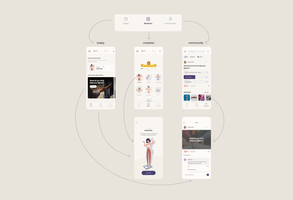
For example, in ProgressMe a person clicks on “Modules” in the footer menu (1), then selects the desired module (2) and clicks “Let’s Start” on the picture with a brief description of the module (3).
And that’s it! The user doesn’t need to spend time navigating between sections, their cognitive load is reduced, and the potential for treatment is increased 🙂
IV. Simplify Related Components
The next step that highlights the importance of simplicity for intuitive ux in health apps is relation. Applying the principle of Prägnanz, we can enhance the user experience by simplifying related components. Our brains perceive visual objects as a unified form rather than separate elements. By organizing content into distinct groups, users can easily process and interact with the information.
To indicate that content belongs to a specific group, there are several effective techniques. You can employ dropdown menus to consolidate related items, utilize consistent background colors or borders to visually connect elements, or employ similar styles and sizes for menu icons.
For instance, consider grouping related features with consistent menu icons that share the same style and size. This visually reinforces their association and facilitates user comprehension and navigation.
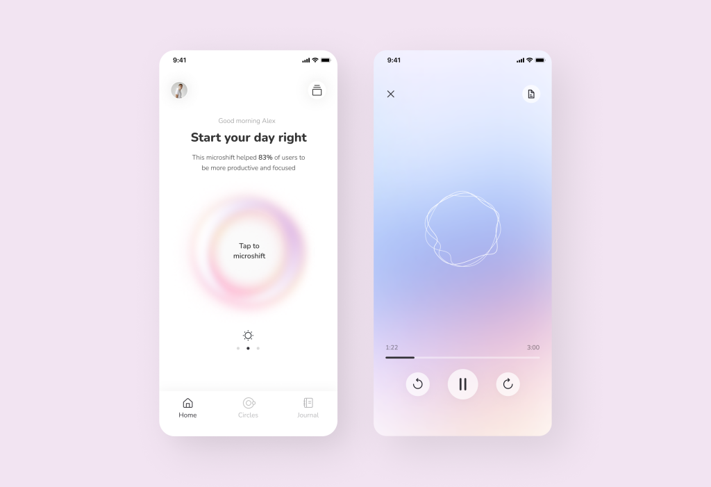
In the example above, on the left, we wrote the word “Journal” below the icon so that the user would understand its meaning in the future. And on the right side of the interface, we repeated the same-sized icon without the label.
In later stages, there is no need to provide detailed descriptions for already familiar elements to the user. And with each dive into the app, we not only keep the cognitive load in check but also reduce it.
But this is not the only advantage of the design-related example. We have described the full story of Microshift‘s uniqueness here.
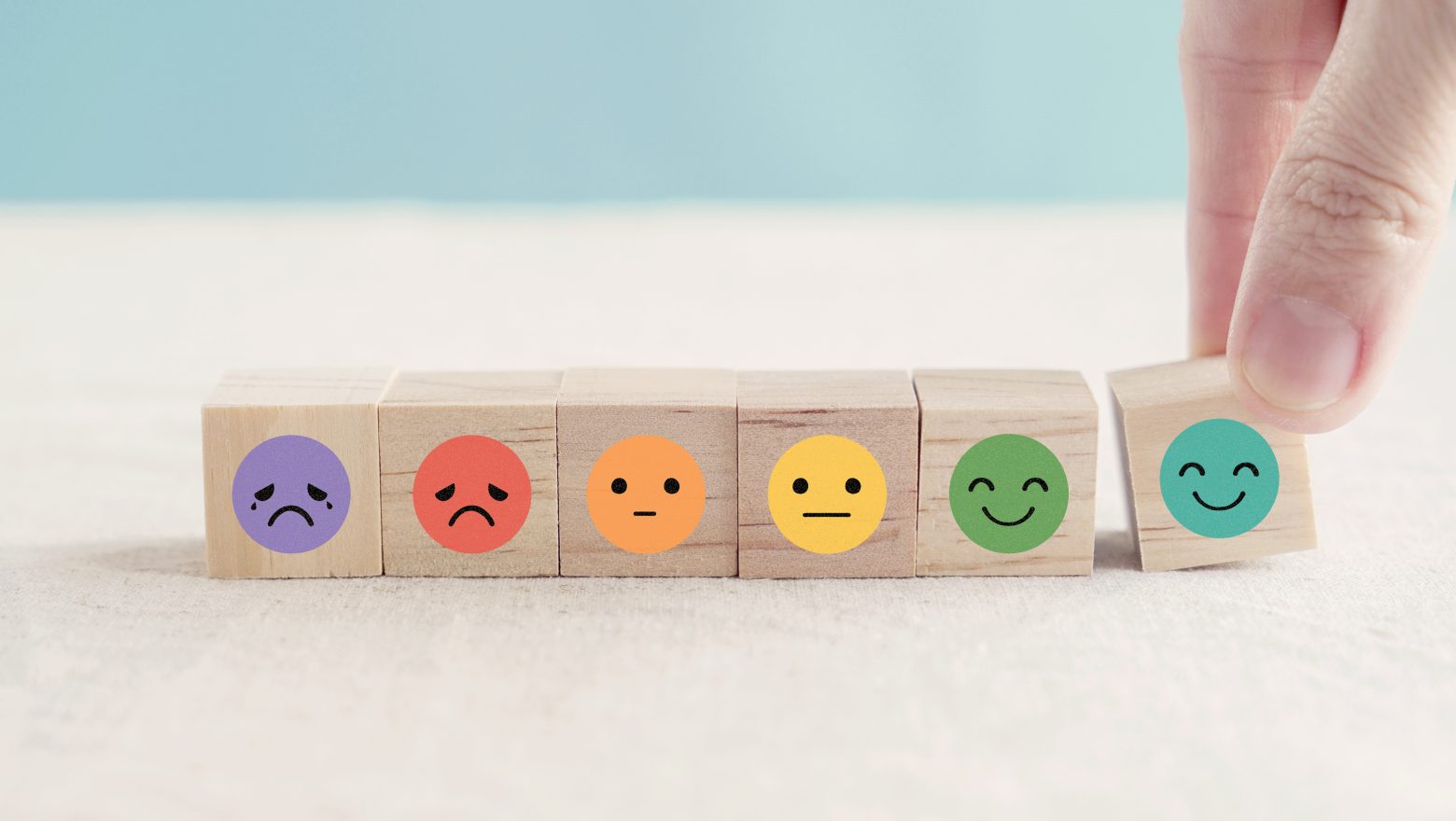
V. Help Users with a Choice
Many psychologists and philosophers (such as Erich Fromm in the book “Escape from Freedom”) explicitly state that making choices can be uncomfortable for individuals. It is much easier when choices are made for you.
Therefore, decision-making can be a time-consuming and mentally taxing process. When users are presented with an overwhelming number of choices, it adds to their cognitive load and creates unnecessary work for them.
To enhance the user experience, it is important to minimize the decision-making burden. Streamline the choices and options presented to users, allowing them to make decisions more easily and efficiently.
By reducing the cognitive load, you can create a smoother and more enjoyable user journey, ultimately increasing user satisfaction and engagement. So, how can usability design in health apps be improved here?
Let’s give an example from our practice. When we were creating the ProgressMe app, we gave a choice to the user. But in case the person was unsure, we offered another option: to take a test so that the user could be sure that their illness matched the symptoms.
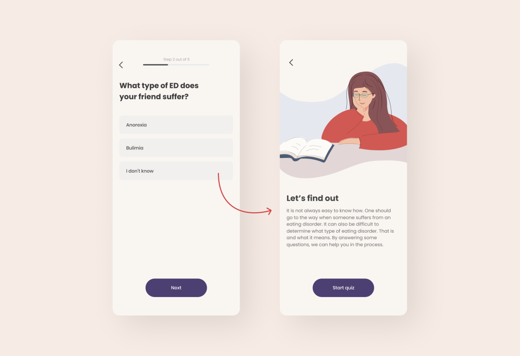
This approach helps to remove barriers and doubts for the user, as they can see that the app itself can identify their problem through tests. And therefore, it can help them solve it after its determination.
Thus, the person doesn’t need to make a choice, which increases retention and patient outcomes. By the way, if you want to learn about other retention mechanics, you can read our recent article on this topic here.
VI. Provide Options for App Configuring
Allow users to customize the app according to their preferences and specific needs. This may include the ability to select and arrange metrics in dashboards or apply filters in the app theme.
Such personalization enhances user engagement and reduces information overload.
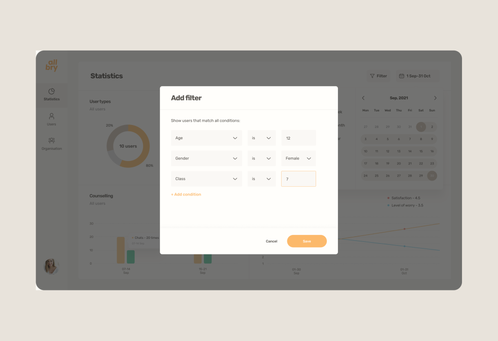
One of our examples is a statistics dashboard for mental health analysis among students. Allbry platform allows to filter only the data required for analysis. For example, to identify patterns of problems among 7th-grade female students at a specific school.
The objective of these filters and the data they generate is to allow people to choose and prioritize preventive measures in a specific segment.
In six months, this approach was able to generate interest in approximately 100 Swedish schools and 10,000 students. You can read more about this case here.
VII. And the Last: Enhancing User Guidance & Support
In certain situations, users may require additional guidance or instructions to successfully complete a task or navigate through their first-time experience.
Rather than overwhelming users with excessive learning information, it is beneficial to provide contextual help that supports their journey.
To create a comfortable user experience, consider implementing features such as small tooltips, autofill and autocorrect functionality, informative error messages, support for inline edits, and other relevant aids.
These enhancements can guide and handhold users, ensuring they feel supported and confident while using your app. By offering intuitive assistance, you can enhance user satisfaction and facilitate a seamless interaction with your application.
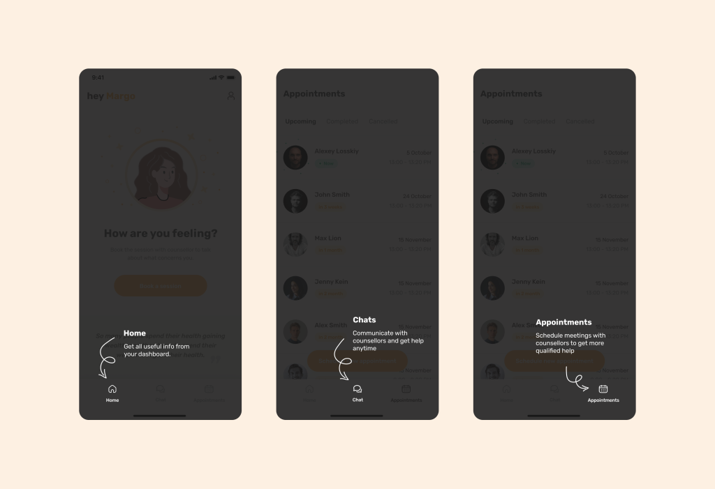
Above we showed our example with Allbry, where we used the backlight and arrows that introduced the user to the application interface. Thus, the onboarding process will go more smoothly and the % of users leaving the application will be significantly less.
And it seems that it is not so easy to create a simple and user-friendly design in health apps. It is essential to note that these principles cannot be applied in isolation. They should be implemented within the context of a thorough understanding of the product idea, proper planning, and comprehensive research.
Because there is a risk of not knowing the behavior patterns of your target audience.
——————————————————————————————————————————————
Who we are? We are a Digital Health Product Studio, who transforms healthcare digital experiences and sets new standards for delivering digital healthcare in a way that positively impacts people’s lives. We assist healthcare startups in designing and developing digital products, while also helping healthcare organizations undergo transformative changes. Check our cases-studies by the link.
If you want to delve into our approach in more detail, simply download our book using the link below.
Learn more about our approach in Digital health product development
And if you need to create a product that complies with industry standards and regulations or you want to receive digital health product expertise — Let’s discuss how we can help ensure that your product brings real benefits.
