Digital health startup founders spend months conducting research, fine-tuning features, following best practices and the latest trends. But, in the end, struggle with adoption and positive outcomes.
However, healthcare design goes beyond standards, focusing on understanding users, their journey, needs and frustrations. We need to build the product development process by remembering about the user and his outcomes. Right from the beginning and without braking.
The healthcare industry is a highly regulated, complex ecosystem with many stakeholders such as physicians, insurance companies, and governments, each playing an integral part in the therapy flow.
When developing digital products for healthcare, it’s important to consider all the parties involved and take into account their needs and challenges.
What process can help and how to create a user-oriented health app?
You may be familiar with Google’s Design Process. It’s human-centered approach, which helps to create a valuable and helpful product for the end user.
In digital health, this process helps to create impactful solutions by understanding users’ challenges and preferences.
It fosters empathy, tackles complex problems, and allows to create solutions that are effective, efficient, and enjoyable for end-users, ultimately leading to better outcomes in healthcare.
How to make the health app design user-friendly? So let’s demonstrate how the Google Design Process works.
We will tell the whole process using the example of our partner Allbry. This is a Swedish telemedicine company aiming to make mental health support for young people accessible, providing a complete digital platform for student health teams and students.
By the way, before we dive into our article, for keeping track of emerging technology trends in healthcare industry, you can explore our selection of 100 resources (books, guides, websites, and influencers) about Product Management, UX, Technology, Healthcare market trends, and Product Marketing.
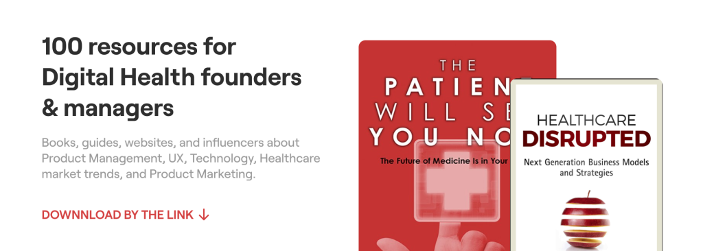
Download List of 100 resources for digital health startup founders & managers
I. Understanding: HMW & user/market research to improve UX/UI in healthcare apps
1. To identify issues, we need to conduct market and user research for UX/UI/Features improving in healthcare apps and gather all necessary information from stakeholders.
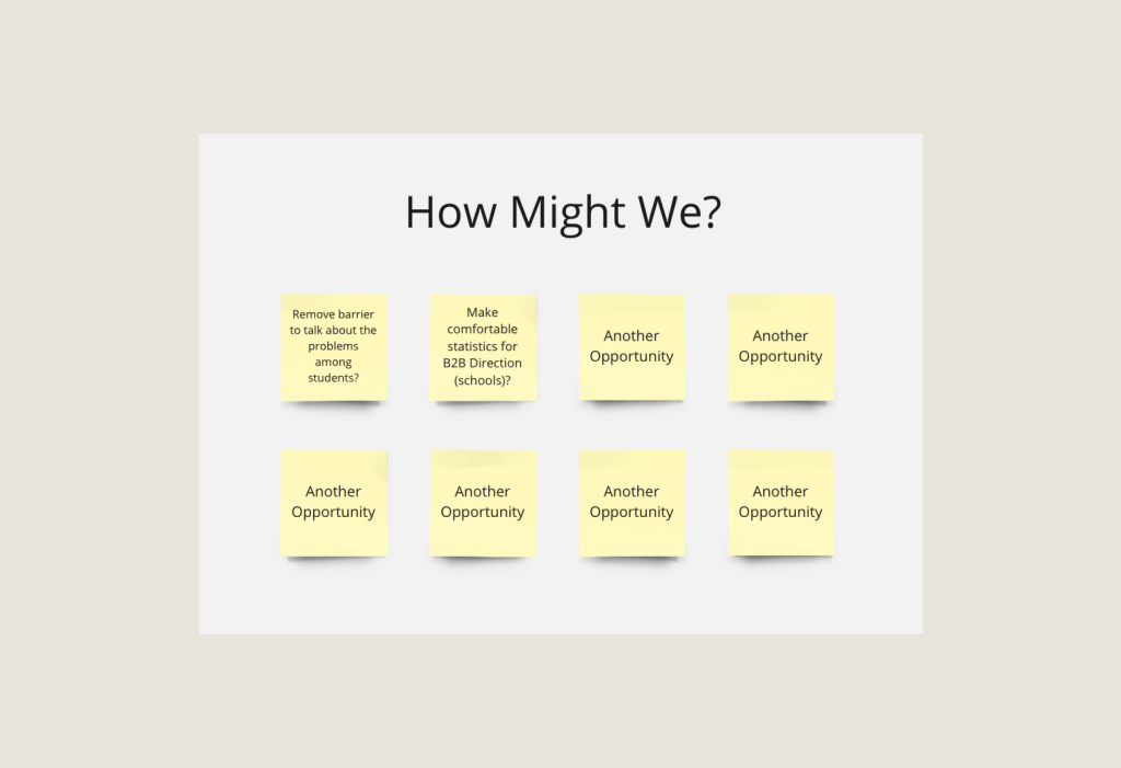
2. After all the collected information, we create HMW (How Might We) notes.
The “How Might We” or HMW method is a crucial technique used in the Design Sprint methodology. It is employed during the Understand phase to capture opportunities.
This method enables the team to reframe insights and pain points in a positive manner. By using sticky notes, each team member can write down a “How might we…” statement to transform a problem into an opportunity.
During our research, we discovered that students were reluctant to use the product due to an emotional barrier – a feeling of shame that prevented them from seeking support from specialists. As a result, the product had poor adoption among students. The majority of our “How Might We” notes revolved around this problem.
That’s why, for the focus, we will take the opportunity “Remove barriers to talk about the problems among students” as an example.
What about the other stages in health app design?
II. Define the problem with the HEART
During the previous stage, a large number of pain points were generated. Now we should formulate the problem.
This is done by defining specific context and desired outcomes of potential solutions. The phase concludes by choosing a specific focus for your Sprint, as well as goals, success metrics, and signals.
What sets success metrics apart from signals? Signals reflect the overall presence of a desirable behavior, while metrics provide quantifiable and numeric outputs related to the desired behavior.
Use the HEART. HEART is a user-centered design framework developed by Google to measure and evaluate the user experience (UX) of a product. The HEART framework provides a structured approach to assess the UX metrics of a product and understand how well it is meeting the user’s needs and expectations.
We are interested in the letter “E” (Engagement) as this problem was most relevant to the company.
1. For example, let’s set the Goal for our case: show users (students) that they should not be afraid of using consultations (in contrast, they don’t use an app and will leave it). In the Goal, you should understand what problem you are trying to solve based on previously identified pain points.
2. Metric: sessions. This metric shows whether the student attended a consultation or if they had doubts/fears. Here, you need to determine how to measure any changes in user behavior or opinion.
3. Signal: booking of consultations. Did the student book a consultation or did they stop accessing them using the app? Think about what changes in user behavior or opinion indicate that you have achieved success in achieving your goals.
In summary, we can formulate our problem as follows: in order to increase the number of sessions (metric) with a specialist, we need to eliminate fear/doubts (goal) among students, influencing this at the book of consultations stage (signal). The problem itself can be stated as: fear of users that other users will learn about their problems.
So, we have defined the problem. Now we need to generate ideas for solving it.
III. Then we create sketches of solutions
1. Let’s understand how to solve the problem. For this we can write all problems and make solution ideas for them (how to act?):
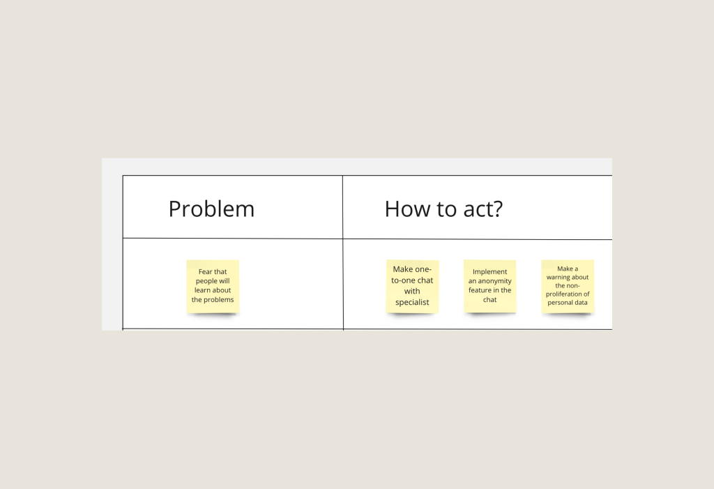
Once the solutions are written, each person, having 2 votes, votes for the more suitable solution options.
As an example, take a look at the screenshot above (we still use the example of the mental health app “Allbry“): here, we selected the problem “students are afraid to talk about their problems” as the reason why the app is not liked by students (low adoption).
What solutions did we come up with?
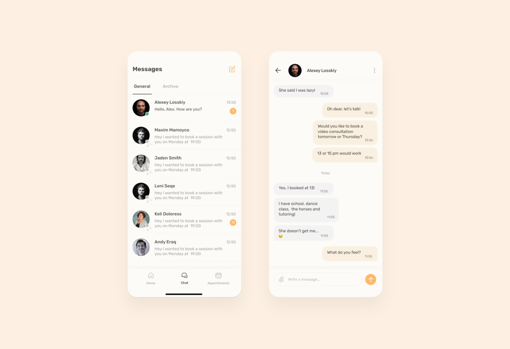
1) We decided to add a chat feature. This helped to remove students’ main frustration – feeling of shame we added a “chats” feature. Chatting provides students with a sense of anonymity and privacy that may be lacking in traditional face-to-face therapy sessions.
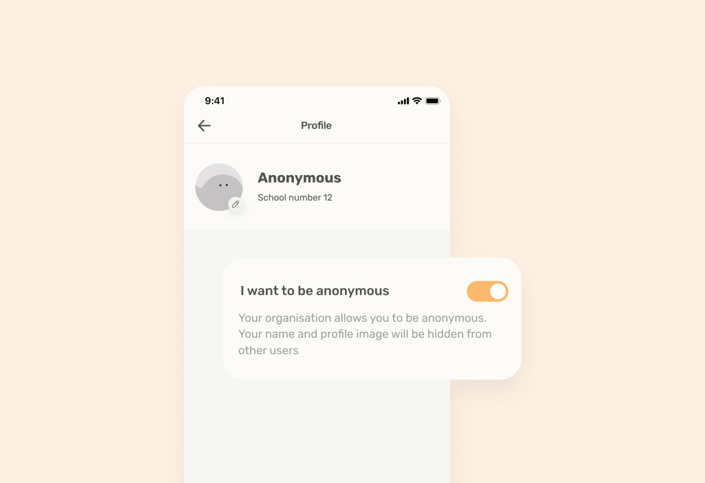
2) Then, we enhanced the communication part and added the “Anonymous mode” feature. This anonymity can create a safe space for students to discuss sensitive or personal issues, encouraging them to seek the help they need.
2. Have we considered everything? Let’s check together using the Crazy 8’s method. This exercise involves quickly sketching eight different ideas/components/variants in eight minutes.
The goal is to take a deeper look at our idea (e.g., with the chat feature) and generate additional solutions for that idea. It’s possible that one idea may contradict another idea.
For example, “just getting rid of fear” and implementing an anonymous chat feature is good, but what if schools want to receive statistics and data, and anonymity prevents obtaining all the data?
Well, not all data is necessary. In our case, the class and type of problems may be useful data, but names may not be required, so the necessary data will still be obtained. The key is to understand what needs to be implemented in the app to gather the relevant information about students.
Then we add a new idea of “getting rid of fear, but schools need data” and generate ideas for interaction and solution components for this problem. When the eight minutes are up, we stick all the sketches on the wall.
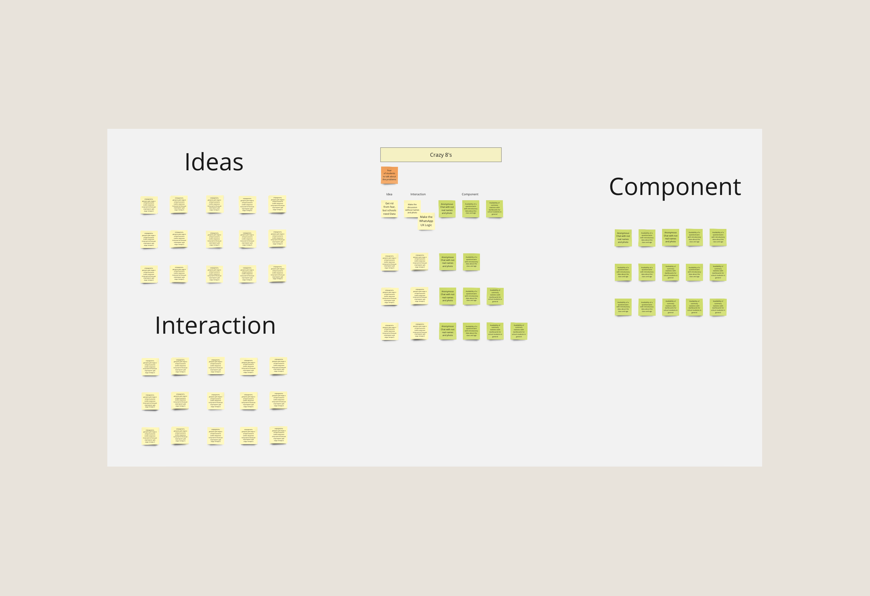
Next, we add “Interaction” and “Components” to these ideas, which describe the idea. For the idea “Get rid from fear, but schools need Data,” we can add the Interaction “Make discussions without names and photos” and any Components related to anonymity and data collection.
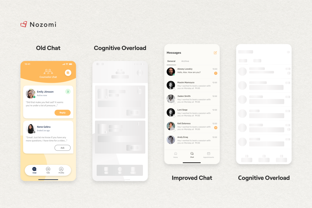
In the “Interaction” section, we can also consider how students will find it more convenient to interact with counselors. In our example, if you have chats or video calls in your app, it’s better to not reinvent the wheel, but make the UX of this feature similar to WhatsApp. It’s much easier for users to get the information they need.
Why WhatsApp? Considering the fact that students are our target audience, we performed analytics to determine which chat software is most popular with this demographic. And it was Whatsapp!
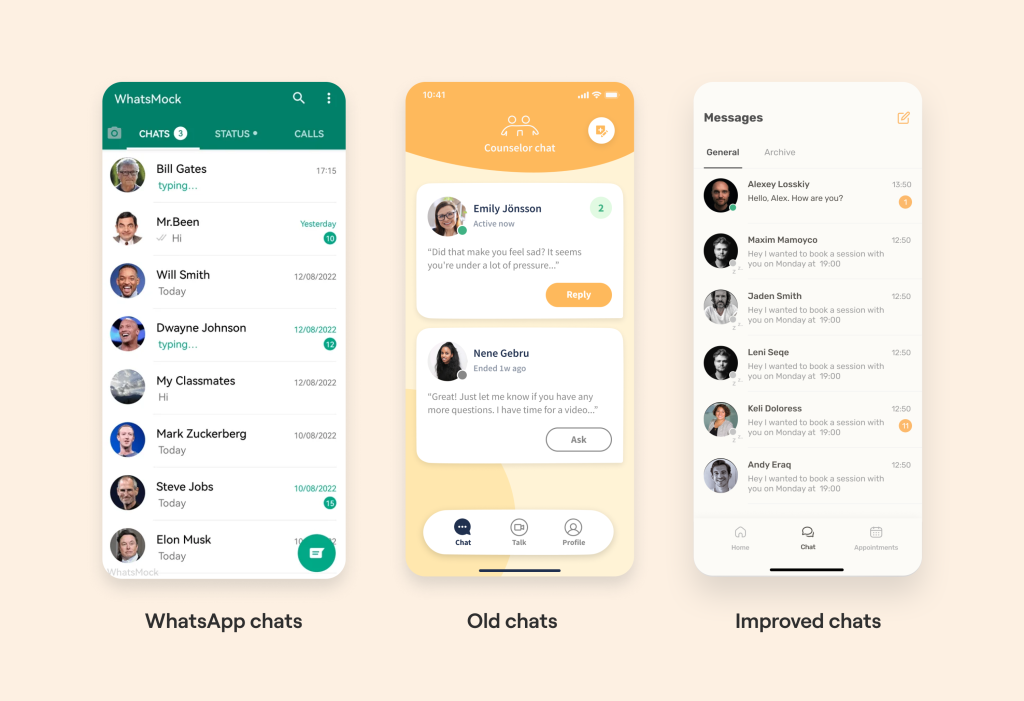
A small spoiler that shows visual convenience
In general, to solve such UX problems, we even wrote a separate article about how to simplify the design here.
So we have identified solutions. How do you choose the best now?
IV. How to Choose Solutions in Health App Design?
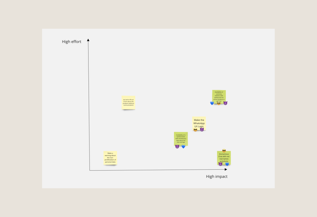
Next, we prioritize the best solutions using the Decision Matrix method. The matrix is a simple diagram that compares the impact and implementation efforts.
As a group, distribute all your ideas along these two axes, discussing which ideas fall into the high impact/low effort and high impact/high effort ranges. Once we have placed all the solutions on the matrix, each person, having 2 votes, can vote for the best solution.
In the image below, we have selected three essential features: chat feature, anonymous mode, and analytics dashboards.
Now, based on the selected sketches, we can create User Stories that address the concerns of our users and outline all the tasks that each individual User Story solves (specifically the problems).
Ask the sprint participants to estimate the hours required for each task (based on their experience), its complexity, and their confidence in its completion. Then, describe the number of meetings per week/month and the necessary reports for each party.
Now we know how to choose solutions in health app design. Next, we have a timeline understanding and show how to create a user-oriented health app (prototype).
V. After the discussion, we create a prototype
Once the critical problems have been determined, we create a prototype.
What should we make for this?
1. We should have the 4 key questions based on the partners’ concise responses and data from the Ideation Phase.
○ Who will use this app, and for what purposes?
○ What format should the application have? What is the main message that is being communicated through the visuals, including the colors, fonts, illustrations, characters, etc.?
○ What are the app’s voice and tone? Is it official or casual? Does it address the user as a friend, subject matter authority, mentor, or someone else?
○ What emotions and feelings ought the application to arouse in users?
2. We create a list of keywords. These keywords define the main characteristics the user should notice in terms of appearance and interaction. “Helpful, simple, and minimalist” is an example.
3. After gathering all the information, we move on to our visual design concepts and moodboards. Moodboards consist of several blocks, including keywords, colors, typography, and screen examples (with a clear description).
4. And right now, we have everything we require to create the best possible customer experience. We combine our UX wireframes, creative direction, and UI design to produce a prototype.
For the prototype we can use Figma.
And what should we count in the prototype? Based on the best international app practices, we must create the entire user’s path through the application, but taking into account the problems discussed earlier and their solutions.
Well, let’s check out our prototype? 🙂
VI. And Next: Testing Healthcare Applications
Thanks to this aspect, our process is called user-oriented. We have discovered a basic pattern while communicating with many companies in the multifaceted niche of Digital Health products: few people consider User Tests.
After all, by putting ourselves in the shoes of all parties testing users in healthcare applications, we gain a better understanding of their experiences and can design solutions that meet their specific needs. How to run User Tests?
1. Collect the target audience:
– Within the current database;
– In other locations where your potential users stay, such as Facebook groups with discussions of valid problems, thematic websites and forums, or communities/blogs of your competitors.
The thing to keep in mind: Separate tech-savvy users from others to determine whether, for example, older people can also use your product.
2. Prepare questions and tasks, such as using a specific button in the app. In our case it can be “find a chat”.
3. You can also do CustDev concurrently, though we advise reading “The Mom Test” because the subject is too extensive to cover here. But generally speaking, you need to ask questions about the past rather than the future (‘will you use this?’ instead of ‘how did you solve such a problem in the past?’).
4. Record the test results:
– Did users remember the brand’s primary colors after the test session?
– Were there any navigational issues?
– Were the tasks completed?
Result: according to testing, the count of chat sessions increased by 100 times.
The old version of the application had 100 students from Swedish schools. The new version of the app reached 10,000 Swedish student users in six months.
The number of users who finished all tasks connected with the chat on time increased by 32%. Users can now find the information they need more quickly. As a result, engagement and registration rates have increased.
If you want to learn more about these tests, you can read a detailed Design Review with a complete analysis of the problems and their solutions Here. Many ideas can be applied in your own application 🙂
Therefore, a subsequent user test will demonstrate whether past performance has improved and whether further improvement is necessary.
If the initial prototype received a negative experience from users, then we go to the second round. Completion of the second round takes place with ready-made materials and feedback. Due to this, the repeated stage lasts several times faster.
How to create a patient-centered app design?
So let us recap what Design Process entail:
1. Understanding: Plan & Vision formation.
2. Definition of problems & how we will solve them.
3. Creation of Sketches: Ideas, Interaction & Components.
4. Choosing Ideas, Interaction & Components.
5. Creation of the Prototype.
6. User Testing.
By implementing human-oriented design process, you can create effective digital health products that cater to the diverse needs of the healthcare industry.
And if you want to delve a bit deeper into development, process and UI/UX topics, we’ve also created a comprehensive guide on how to boost CX and user engagement:
1. Our best CX (UI/UX) practices to make an app not just used but loved
2. Product strategies to drive retention and engagement
3. Our best Engineering practices to build scalable solutions
4. Tips to ensure compliance with healthcare regulations
Download Free Actionable Insights to Grow your Digital Health app
——————————————————————————————————————————————
Who are we? We are a Digital Health Product Studio, who transforms healthcare digital experiences and sets new standards for delivering digital healthcare in a way that positively impacts people’s lives. We assist healthcare startups in designing and developing digital products, while also helping healthcare organizations undergo transformative changes. Check our cases-studies by the link.
Or write to us now and we will discuss how we can help ensure that your product brings real benefits 🙂