There are many reasons why people may be hesitant or concerned about using telehealth services instead of in-person doctor visits: the complexity of navigating the platform, skepticism about the ability to make diagnoses using digital tools, fear for the security of personal medical data, and much more. When it comes to telehealth building trust with patients, addressing these concerns is crucial.
However, in reality, all of these user barriers can be addressed and even overcome. The key is to incorporate specific elements into the product.
Of course, not all conditions can be diagnosed and treated via telemedicine, but a significant portion certainly can. It’s sufficient to take a closer look at what a standard doctor’s visit entails.
The process of providing healthcare can be condensed into three essential stages:
1. The doctor collects pertinent information about your health status and any existing illnesses.
2. From this gathered data, doctors formulate a diagnosis or a list of potential diagnoses.
3. This step may iterate multiple times until a definitive diagnosis is reached.
Subsequently, a care plan is devised and communicated to the patient. This may encompass various recommendations, including prescription medications if necessary.
When it comes to follow-up care, there is a slight modification in this process, particularly if the diagnosis remains uncertain:
1. The doctor assesses how the patient has responded to the initial care plan.
2. If a new course of therapy is deemed necessary, the doctor will discuss this with the patient, providing detailed information about the proposed treatment.
If palpation is not required at these stages, then telemedicine is an excellent choice for our users.
Although it is beneficial even in some cases where an offline element is necessary. For instance, if a person is on a business trip in another country, has limited proficiency in the language, but can obtain an ultrasound image at a foreign facility, they can send it to the doctor and then conduct a telemedical consultation.
Therefore, our goal here is to demonstrate to the user that the telehealth format is no less effective than in-person care. In the first two points, we will demonstrate how to convince of the advantages, and in the last ones, we will show how to counteract the stereotypical drawbacks. This is essential for telehealth building trust with patients and overcoming their hesitations.
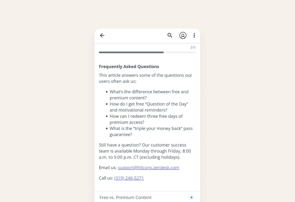
I. Answer basic questions with FAQ
We should provide the user with a comprehensive FAQ in case users have any questions.
This way, the user will know:
1. What they need to prepare for video communication in advance of booking an online meeting. For example:
1.1 Patients should ensure they have a stable internet connection and a device with a working camera and microphone.
1.2 They should also have any relevant medical records or documents on hand for reference during the online session.
1.3 Additionally, finding a quiet, private space for the video call can help ensure confidentiality and effective communication.
2. How and where to seek assistance if they encounter difficulties while using the product.
2.1 In-app support: users can check if there’s an in-app help center or support feature. This is often the quickest way to get answers to common questions or report issues directly.
2.2 Contact customer support: provide clear instructions on how users can contact your customer support team. This could be through email, a dedicated support portal, or a hotline if applicable.
2.3 Community forums or groups: if available, suggest joining user forums or groups related to your product. Often, experienced users or community managers can help troubleshoot issues.
3. The differences between telemedicine and in-person care, and why it is effective.
What are the advantages of telemedicine compared to in-person care (you can use these convincing examples in your telehealth platform):
3.1 Convenience & time efficiency: patients can access healthcare services from the comfort of their own homes, eliminating the need for travel and reducing wait times.
3.2 Cost-effectiveness: telemedicine often leads to lower overall healthcare costs, as it eliminates expenses associated with transportation and reduces the need for physical infrastructure.
3.3 Expanded access to specialists: telemedicine allows patients to consult with specialists who may not be readily available in their geographic area.
3.4 Improved chronic disease management: patients with chronic conditions can receive ongoing care and monitoring without the need for frequent in-person visits. Moreover, telemedicine often integrates with wearable devices and digital health tools, allowing for remote monitoring and data-driven decision-making.
3.5 Enhanced follow-up care: telemedicine facilitates regular follow-up appointments and allows for timely adjustments to treatment plans.
3.6 Language and cultural accessibility: patients who speak languages other than the local one can access care in their preferred language through telemedicine.
3.7 Easier access to mental health services: telemedicine has significantly improved access to mental health services, reducing stigma and increasing availability.
These examples we can use in onboarding.
4. And any other specific details about plans (if your product includes paid features).
Source: PTCB Exam
Also nominate a go-to tech person or contact point for login issues. Above, we demonstrated that these points can be included in the FAQ.
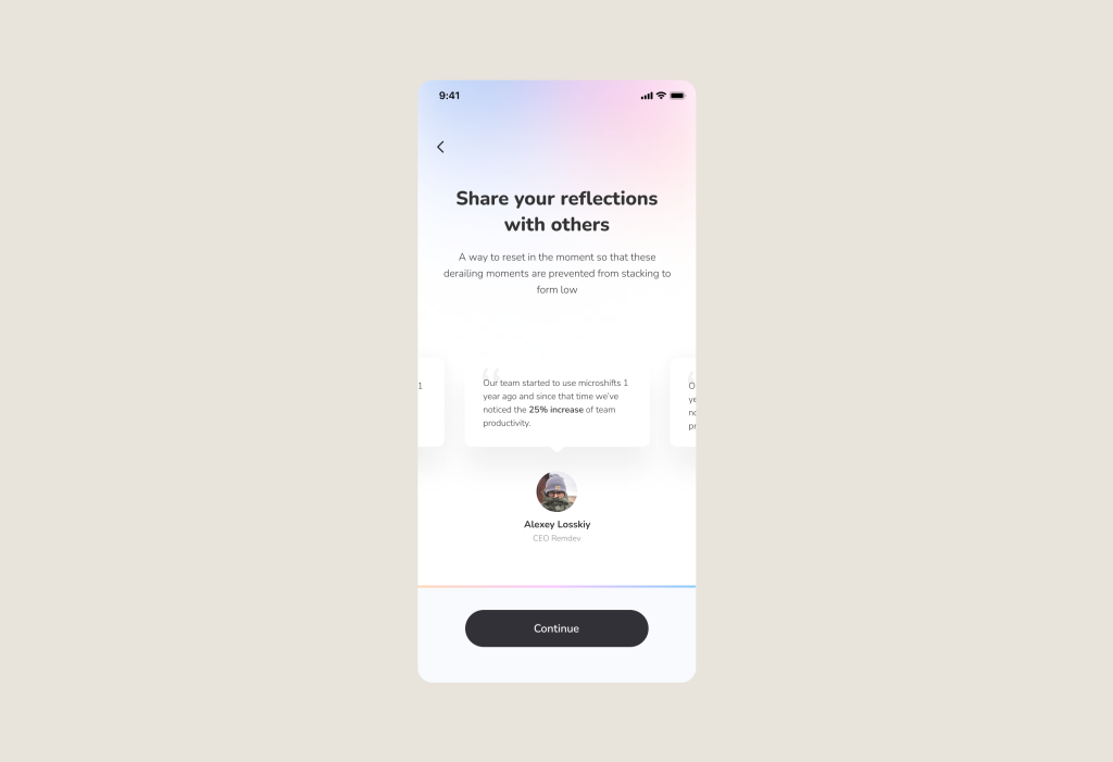
II. Show social proof and highlight user success stories
To start, we should demonstrate during the onboarding process how the telehealth product has impacted other users. This particular moment will trigger the thought in the user’s mind, “if it worked for others, maybe it will work for me too?”
Integrate sections or modules within your platform’s onboarding process that feature authentic success stories from actual users. These narratives demonstrate how the platform effectively addressed specific challenges and assisted individuals in achieving their health goals.
By showcasing these positive accounts, platforms instill confidence and nurture trust among prospective users. This feature ultimately enhances registration rates and minimizes user drop-off.
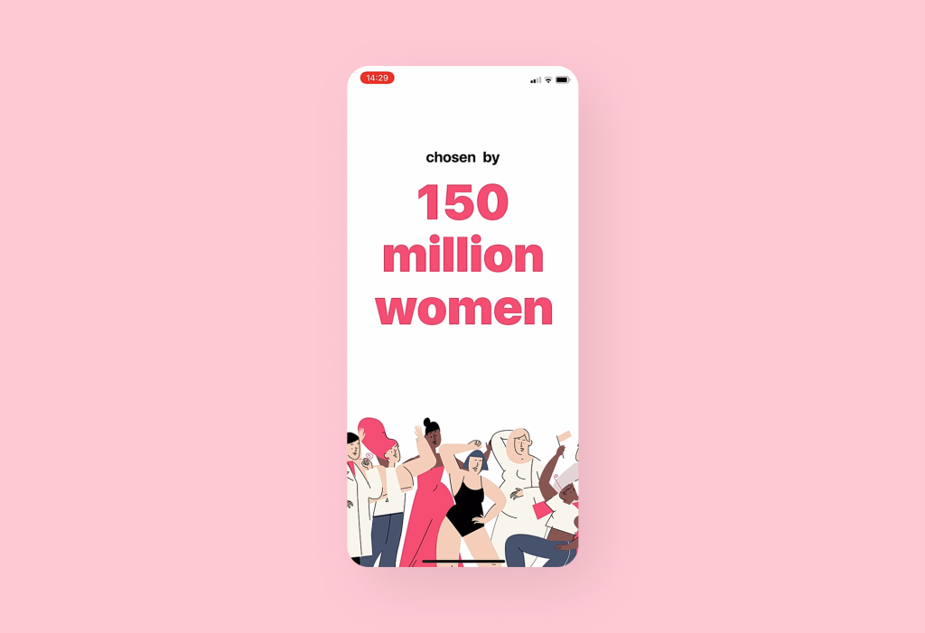
Alternatively, consider emphasizing scale. Once you’ve recognized that collecting excessive data isn’t necessary, prioritize presenting your own data showcasing successful and satisfied users.
Because presenting this information right at the start of the onboarding process convinces the user that if it’s been beneficial to so many others, it will be beneficial to them as well.
Let’s take the Flo app as an example. From the very first message, the app establishes social credibility by highlighting its substantial user base. This strategy aims to boost total registrations and reduce user attrition.
Source: Flo
By the way! We told you more about onboarding at the link below where we have collected 20 onboarding examples for digital health apps with explanations of how they work and what onboarding engagement metrics (like Retention, Total amount of Registrations, etc.) they affect.
With these examples, you’ll be able to identify areas for growth and understand how you can alter your product.
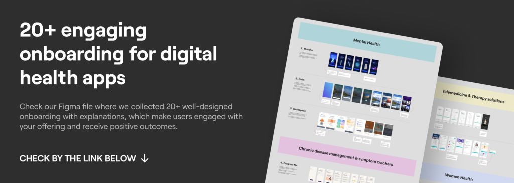
Check Figma with 20+ examples of engaging Digital Health Onboarding
But even after reading positive reviews and FAQ, people will subconsciously think about the drawbacks of this format: complexity and safety concerns. Here we should convince users with the right UI, UX and code.
III. Fight complexity
Now that the user has read the reviews and explored the FAQ section, we need to guide the prospective patient through the entire application to demonstrate the path to the most essential features: selecting a medical specialty and booking an appointment with a doctor.
Often, users are unsure where to click next, which increases their cognitive load, and they may start to consider leaving the platform.
1. To create a seamless journey within the application, UI and UX design come to our aid.
For instance, during the menu exploration process, we can use highlights and arrows, as we did in the telehealth app Allbry (it’s a platform that connects counselors with students for mental health concerns):
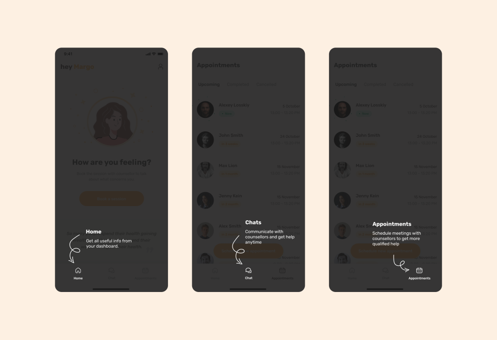
Learn how we’ve built telemedicine mental health platform for Swedish startup
In some cases, users can even navigate the layout of most elements in the application without any highlighting.
By analyzing your target audience, you can construct a similar product experience. For example, if you discover during user interactions that they predominantly use WhatsApp and Facebook Messenger (and your application is chat-based), you can confidently adapt the interface.
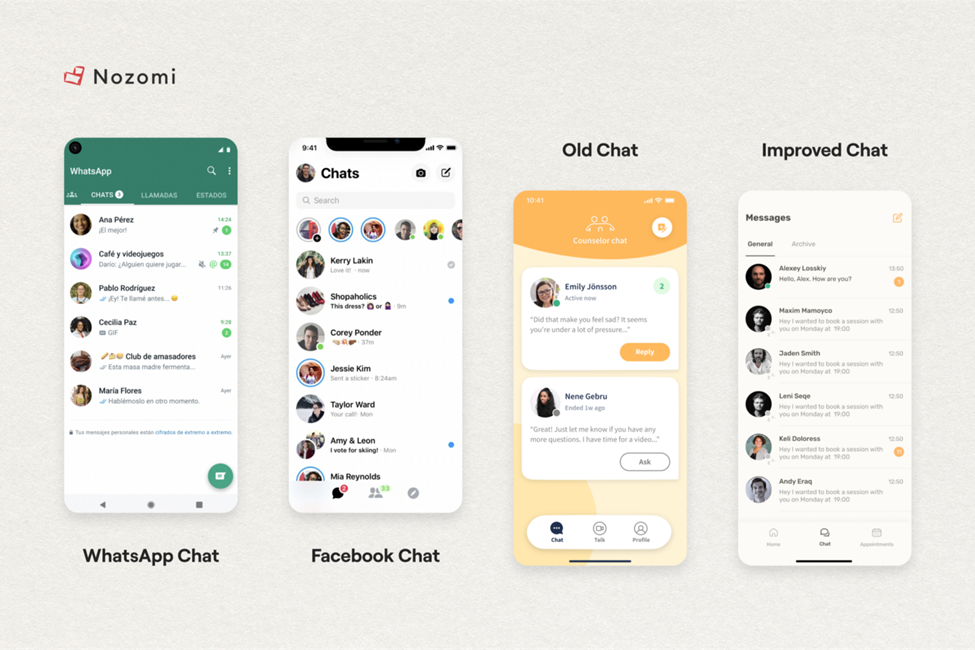
In this case, users won’t even have to learn how to use many features or get used to the interface. It’s already in their memory. Therefore, we reduce cognitive load and the percentage of user churn.
So, why is the aforementioned highlighting necessary? Firstly, it is done to cater to a wider range of audiences (as not all elderly people may be familiar with WhatsApp).
Secondly, most likely, your telehealth product will have various features and sections that the main audience will encounter for the first time. That’s why it’s essential to provide clarification alongside an icon.
2. Don’t forget about Accessibility
We even wrote a separate article about this topic here. Let’s delve into the practices typical for telemedicine.
2.1 For those with visual impairments, it is crucial to offer an alternative in the form of the ability to send audio messages.
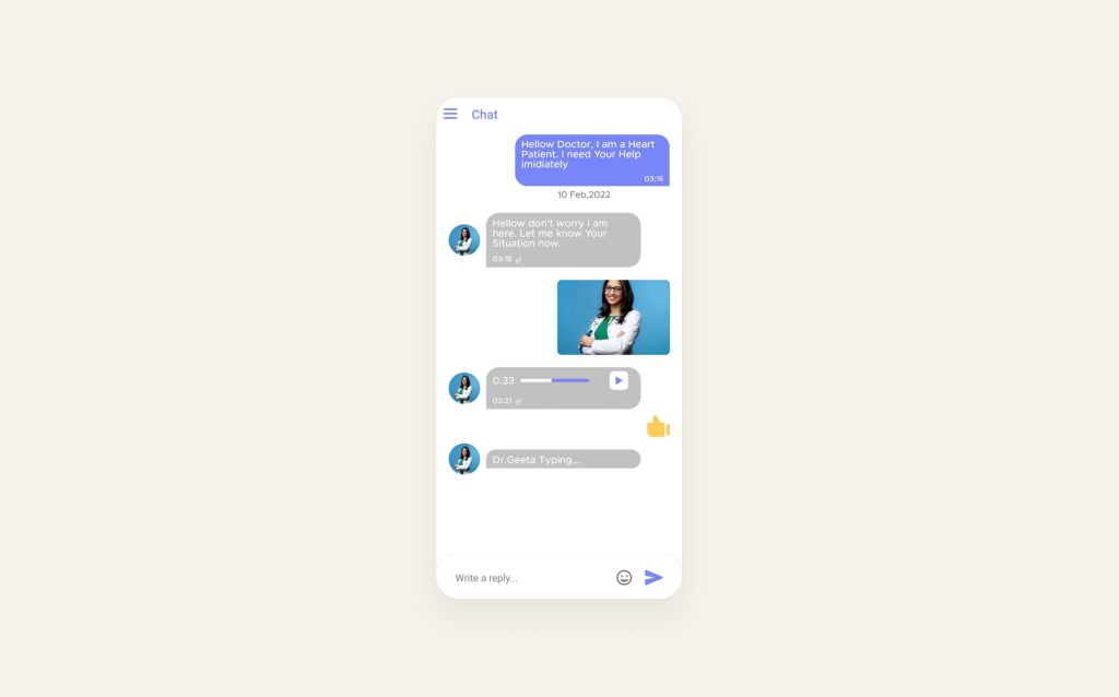
Source: Pharmacy
2.2 Ensure clarity in presentation. Adhere to established norms: emphasize key terms in bold, allow for text enlargement, and steer clear of abbreviations or informal language that might not be universally understood by your target audience.
2.3 Foster multilingual accessibility. Contemplate offering language preferences and localization features to cater to users from various linguistic backgrounds. Otherwise, users may face confusion when initially interacting with the application.
2.4 Assist with data input. Demonstrate effective error handling and feedback. Here, it is essential to incorporate explicit and informative error messages and feedback for form validation (or critical actions) to aid users with disabilities in comprehending and resolving issues efficiently.
Consider a typical situation: encountering a message that reads, “You entered the password incorrectly; please check if Caps Lock is on.”
Now, consider a scenario where the user has visual impairment. This is where haptic feedback becomes invaluable.
Haptic Feedback: a potent technique for creating deeper user engagement is through haptic feedback. By integrating tactile sensations like subtle vibrations or touch responses, digital health apps can offer a more absorbing and immersive user experience.
To illustrate this, let’s revisit the example of Allbry. In our implementation, we incorporated sharp vibrations for negative scenarios. When an error occurs, the pronounced vibration signals the user to pay close attention to what went wrong.
On the contrary, a gentle vibration is used (while logging in to the application or performing a task).
3. Also, make certain that your code is thoroughly optimized
For instance, if the code of your website or application lacks appropriate opening and closing tags, it may result in:
– inconsistent display across different devices;
– content not displaying at all;
– or appearing unreadable.
Ensuring that your HTML code is correctly formatted and aligns with all markup language specifications guarantees that the structure of accessible content remains consistent across all platforms and devices.
IV. Comply safety: privacy and confidentiality
To assure users of the privacy and confidentiality of a telemedicine product, it’s crucial to implement robust security measures and communicate these clearly. Telehealth building trust with patients heavily relies on addressing their concerns about data privacy and security.
Here are strategies to demonstrate the commitment to privacy and confidentiality:
1. Use encryption and secure communication: for example, use industry-standard security technologies (e.g., SSL/TLS) to safeguard information and explain to users that you are protecting their medical data.
2. Compliance with data protection laws: provide links to privacy policy documents for users to review and comply with international data protection regulations like GDPR (Europe), HIPAA (USA), PIPEDA (Canada), or other relevant local laws.
3. Access controls and role-based permissions: explain how the system limits access to patient records, ensuring only authorized healthcare professionals can view specific information. And emphasize that administrative staff have restricted access to sensitive data.
4. Audit trails and activity logs: assure users that the platform maintains detailed records of user activities for accountability and transparency. And explain how these logs are regularly reviewed for any unusual or unauthorized actions.
5. Patient consent and authorization: clearly communicate how patients’ consent is obtained for sharing their information with healthcare providers. And describe how users can review and revoke their consent settings.
About how to create a Safe & Compliant Digital Health App we wrote here

We hope our article was useful for you!
If you want to build a product which brings positive outcomes, It is necessary to have a clear understanding of how the UI/UX design should work and how to do it in a way that shows care and value.
But that’s only one component, another one – is technology. No matter how awesome you make your product look, if the development is poor and it starts glitching and lagging, all your hard work goes down the drain.
And to stay updated on the product (CX, UI, UX, Engineering) and process approaches used in the digital health market, as well as the current industry trends – subscribe to our monthly newsletter. We provide more detailed insights into creating Digital Health products, their components, and how to convince users to use healthcare products.
