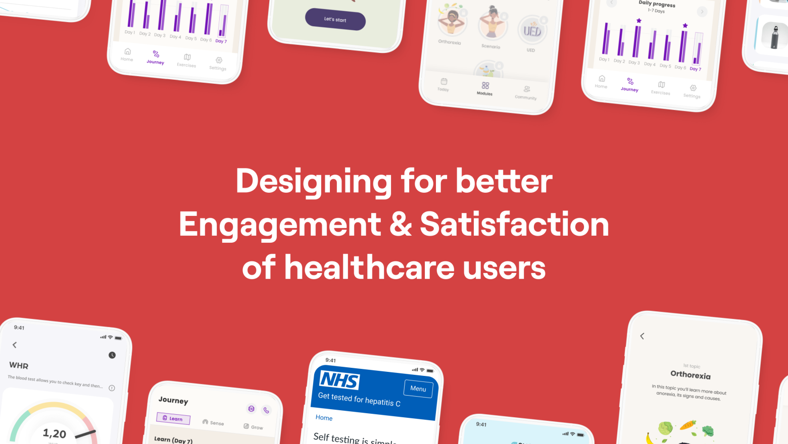
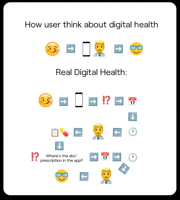
Why We Don’t Understand Our Users
Have you ever had a situation where users use your product in a way you didn’t intend?
Or perhaps:
1. You developed a product and features that aren’t being used, even though customer development interviews and user tests suggested otherwise.
2. Users requested updates, but for some reason, they don’t use them after release.
3. You created excellent navigation and onboarding, but people just skip everything and take a completely different path.
This is a very real problem, and as a team developing apps and new engagement/retention mechanics, we fully understand that understanding users is very challenging.
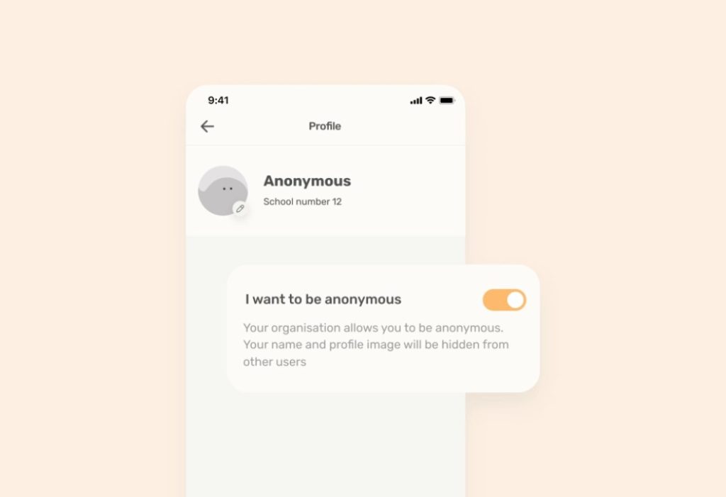
For example, in our experience, we had a student user who was hesitant to use the consultation chat with a specialist until we came up with the idea to add an anonymity feature.
But how do we come up with such an idea and initially understand that the user has this problem?
First and foremost, we need to recognize that we don’t understand the user due to incorrect methods of collecting and analyzing feedback during the development process.
So, how can we understand the user? That’s why we wrote this article, based on our practical experience.
Our Experience: what are the real main problems users face
1. Complicated registration process: long and complex registration and onboarding processes can deter users at the initial stage.
Simplify it by making it appear as though onboarding has only four steps, as shown in the example below. In reality, each step contains three different, complementary descriptions:
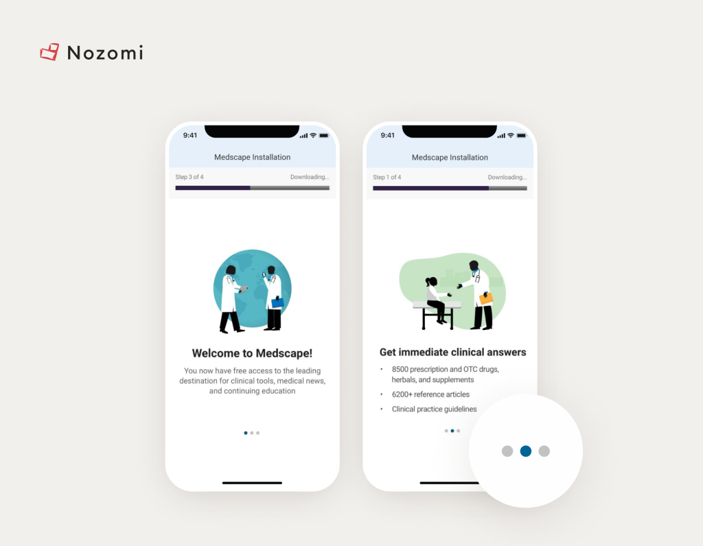
Image Credit: Medscape
Also, carefully consider which questions you really need and which you can do without. Alternatively, break the survey process into several stages.
2. Lack of instructions: the absence of clear instructions and tips on how to use the app can make it difficult for users to get the hang of it.
I. For example, as shown in the image above, you can use arrows to familiarize users with the interface and features. So the adaptation process will go more smoothly, and the percentage of users leaving the app will be significantly reduced.
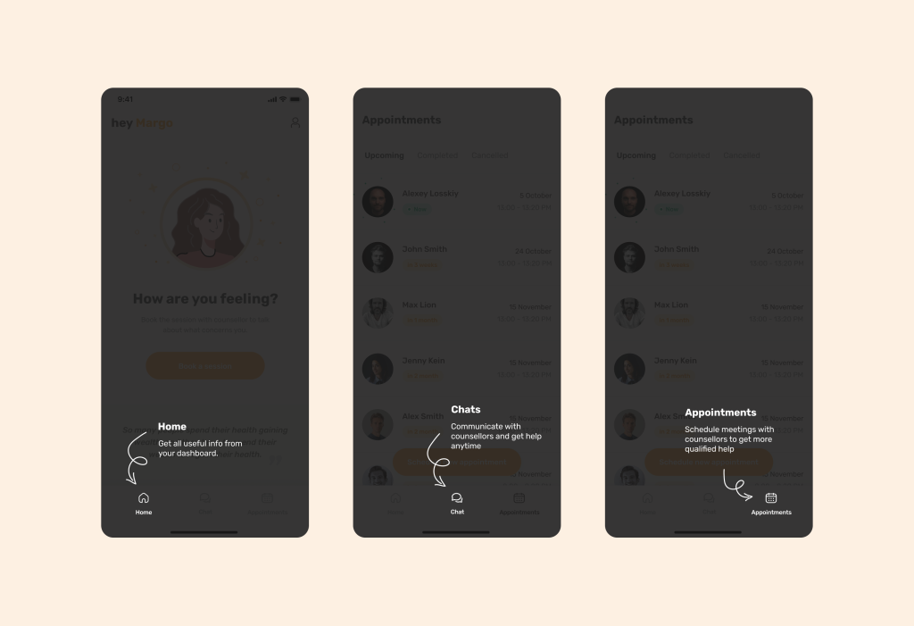
It’s better to do this (Allbry case example)
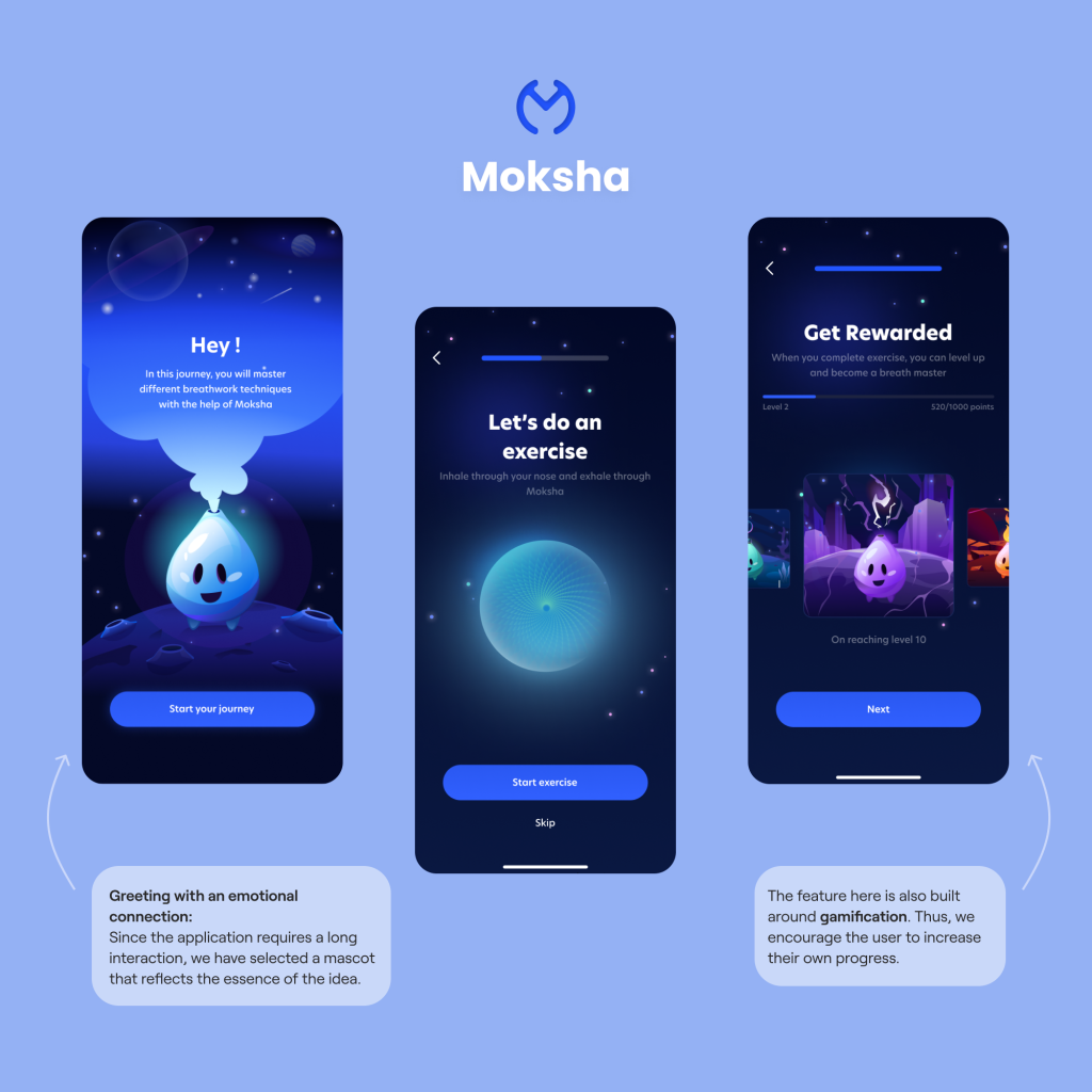
II. Also you can use emotional connection through a mascot (that describes app features and navigation), which enhances user attention and engagement. Additionally, it incorporates gamification into the process.
While users watch explanations from the mascot, they can increase their in-app level and see that their efforts will be rewarded. This shows users that their engagement will not be in vain as they will receive rewards for their progress.
3. Reluctance to share data: insufficient protection of user data can lead to information leaks and loss of trust.
To address this issue, clearly state:
– Why the data is being used. The most common reason: personalization.
– How the data will be used.
– If possible, mention that the product is GDPR/HIPAA/PIPEDA compliant.
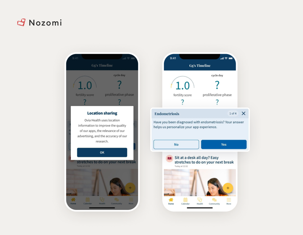
Image Credit: Ovia
There is no need (!) to downplay this problem, because for users this is one of the most important points.
4. Slow performance: delays, long loading times, and slow app performance can greatly frustrate users.
If there’s no other way, it’s better to use animations during loading times:
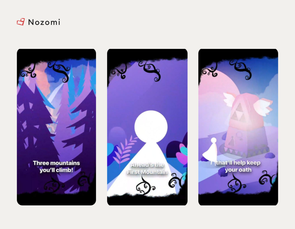
Image credit: Fabulous
Or you can:
1. Optimize Images: compress and resize images to reduce load times without compromising quality. Use modern image formats like WebP for better compression.
2. Use Content Delivery Networks (CDNs): distribute content across multiple servers globally to ensure faster load times for users, regardless of their location.
III. Asynchronous Loading: load non-critical resources asynchronously to ensure they do not block the rendering of critical content.
5. Lack of personalization: users may feel that the app does not consider their individual needs and preferences. Yes, in the first point, we talked about surveys that create that personalization.
However, as shown in the example below with one of our partners, Sensae, the personalization process is achieved using AI and Haptic Feedback. It is quite possible that some survey questions can be replaced with such unconventional methods.
Click to read Sensae Case Study
Note that these issues can be resolved simply by knowing standard international UX and engagement practices. However, to achieve this, one would need to scour the entire internet and compile the secrets of all companies.
We’ve done this for you and prepared two books: “5 UX Rules for Healthcare Apps” and “How to Drive User Engagement.”
Download free actionable insights to grow Engagement in your digital health app
And also, you can check out the 5 UX Rules 😉
Returning to the topic… there are 3 problems that are not only related to understanding UX rules but also to improperly structured feedback collection processes.
6. Feedback issues: lack of an effective channel for feedback and support can leave users with unresolved problems.
Firstly, not everyone leaves reviews in the App Store/Play Market (most users just rate with 1 star in bad cases). Therefore, it’s essential to have either a forum where issues can be quickly addressed, or a very visible technical support button.
Secondly, we might simply misunderstand the user. If a user requests a feature, it’s crucial to understand (through customer development interviews or user tests) which competitors with similar features they are using.
If the user hasn’t been looking for a solution to the problem, it raises the question of whether they really need it or if they will abandon the feature.
P.S. References from competitors are necessary to understand how their feature engages users. Then, you can even try to improve it. During the process, when the user is using your prototype, observe if they find the feature quickly and how easily they can use it.
And yes, from what we’ve described about poor feedback, two more problems arise.
7. Lack of key features and poor usability: Users may become frustrated if the app doesn’t provide features they consider essential.
For the last two points, it’s important to think more broadly: perhaps the UI and UX are the reasons why users don’t like your feature.
Solving issues 6 and 7 requires various user analytics methods, which we will describe in detail later. For now, let’s provide an example.
When we were developing a chat for Allbry, we surveyed users about which messaging apps they use. Most responded with WhatsApp and Facebook Messenger.
Therefore, to prevent users from having to readapt and to reduce cognitive load, we made the icon layout and messages very similar to WhatsApp.
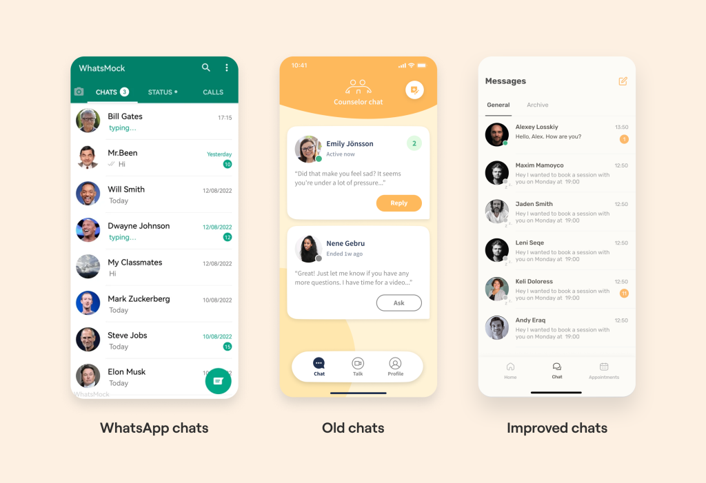
As a result, the adaptation process went very smoothly, and the number of app users kept growing. Within six months, we went from 100 to 10,000 Swedish student users.
User-Oriented: ways to get inside the user’s head
Great, we’ve discussed why we don’t understand users, the most common issues, and the UI/UX/engagement techniques we can use in an app prototype before we start user testing.
Now let’s talk about the tools we can use to identify and systematize specific user problems.
1. Patient Journey Map
Take a look at the image below.
This is roughly how most healthcare apps on the market operate. Developers often think it’s great to load their product with a multitude of features and then meticulously explain them during the onboarding process.
The most critical mistake is the erroneous assumption about how the user will navigate the app (in what order and to where).
In reality, most startups don’t know how their users are actually using their app. But there is a method I’d like to share.
To understand this, we:
1. Need to talk with the target audience (patients).
For accurate completion of each element, we recommend conducting Customer Development Interviews or mass surveys with the target audience. Click on an example
2. Then build the entire funnel based on real user pains and concerns from start to finish.
By doing this, we create a journey where we can see the stages of the app where there are issues: patient pain points and needs.
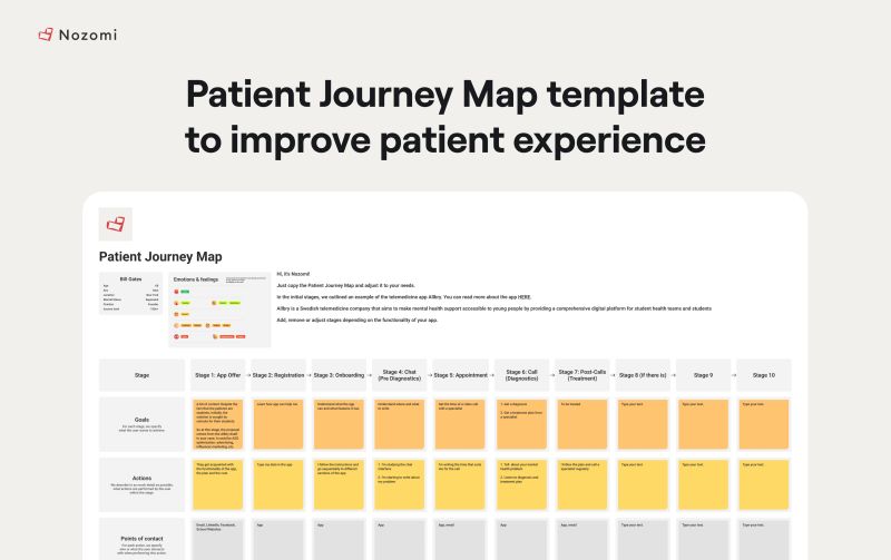
You can download a template with the Patient Journey Map (PJM) here.
Algorithm:
1. We detail each stage of the user’s journey: from the initial search for a solution by the patient, solving their problem to the actual installation of the product and constant return to the app
2. Then for each stage, we detail for the patient: goals, actions, thoughts and emotions, pain points and their potential solutions
For example:
– the goal “treatment”
– action “call with a specialist”
– pain point “fear to talk about problems”
– and accordingly the solution to it “anonymous feature”
3. Thus, we were able to find a solution to one of the potential problems and improve our product funnel. Then, after User Tests, we improve our Patient Journey Map based on new knowledge.
We also included detailed instructions on how you can improve your product funnel in the template.
2. User Tests
Red or blue button? Should the user profile button be replaced with something else? How often will it be used?
While internal app analytics can answer these questions to some extent, how do you initially choose the button color and determine which buttons should be included in the interface?
Besides analyzing competitors, it’s essential to conduct preliminary analysis with your own users on a prototype to narrow down the options and release an MVP with the most user-friendly functionality and design.
Here, we provide a ready-made prototype to our target audience and ask them to perform specific tasks while we record the test results.
Usability tests for healthcare apps help us identify UX/UI errors and understand which features are underutilized. Essentially, we conduct UX research for healthcare apps. Here’s how to run it:
1. Choose a format:
– Tests can be conducted both online and offline.
– A prototype can be created using tools like Figma or Invision.
2. Identify the target audience:
– Use your current database.
– Explore other locations where potential users are active, such as Facebook groups discussing relevant issues, thematic websites and forums, or communities/blogs of your competitors.
Keep in mind: Separate tech-savvy users from others to determine if, for example, older adults can also use your product effectively.
3. Prepare questions and tasks:
– Design tasks that involve using specific features of the app.
For example, at Allbry, we noticed that only 10% of users used the Profile button and struggled to find this option quickly. Therefore, we can ask users which sections they need (to see if “profile” is among them).
By following these steps, we can gain valuable insights into how users interact with our healthcare app and make necessary improvements.
4. Record the test results:
– Were the tasks completed?
– Were there any navigational issues?
– Did users remember the brand’s primary colors after the test session?
If the initial prototype received a negative experience from users, then we go to the second round. Completion of the second round takes place with ready-made materials and feedback. Due to this, the repeated stage lasts several times faster.
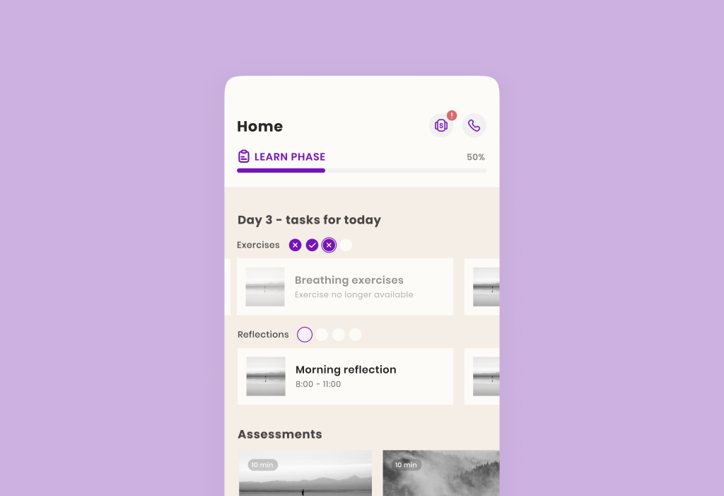
For example, after conducting Usability Tests for healthcare apps , we discovered a serious defocus and high cognitive load among users. Especially in the context of chats.
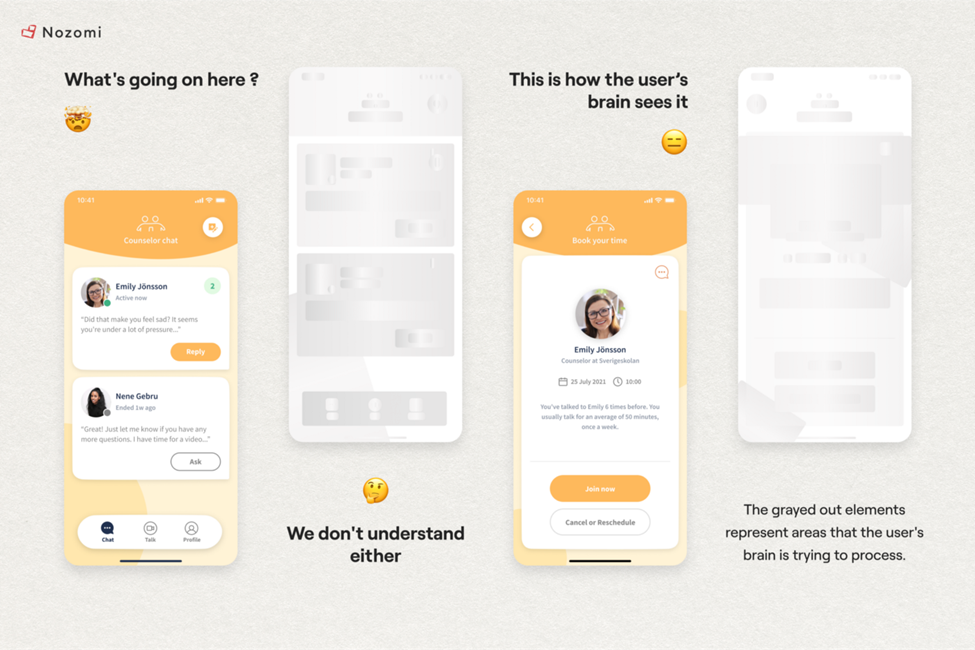
They struggled to find necessary information and features in the application, took a long time to complete tasks, and found navigation difficult.
This highlighted areas needing special attention and improvement, preventing major reconstructions later in the development process. This is why User Tests are essential as a healthcare UX research method for apps.
3. JTBD (Jobs-To-Be-Done)
“If I had asked people what they wanted, they would have said faster horses.” – Henry Ford
Let us share a secret on how to create a competitive feature for a digital health app, and how Henry Ford fits into the picture.
Ford’s quote reminds me of the Jobs-to-be-Done methodology, which rethinks user needs.
Because, in reality, in the early 20th century, users didn’t need faster horses. They needed a faster way to get from point A to point B.
So, if you try to solve a user’s problem without seeing their actions as “jobs,” you’ll be thinking about nothing but the current subject – horses – unlike Ford, the creator of cars.
For instance, someone might say they want a more open therapist to discuss their most intimate problems.
But in reality, they just don’t want to talk about them at all in conditions where they feel “identified” (face, name, and other data). So what they need is an anonymous feature, not just a kind specialist 🙂
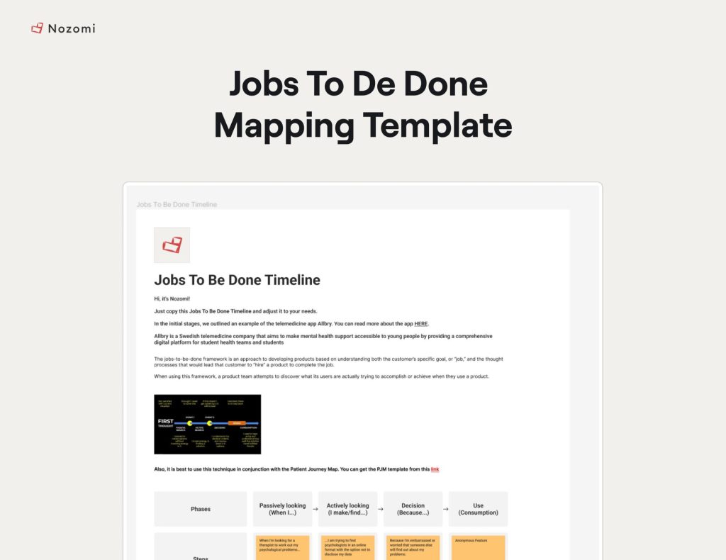
Download a template with JTBD
Therefore, after user tests, when we have gathered opinions about the features and the app, this method can be used to segment the target audience not by persona, but by pain points, leading to new or improved features.
Now, we clearly understand what the user wants, thanks to:
- Understanding the user’s main problems
- Ensuring our prototype incorporates basic UI/UX/Engagement methods (otherwise, we wouldn’t know where to start)
- Methods for analyzing and systematizing user feedback
If you’re interested in seeing more case studies and their improvements, check out our case study library below 🙂
We are a digital health product studio, who assists healthcare startups in designing and developing digital products, while also helping healthcare organizations undergo transformative changes.
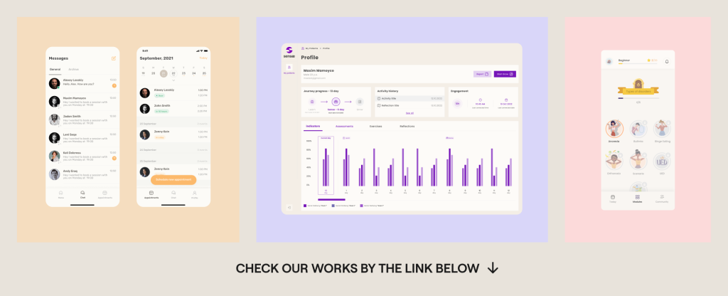
If you are interested about our experience check our portfolio with case studies: https://studio.nozomihealth.com/work
Or write to us now on m@nozomihealth.com and we will discuss how we can help ensure that your product brings real benefits