It’s good if you know what features your digital health product needs. However, many people often don’t know how to implement them correctly from a UI and UX perspective.
For example, in spite of the potential benefits offered by health apps, user engagement often remains low. To illustrate, a Mobile Consumer Report revealed that, in the case of medical, health, and fitness apps, merely 20% of users engage with the app one day post-installation, and this number decreases to 8% after seven days following installation.
And this is all because these applications had a very low level of Customer Experience (CX).
How to make the UI pleasant and not cause cognitive overload for the user? How to make the UX intuitive? In this article, we will demonstrate this using examples of the most popular and engaging features.
By the way, if you want to learn not only about design but also other aspects of digital health development, check out our list of 100 resources for digital health startups and companies. It includes books, guides, websites, and influencers covering Product Management, UX, Technology, Healthcare market trends, and Product Marketing.
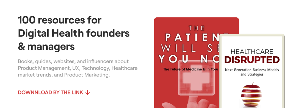
Download List of 100 resources for digital health startup founders & managers
Patient-centric Service Design
The first fundamental step (that so many people miss) is to talk with target users and stakeholders to understand their needs and clarify the problem that has to be solved for them.
The way to do this is through discovery phase primary research with real users, as part of a service design approach, to understand perspectives, barriers, and motivations. This involves 1-2-1 interviews and group discussions to generate vital insights about what is needed for digital health engagement and satisfaction within any solution.
For example, CEO of nuom Martin Sandhu talked about how his team created a self-testing platform for the new NHS hepatitis C using a service design approach.
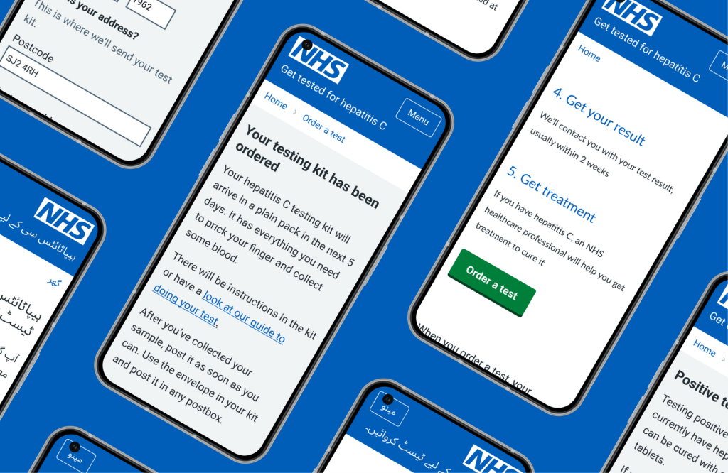
By speaking to diverse target users (many of whom wouldn’t typically engage with this type of service) insights were gained and validated, to create a streamlined service that removed any typical unnecessary steps (e.g. authentication), with simplified, accessible and inclusive UX and messaging that worked for every user group.
This is an example of why it’s important to follow such an approach, as it helps us understand the audience’s needs and identify the features that are truly essential for us.
“This is what creates engagement and satisfaction, and has led us to create a really successful platform for the National Health Service, that hard-to-reach users are now using, and which is helping to eliminate hepatitis C in the UK as a result.” says Martin Sandhu, who helps digital health companies from start-ups to national services to improve user engagement and satisfaction.
I. Social Gamification
This concept underscores the significance of actively involving patients in their healthcare journey. Unlike a car mechanic diagnosing and fixing an issue, many clinicians adopt a similar approach—diagnosing patients, devising treatment plans, and swiftly moving on to the next case.
Although this method is undoubtedly efficient, it contributes to the prevailing perception of medicine as impersonal and detached, posing a hindrance to the attainment of top-notch medical care.
Such an approach tends to label patients based on their health rather than viewing them holistically as unique individuals with diverse motivations, priorities, and requirements. It fails to address the individual challenges and obstacles they may face in accessing care.
Create motivation for your users. This is where the concept of progress and reward systems comes into play.
The first element: it’s the journey itself. You should allow the patient to accumulate visible progress. And as childish as it may sound (not all adults enjoy games), we’re not talking about turning the app into a game.
We’re referring to the idea that a user wouldn’t want to give up their accumulated progress, which can be lost. They’ve invested a lot of time and can see all the efforts put in to achieve a high level/rank, and they might even compare themselves to other users (which undoubtedly fills the patient with pride).
How should it look ideally from the UX and UI design perspective? Users should be given the ability to create an avatar (with the option to change the image) and a simple progress bar that numerically indicates how much is left for the user to reach the next level.
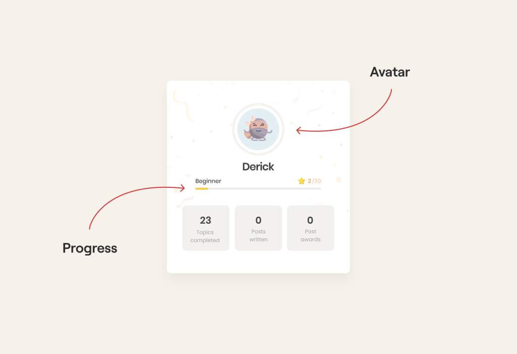
Thus, the user will return to the application more frequently, especially knowing that they are very close to reaching the next level. Moreover, a personalized avatar will only create an additional sense of association.
So in this scenario, having the stick of level decrease, the user will psychologically find it harder to not follow the prescribed treatments related to their health.
The second element: these are additional rewards tied to progress.
While offering quality information is inherently motivating, modern users have grown more discerning. Our objective is to evoke fresh emotions and differentiate ourselves from the competition.
To achieve this, we enhance the concept of progress and bolster retention through elements that other app users will see:
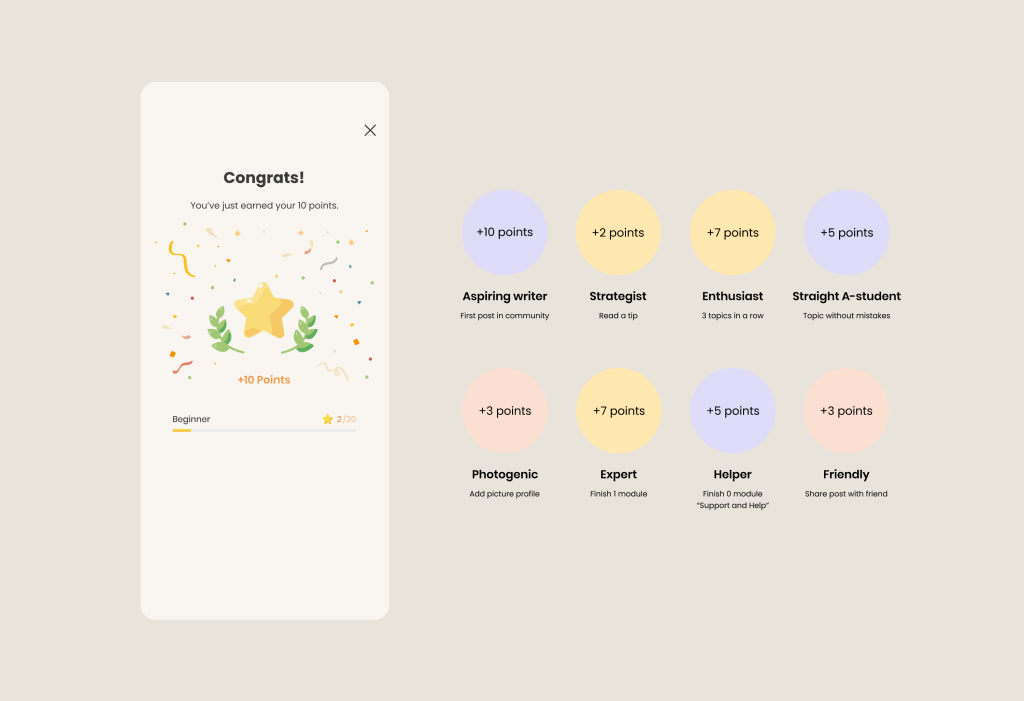
How does it work from a UI/UX perspective? The key lies in the way we express our appreciation: we present users with a sequence of rewards, accompanied by engaging animations or visuals. This approach triggers the release of endorphins in users, making them feel valued and appreciated for their time.
But this isn’t the only way to release endorphins and improve engagement in digital health apps 🙂
If you want to delve a bit deeper into this topic, we’ve also created a comprehensive guide on how to boost user engagement:
1. Our best UI/UX practices to make an app not just used but loved
2. Product strategies to drive retention and engagement
3. Our best Engineering practices to build scalable solutions
4. Tips to ensure compliance with healthcare regulations
Download Free Actionable Insights to Grow your Digital Health app
II. Interactive Education
The main reason for high digital health engagement is demonstrating something new and unusual that is not available to other players in the market.
Objectively, not everyone likes to receive information about treatment and then simply follow it. It’s much better to participate in group sessions to improve your spine or meditate while looking at a changing and user-engaging point on the screen.
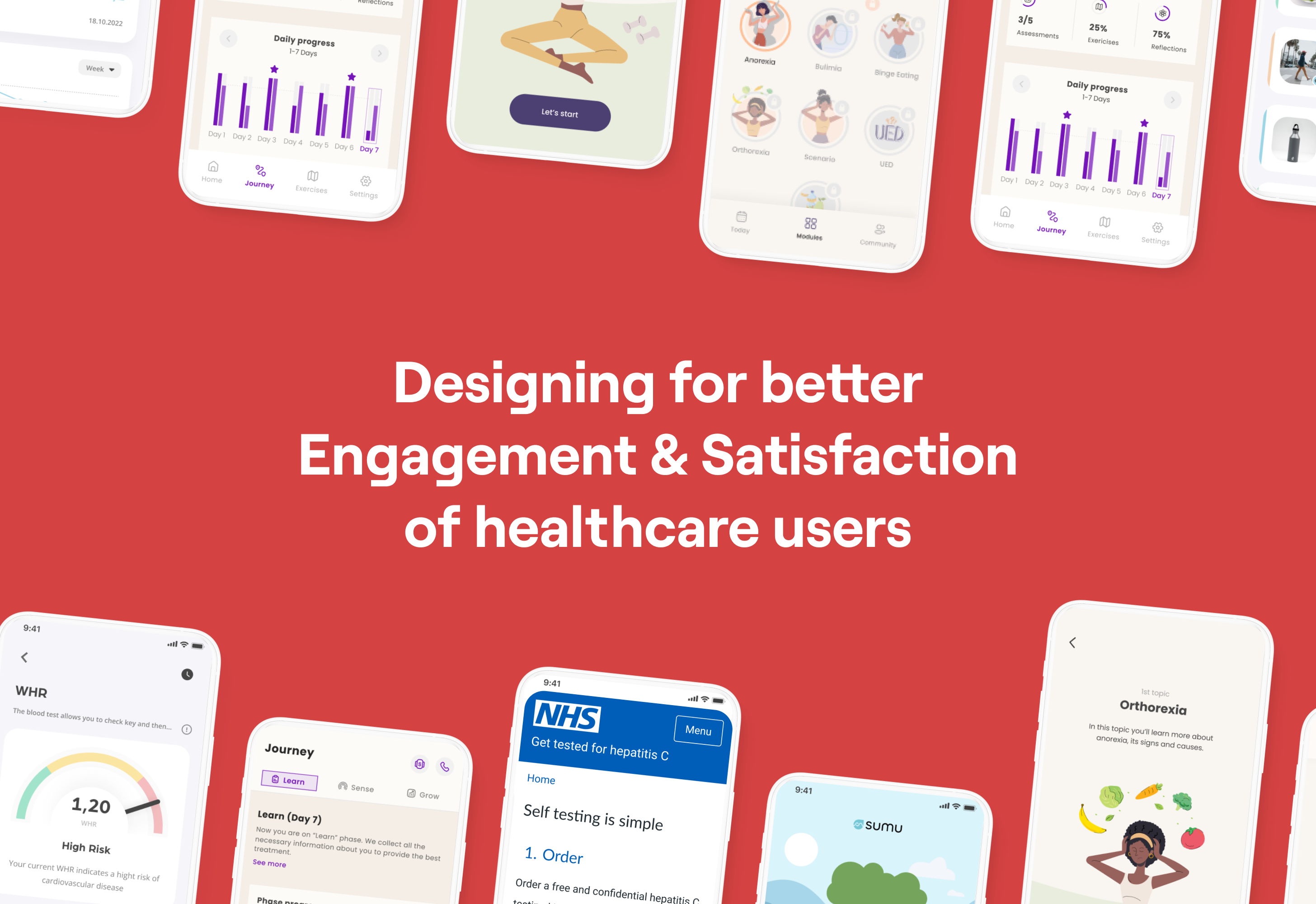
By the way, these are real examples from practice. For instance, the latter case is Microshift. In the app, we implemented audio content selection on the home screen that is tailored to address specific user problems.
Here, everything is straightforward: we use minimalism and white color around the circle in the UI to create maximum focus during meditation.
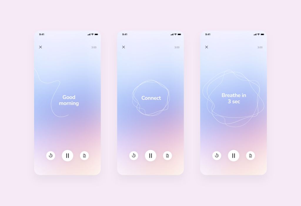
In UX, it’s also important to adhere to minimalism: we keep no more than three icons at the bottom of the menu and also provide a choice of 3 tracks so that the user does not experience high cognitive load:
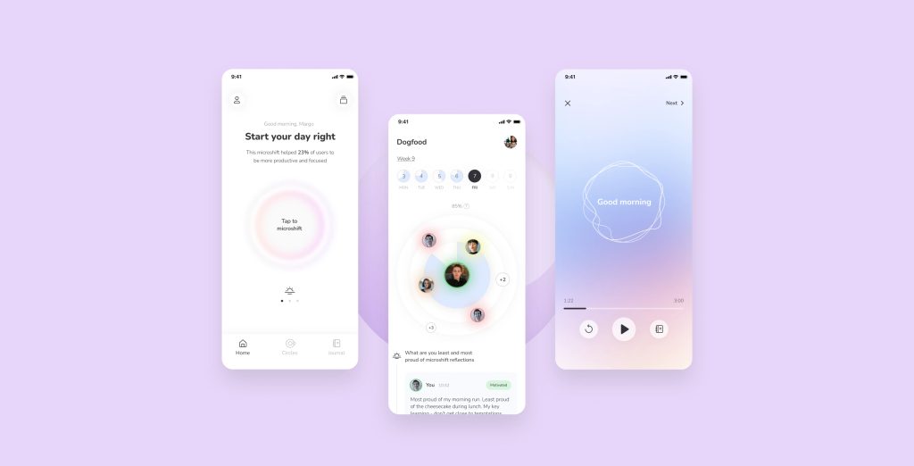
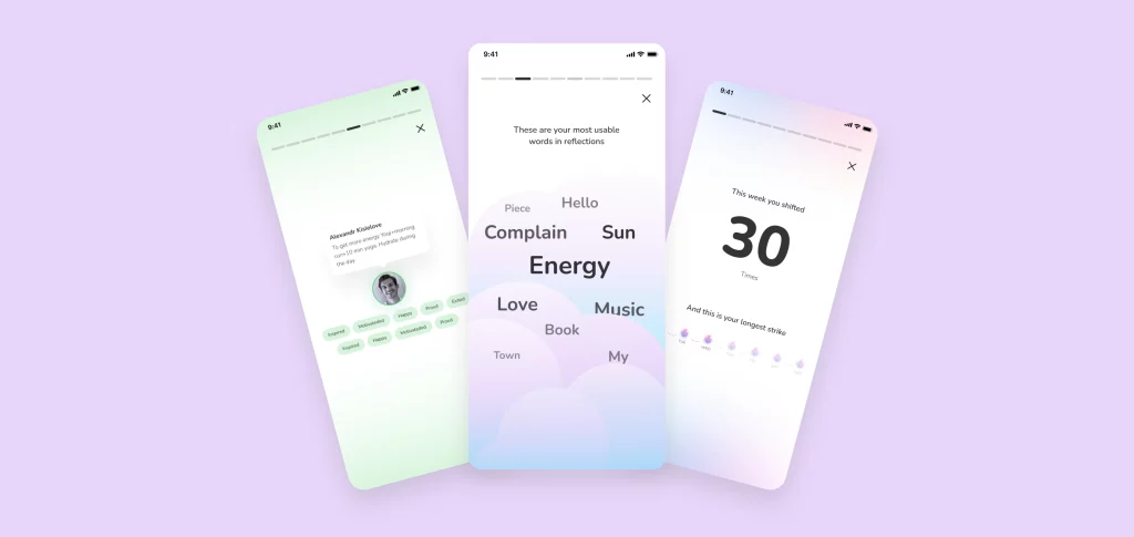
After the meditation session, Microshift offers several additional interactions: sharing meditation successes with others (leaving real feedback) and marking the emotions and sensations that a person feels after the workout. A complete user success feedback is also provided.
At such moments, it is important to understand that users may be annoyed by a large number of sequentially appearing blocks. Therefore, it is crucial to immediately show the user how many blocks they need to scroll through to read all the information.
By the way, are there any other good features that provide positive feedback to the user? Yes, this is…
III. Remote Monitoring
As a rule, we are talking about an application that connects to wearables. In detail on how to create such applications and integrate them, we have written about them here.
Here, we will provide an example of how to make the UX of applications with the Remote Monitoring feature as intuitive as possible.
Remote Monitoring is about statistics that are either delivered to the B2C user or their treating physician. In this context, it’s crucial not only to present statistics in a clear way and choose appropriate dashboards, steering clear of excessive pie charts, but also to consider users’ comfortable interaction with them.
Here are three principles of UX that should be adhered to:
Intuitive data display: represent data from the wearable device in a clear and understandable format. Utilize meaningful labels, icons, and visualizations that resonate with users. Avoid clutter and prioritize essential data to prevent overwhelming users.
Real-time feedback: if the wearable device offers real-time data, ensure users receive immediate feedback within the app. For instance, display the current heart rate in real-time, accompanied by visual cues indicating normal, high, or low readings.
Alerts and notifications: implement alerts and notifications for critical events or abnormal data readings. These alerts should be informative and actionable, guiding users on the necessary steps based on the situation. Allow users to customize alert thresholds when applicable.
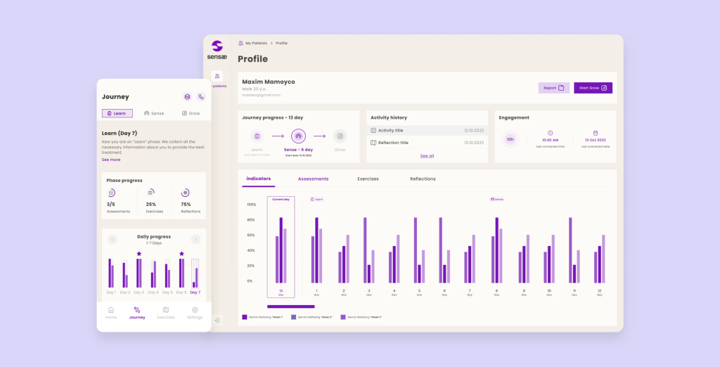
Now, let’s illustrate the last point with an example of such UX and introduce a company we collaborated with, Sensae, a Danish mental wellness company using AI to manage stress and anxiety through personalized haptic biofeedback.
For Sensae, we designed a patient list where each patient’s current condition is displayed (including Real-Time Feedback).
If there’s an issue, it’s highlighted as an alert (Alerts and Notifications). Essentially, the coach already knows where to prioritize urgently from the list of patients, making it convenient for starting the workday by focusing on the most critical tasks.
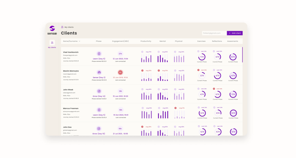
Note that easily comprehensible and user-friendly histograms are the primary data visualization method used here (addressing the Intuitive Data Display point).
Remember, the aim is to make interactions with the device intuitive and informative, guiding users to maximize the benefits of their wearable technology. The design should empower users to navigate their device interactions effortlessly within the app interface, enhancing their overall health and wellness journey.
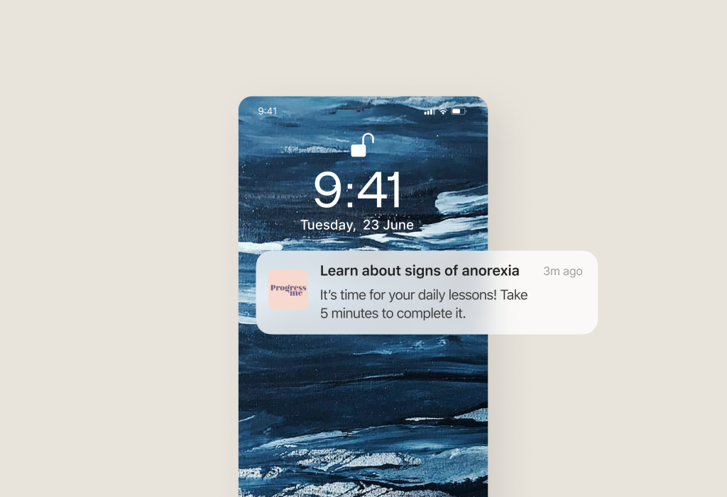
IV. In-product & Push Messaging
Firstly, when creating push notifications or in-app messages, think in advance about the text’s conciseness.
For example, in the case of push notifications, no, users won’t want to open the app due to intrigue in an ellipsis like “learn how…”, as they receive a large number of such rectangles on their phones.
Therefore, the message should be brief and maximally useful but without leaving things unsaid.
Internal messages can help users navigate the app. How to make them as user-friendly as possible? For instance, use highlighting and arrows that introduce the user to the app’s interface.
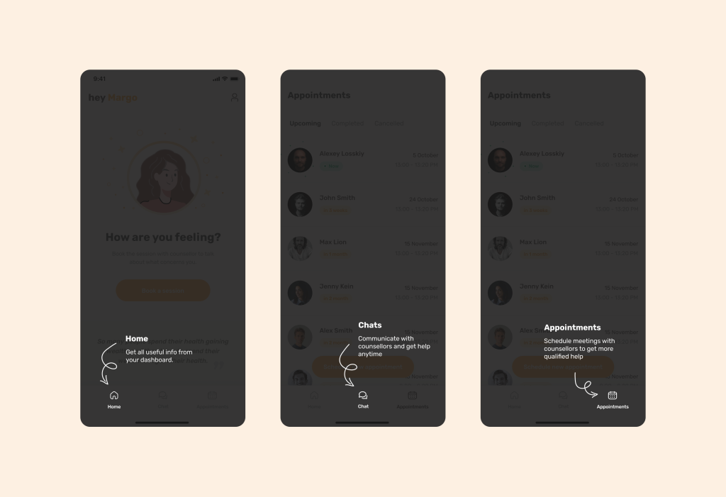
This way, the adaptation process will go more smoothly, and the percentage of users leaving the app will be significantly reduced.
V. AI-Powered Health Companions
We couldn’t ignore the popular trend with AI.
Essentially, companions are used as assistants for professionals, freeing up a lot of their time and increasing the throughput of the medical company: they answer medical questions at any time, diagnose problems in advance based on symptoms, and even provide a complete workout or treatment program.
What do we need to consider here? Firstly, AI must establish emotional contact. The best way to do this is to introduce itself and provide a clear call to action (CTA).
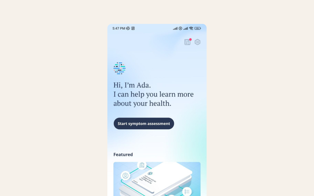
Source: Ada
Secondly, limit the choices. Yes, many existential psychologists say that people don’t like to choose, and a large number will definitely increase cognitive load and lead to an increase in User Churn.
Therefore, display on the interface the minimum number of most relevant options. In the example below, we did this regarding symptoms and the dialogue with the AI companion:
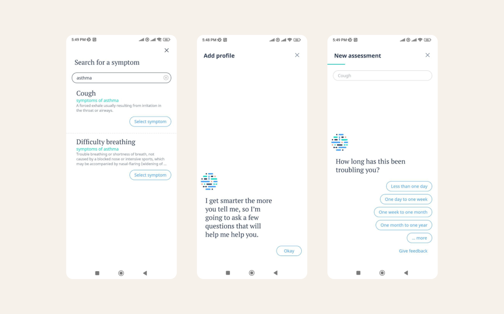
Source: Ada
By the way, notice that the 3-Click-Rule, introduced by Apple, is followed here: the user should not make more than 3 clicks to find the desired feature (click to begin searching for a symptom -> enter the symptom -> AI’s welcome).
Hope our article was helpful for you!
Who we are? We are a digital health product studio, who transforms healthcare digital experiences and sets new standards for delivering digital healthcare in a way that positively impacts people’s lives.
We assist healthcare startups in designing and developing digital products, while also helping healthcare organizations undergo transformative changes.
If you are interested about our experience check our portfolio with case studies by the link or you can read more about us here.
And write to us now on m@nozomihealth.com and we will discuss how we can help ensure that your product brings real benefits