You probably had a moment when you heard about a variety of approaches to improving business/product metrics and involving users in the product. But at the same time, most likely you received these pieces of knowledge separately and did not know how to combine it all into a single system.
This idea came to us after talking to Digital Health entrepreneurs who wanted to understand the right algorithm that would lead them straight to their business goals.
Therefore, in this article, we decided to describe a step-by-step plan on how to increase User Engagement and other Product/Business Metrics of Digital Health product.
And before we delve into our article, here’s a valuable resource of 9 emerging product trends in the healthcare industry for 2024: AI Companions, Interactive Education, Behavioral Design, etc. This book is not just a general description of trends but an explanation of why they work, with illustrative examples of apps for UI/UX/User Engagement inspiration.
Download 9 Product Trends in Digital Health for 2024
I. Let’s start with the validation processes: User Tests can help here
Why is this method required: it helps to create a user-oriented app.
The word “User-Oriented” is very important here. The User Engagement rate will be low until the “entry point” is established:
– onboarding;
– understanding by users how to solve the problem in the application;
– and where to find the same solution from all possible features.
For example, users can simply leave the app during the initial check if there is too much cognitive load already at the onboarding stage.
Thus, the validation process is needed for the initial verification of problem points in the current version of the application.
Here is an example from our practice: during User Tests, we found out that Allbry users could not solve the tasks (or performed them for a long time) and got lost in navigation.
Allbry is a program that allows school counselors to track students’ mental health performance in order to identify potential problems.
The problem above was related to visual focus (where to go in the app?) and cognitive load (due to the non-intuitive interface). And in the second point we will explain how to solve it.
How to run User Tests?
1. Identify the target audience:
– Within the current database;
– In other locations where your potential users stay, such as Facebook groups with discussions of valid problems, thematic websites and forums, or communities/blogs of your competitors.
The thing to keep in mind: Separate tech-savvy users from others to determine whether, for example, older people can also use your product.
2. Prepare questions and tasks, such as finding a specific button in the application or providing feedback on what is lacking in the gamification.
3. Record the test results:
– Did users remember the brand’s primary colors after the test session?
– Were there any navigational issues?
– Were the tasks completed?
And most importantly: it is important to move forward in accordance with the feedback and, if necessary, quickly change / correct features and UX.
For example, we developed the Digital Health app “ProgressMe” (The app helps young people suffering from an eating disorder) and found a problem in users’ navigation during the test.
One of the reasons was that the Footer menu, which is familiar to users of products on the Digital Health market, was completely absent from the application.
And on the basis of such feedback of problems, it is necessary to react quickly and respond to the market demand.
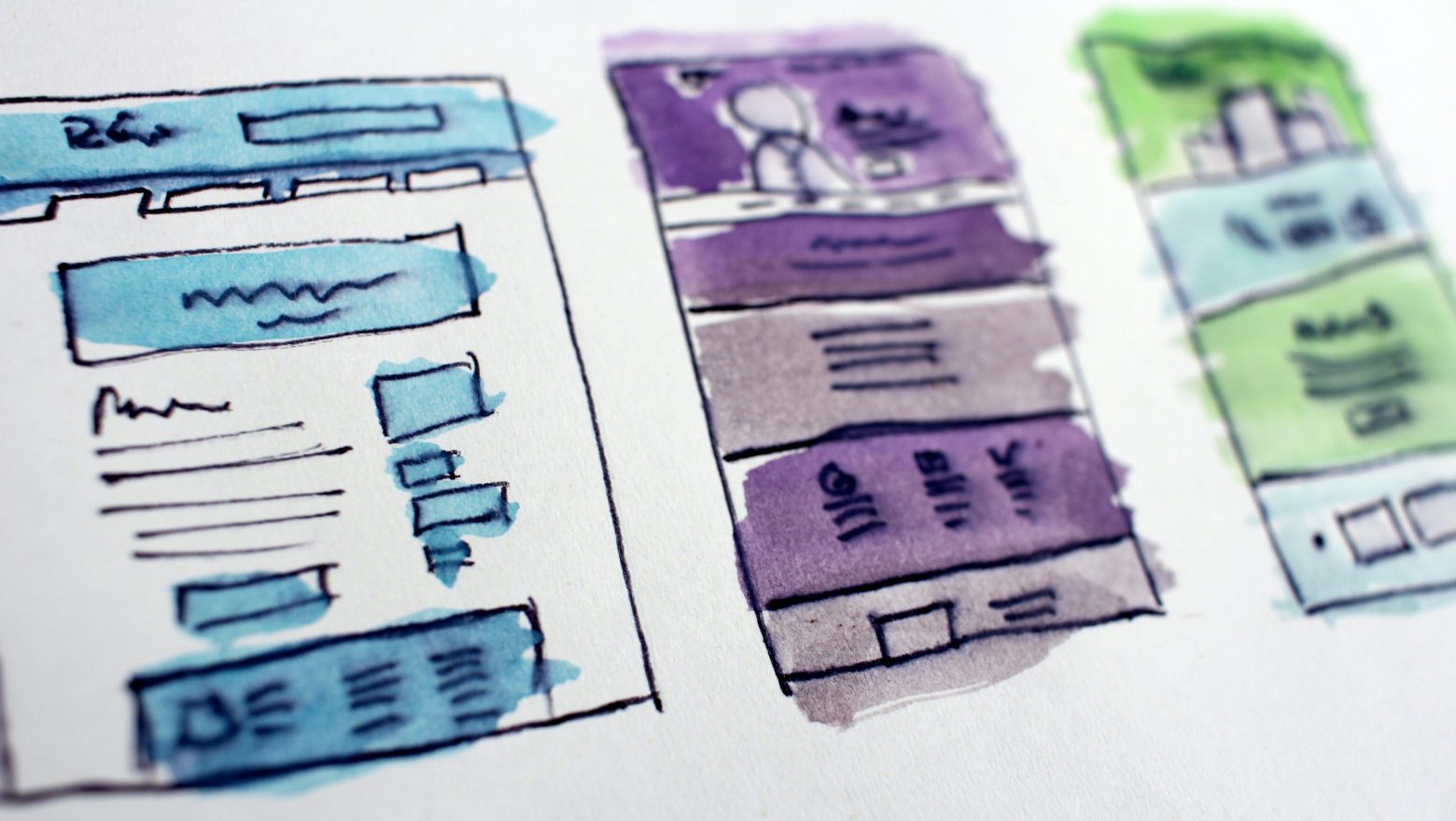
II. Build UX based on User Tests
On the one hand, the connection with User Tests makes sense here: we build UX logic based on current UX problems of real users and eliminate low Engagement and high user churn.
On the other hand, we should also be mindful of global UX practices in order to know how to improve product metrics.
Here is an example of the synthesis of world practices and User Tests for the Digital Health app from our practice: we all know the chats in Facebook Messenger, WhatsApp, Telegram, and Viber and do not think about the location of a certain button or feature. That’s because they all have almost the same UX pattern.
So why add chat-related features familiar to everyone to places where users of such applications usually do not look? The user’s brain is already used to a certain UX logic and it should not be disrupted. Otherwise, the user will experience a high cognitive load and leave the application.
As we can see in the Digital health examples above, we used Patterns from a module called “Messages” that were familiar to our target audience to improve the design.
An example of the cognitive load caused by an unfamiliar arrangement of elements is shown below on the left.
Thus, we have shown only one problem, but there are usually many of them.
Let’s take another look at the B2B interface for the same application. Consider a situation where our Digital Health app uses a lot of data, and users have expressed concern regarding this.
This was because people were forced to use multiple record systems to access the data required to complete their tasks. As a result, they were forced to move from one massive set of data to another to find the information needed to answer their queries.
Finding data took time. And in this situation, we should work on sorting to improve the user experience. Thanks to this improvement, B2B users are more likely to convert into paying users.
The statistics above allow you to filter the necessary data, such as identifying patterns of problems among girls in the seventh grade at a particular school.
Here you can see the details of how we solved the remaining problems of user churn and low User Engagement in the Digital Health app from Allbry and what results it led to.
If briefly. According to testing, the platform’s navigation simplicity increased by 22%, and the platform could scale. As a result, the number of registrations and visits to the application grew.
In one month, the old version of the application had 100 students from Swedish schools. In six months, the new version of the app reached 10,000 Swedish student users and 87 schools.
The percentage of users who completed all tasks in a timely manner has increased by 32%. Users can now find the information they require more quickly.
As a result, indicators like engagement, registration rates and acquisitions of the platform by schools have increased.
And now let’s move on to world practices and explain the fundamentals.
1. When a user enters such an application, you need to establish trust with them right away using evidence and data: use as little advertising as possible, don’t ask for a lot of personal information during signup, provide links to thorough studies or trustworthy sources to vouch for the accuracy of the content, and offer social proof in the form of statistics and expert reviews.
2. Make the content simpler by using straightforward terminology, avoiding clinical jargon, and visualizing information using images, infographics, and animations.
3. Look at other popular apps that have similar features. Then adapt your product so that the User, based on the memory of using other applications, quickly understands navigation.
4. The final point applies to any health application: consider the laws and modify UX accordingly.
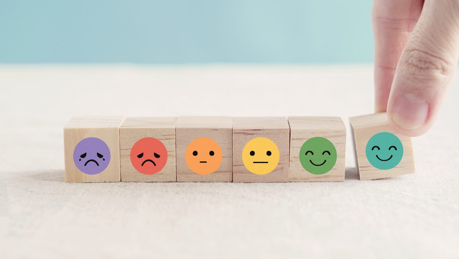
III. Mind the Retention after building UX logic
Don’t forget that a good Retention rate increases LTV, which affects revenue.
First, we conducted User Tests and based on them, we made a UX design that increases the number of users. And now we have to consolidate the result and make sure that users return to our application as often as possible and are interested in a paid subscription.
Our friend Michael was having difficulty in his Digital App with user retention. Communicating with users, he noticed that they lacked motivation and meaning. They don’t feel like they’re doing anything meaningful and their focus is lost.
It seems that there should be no problem with motivation in Digital health applications. But in fact, there is such a problem, it’s just not about rational motivation anymore. Here it is necessary to create conditions under which the user gets meaning and pleasure from daily actions.
How can we help with this?
- Inspire: show empathy by acknowledging their condition and the difficulties that are associated with it.
- Create a sense of community and encourage participation: for example, create forums or a table of the best.
- Use tools that stimulate the discipline and motivation of the user: for example, it can be a diary, a calendar of successes, or just gamification.
Let’s immediately give an example from our practice. Microshift is an application in which you listen to a meditative track every day during breaks and share your current mental state.
The app allows people to connect with other users, enabling them to receive support and guidance in real time. This collaborative approach to care improves user engagement and helps users better manage their condition.
In addition, a properly designed calendar, combined with the features above, directly encourages users to log in every day. And then logging every day encourages the user to buy a full subscription in order not to lose the progress of their development and the added mood notes (which the user used during the trial period).
IV. One last thing: after you have looked at the analytics for all the metrics of your application, choose your NSM
We’ve already discussed the basic metrics: Total Amount of Registrations, User Engagement, and Retention. In addition, we described a stepwise approach that affects other metrics as well.
But now we can go further and focus on the “killer metric” (without forgetting about other metrics) to accelerate business growth.
North Star (NSM, North Star metric) is the metric that best captures the core value of a product to users.
North Star metric:
1. Assists the product team in identifying clear actions to enhance NSM performance, and determining which features should be deferred or abandoned altogether.
2. Facilitates the tracking of the company’s progress through quantifiable metrics, expediting the implementation of product initiatives.
3. Offers a chance to observe tangible outcomes of completed tasks.
To discover your organization’s north star, it is essential to identify the crucial aspects of your business that provide genuine value to customers, drive profits, and signify progress. However, determining what these are can be challenging.
To begin, start by understanding your primary goal from the three options listed below:
1. Attraction — This refers to the number of users who register on your platform or visit your website, which is critical for advertising monetization purposes;
2. Repeatability — This measures the amount of time users spend on your product, how frequently they return, and how actively they engage with it;
3. Transactions — This is the number of payments that pass through your platform.
And then choose your metric. NSM examples:
1. LTV (customer lifetime value);
2. Percentage retention per month;
3. MRR (Regular Monthly Revenue);
4. MAU (active users per month/day);
5. Total Amount of registrations;
6. Number of B2B contracts for service usage.
Let’s recall our Digital Health App from Allbry: their NSM could be point 6 because revenue comes from contracts concluded with schools for the use of the service.
The most important one, the NSM indicator must include three key parameters:
1. Profitability — This indicator shows how much revenue the company generates;
2. Value for users — This indicator reflects the primary value that your product offers to customers;
3. Measurability — The indicator should be easily measurable.
— — — — — — — — — — — — — — — — — — — — — — — — — — — — — — — —
Thus, our plan on how to increase User Engagement and other Product/Business metrics looks like this:
start with User Tests -> create UX based on User Tests and World Practices -> think about Retention mechanics -> choose NSM based on the analysis of all metrics to accelerate business growth.
And if you want to delve a bit deeper into development, process and UI/UX topics, we’ve also created a comprehensive guide on how to boost CX and user engagement:
1. Our best CX (UI/UX) practices to make an app not just used but loved
2. Product strategies to drive retention and engagement
3. Our best Engineering practices to build scalable solutions
4. Tips to ensure compliance with healthcare regulations
Download Free Actionable Insights to Grow your Digital Health app
And We hope you’ve found our article helpful.
Also, If you are interested about our experience check our portfolio with case studies by the link or you can read more about us here.
And write to us now on m@nozomihealth.com and we will discuss how we can help ensure that your product brings real benefits