
A proper Design Review is not based on the personal and subjective impressions or wishes of a particular Designer or Product owner/manager.
Good design is based on a complex opinion of the target audience of the application and their wishes: whether the current design helped to achieve their goals and whether it fulfilled all the tasks.
If a designer justifies his proposals/decisions based only on his own opinion, then it is worth checking 🙂
It’s about user verification. For example, if 70% of the target audience experience problems when registering in the application, but the designer or product manager/owner likes the current flow and does not want to change it, then this approach will lead to a decrease in the User Engagement rate.
In short, the first step is to define the target audience and assemble a focus group to test the application.
After this we receive the results to identify the main pain points of users in the application, which negatively affect the Engagement Rate, User Churn and Number of Registrations.
And how to fix them correctly, without making them worse? You only need to follow global design standards and study feedback from your target audience. Let’s discuss a particular example regarding this topic.
We devoted the last Design Review to the problems of focus and cognitive load in the TeleHealth app Allbry, which you can find here.
And now we come to our Design Review based on the example of one of our developed partner applications — ProgressMe.
ProgressMe — is a Swedish company that helps young people who are suffering from eating disorders, contributing with a simplified app for good help.
Previous app experience wasn’t good and it didn’t bring desired patient outcomes. They had few registrations on the platform, most sessions did not lead to Retention rate and the application itself did not have the potential to scale.
As a solution, we made a UI/UX Design Review of the previous experience and rebuilt it towards a gamified approach.
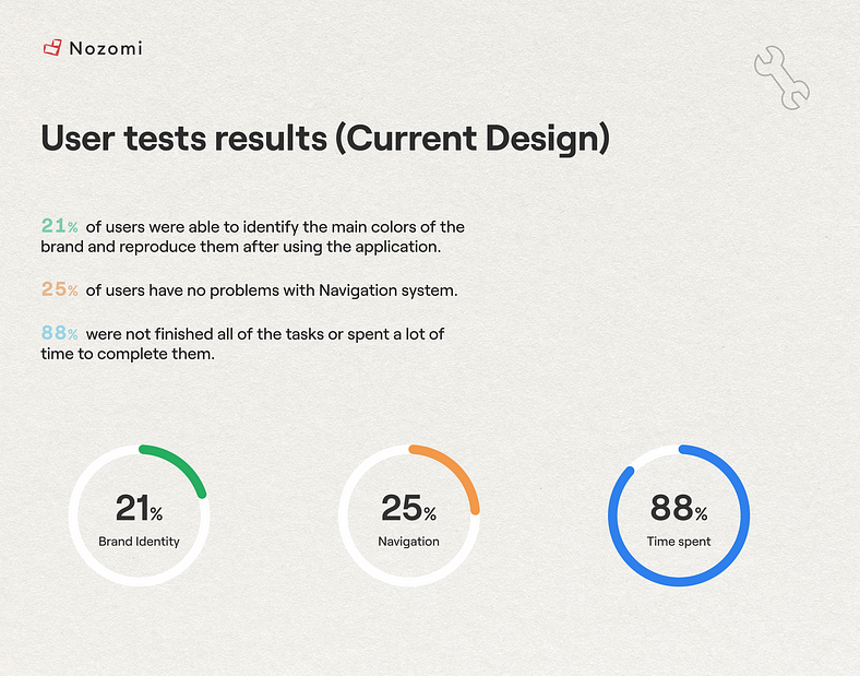
User Tests showed chaos
An important point of any redesign of the application is the ability to retain elements of the current design in order to accurately convey the partner’s vision.
However, you need to understand which points in the current design are strong and which are weak. So, during the analysis of the target audience of the application (divided into 3 groups depending on technical savvy), the necessary behavioral/demographic/geographical factors were taken into account.
Let’s take a look at how users passed the test:
1. The first design issue that leads to user churn: Reinforcement of Motivation. The built user path and UX structure of the application led to the fact that more than 90% of users quit the application after 1 day of use.
Reason: they lacked motivation. And we need a tool that could create this motivation.
2. Almost all users experienced difficulties with Navigation and with the implementation of tasks (many simply did not finish their implementation).
Here the problem lies in the fact that users will “fall off” already at the onboarding stage and will leave after the first visit without understanding the structure.
3. Also, the visual diversity of the past design had a negative impact on the Brand Identity. Many users were unable to identify the app’s brand colors and they were dissatisfied with the “childish” style of illustrations.
The problem of the brand will manifest itself with major updates and the releases of new products: users simply will not be able to quickly adapt without recognizable elements. In the end, this will affect trust and, as a result, conversion rates and the number of users of the product.
How to fix the motivation problem? Through gamification
ProgressMe is designed for daily use, which means its main goal is to maintain motivation.
Gamification in mobile apps is the process of using game elements and mechanics to create a more interactive and engaging user experience. This may include reward systems, achievements, leaderboards, rankings, tasks, and quests.
The main benefit of gamification is that it increases user motivation and engagement. And this leads directly to an increase in retention rate and LTV.
The user begins to spend more time in the app and begins to interact with other users through social functions, which creates such a mutual Retention due to reminders to chat.
Gamification also simplifies complex processes, making them more understandable and accessible to users.
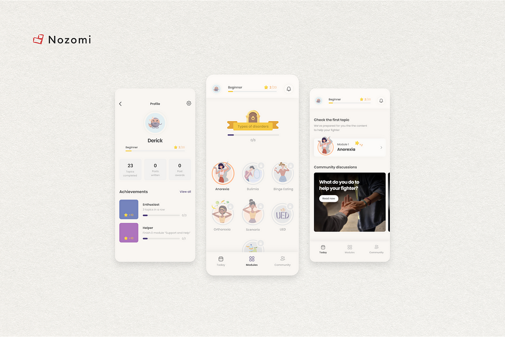
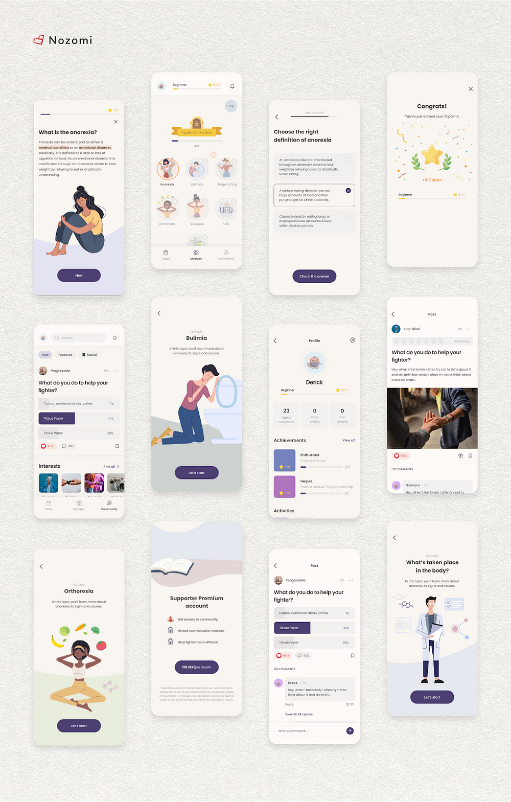
Let’s look at the image below.
Here we have added a complex system that rewards the user for increasing their own progress. You may have heard that computer game lovers very often replay games just to get an “achievement”.
And the trick here is that in order to increase this very progress and get an “achievement”, you need to go into the product more often. Therefore, we repeat once again that this is a Must Have for increasing the Retention rate and related indicators that affect revenue (LTV, ARPPU, etc.)
How does gamification work, in more detail?
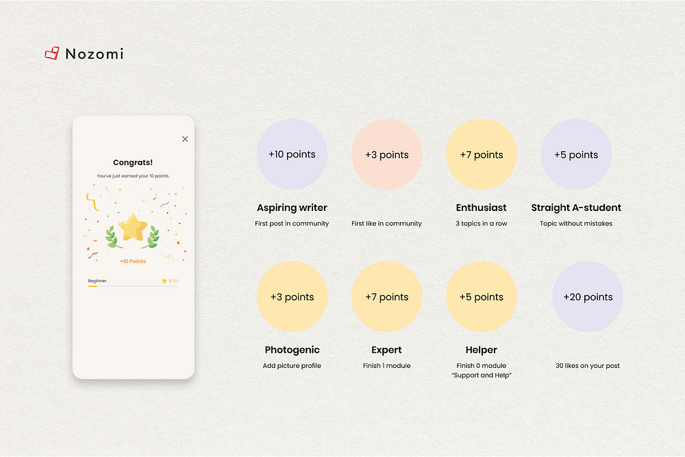
The application provides the user with certain information, a task, a questionnaire, etc. However, in order for the user to spend his time on your application, they need to be encouraged.
Yes, if you provide the user with quality information, this in itself encourages them to use your product. But nowadays, users have become more choosy and our task is to give them new emotions and stand out from other competitors.
Having received the necessary information from the user, we thank the user for the time spent and choosing our product.
And HOW we thank them is most important: we load them with a number of awards, which are backed up by attractive animations/images. Thanks to this, the user receives a microdose of endorphins in the body and the realization that we value their time.
The positive emotions that users receive encourage users to return to the application, again and again, to feel them again. Thus, daily engagement and user loyalty increase.
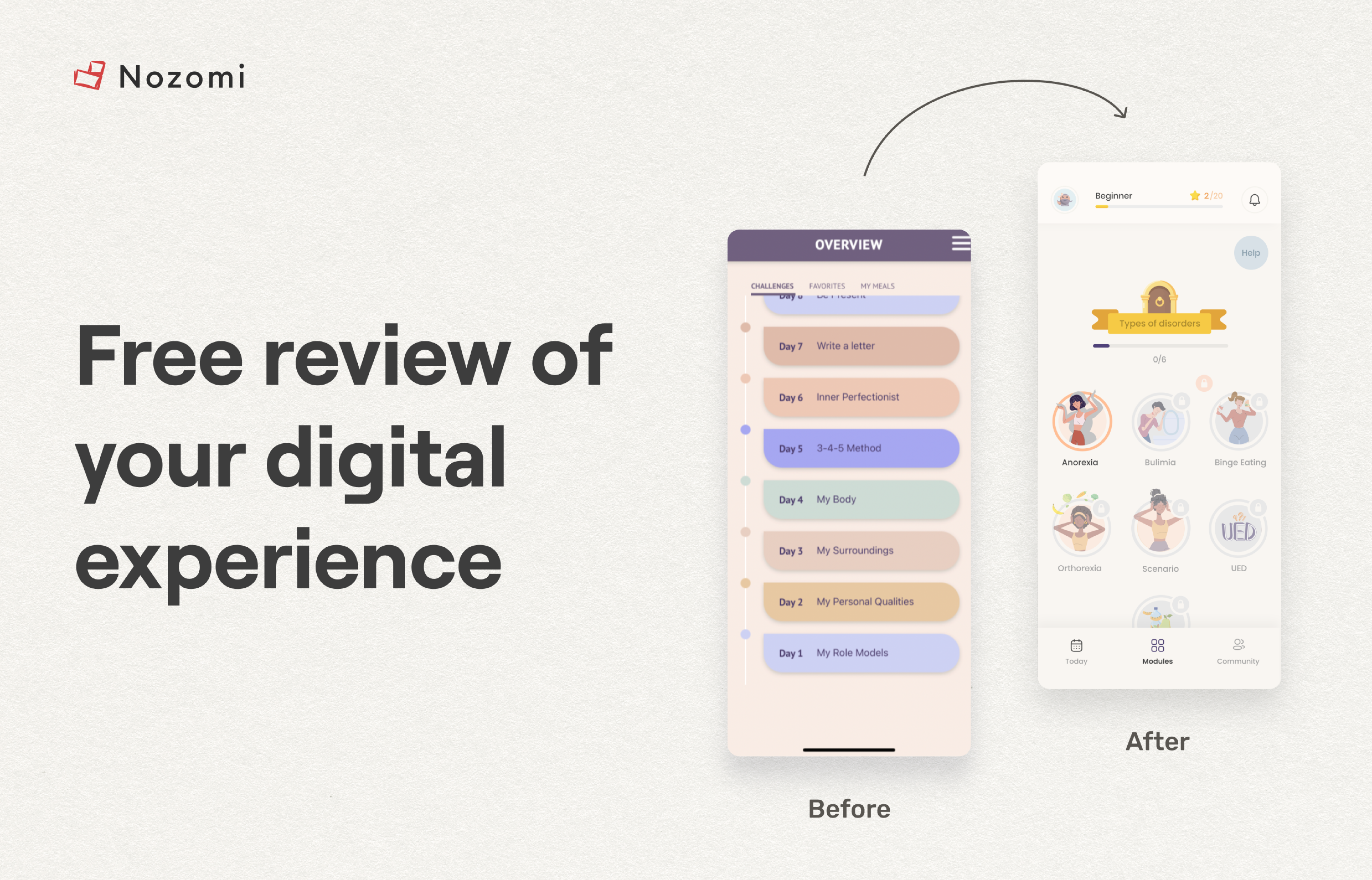
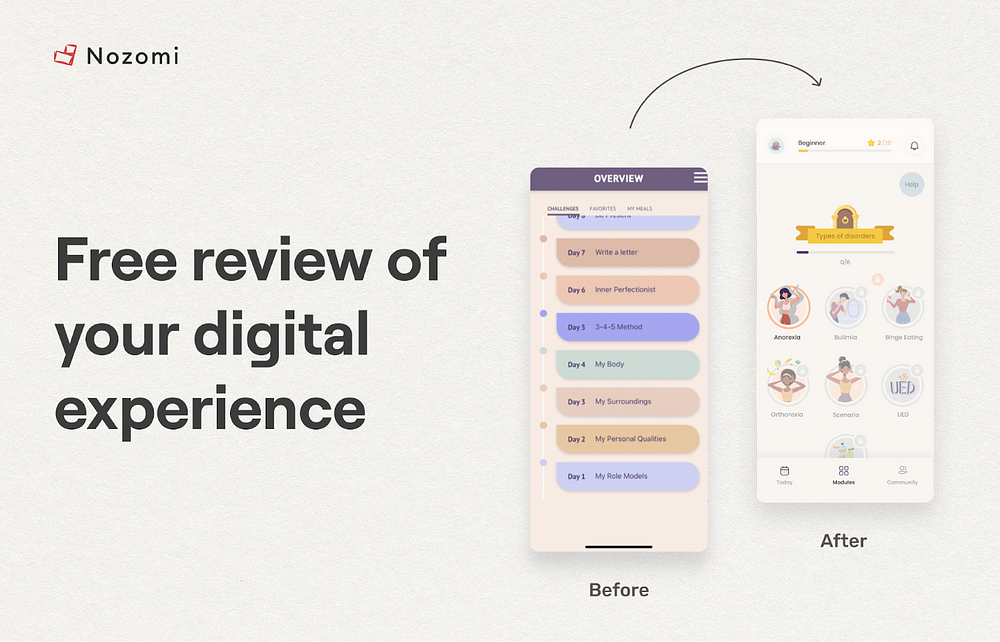
How not to lose a user due to Navigation
1. Let’s solve the problem with the help of an industry standard. Navigation in the app is one of the most important parts of the User Flow. Intuitive navigation greatly simplifies the life of users, while ill-conceived navigation makes finding the necessary information very difficult.
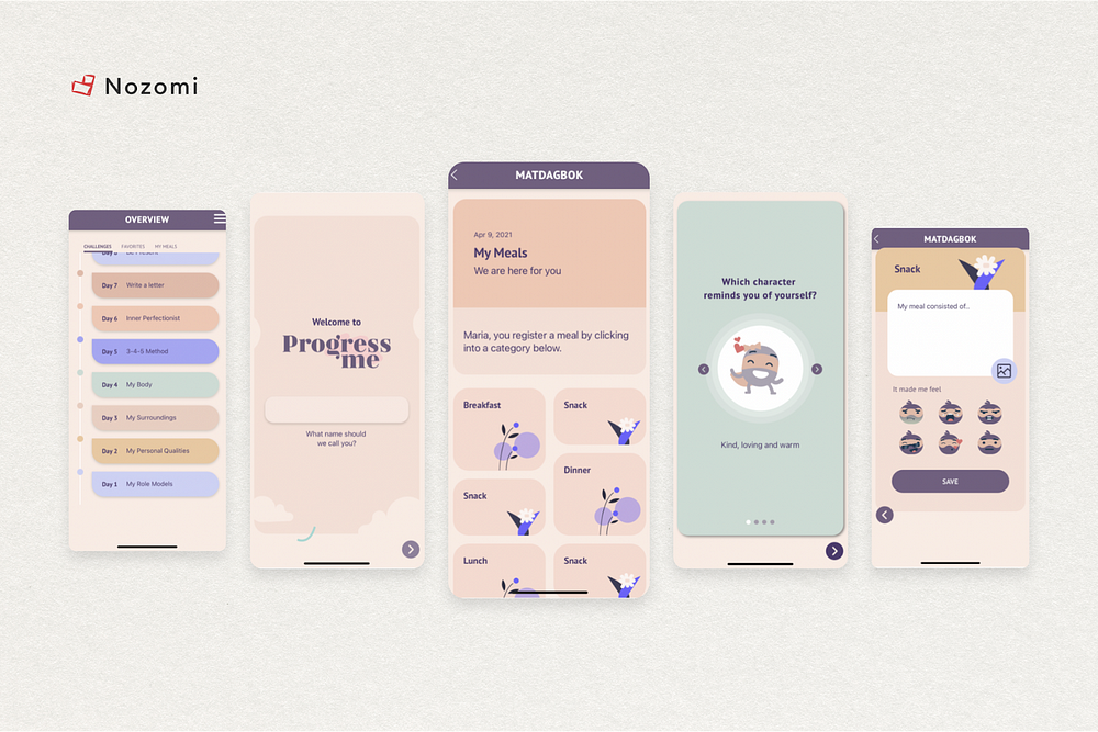
In the case of ProgressMe, industry standards specific to the Mental Health industry were not taken into account. Look at the pictures below.
In the previous design (after User Tests) it was noticed that most users did not understand what exactly needed to be done to access the necessary information.
The application completely lacked the Footer menu, which is familiar to all users of this market. So the logical step was to add it.
2. Then go ahead and recall the 3-click rule. It was introduced by Apple, the main idea of which is: the user must access the necessary information within 3 clicks from the moment the application is opened.
If the user makes more than 3 clicks and cannot complete the desired action, then this increases their cognitive load.
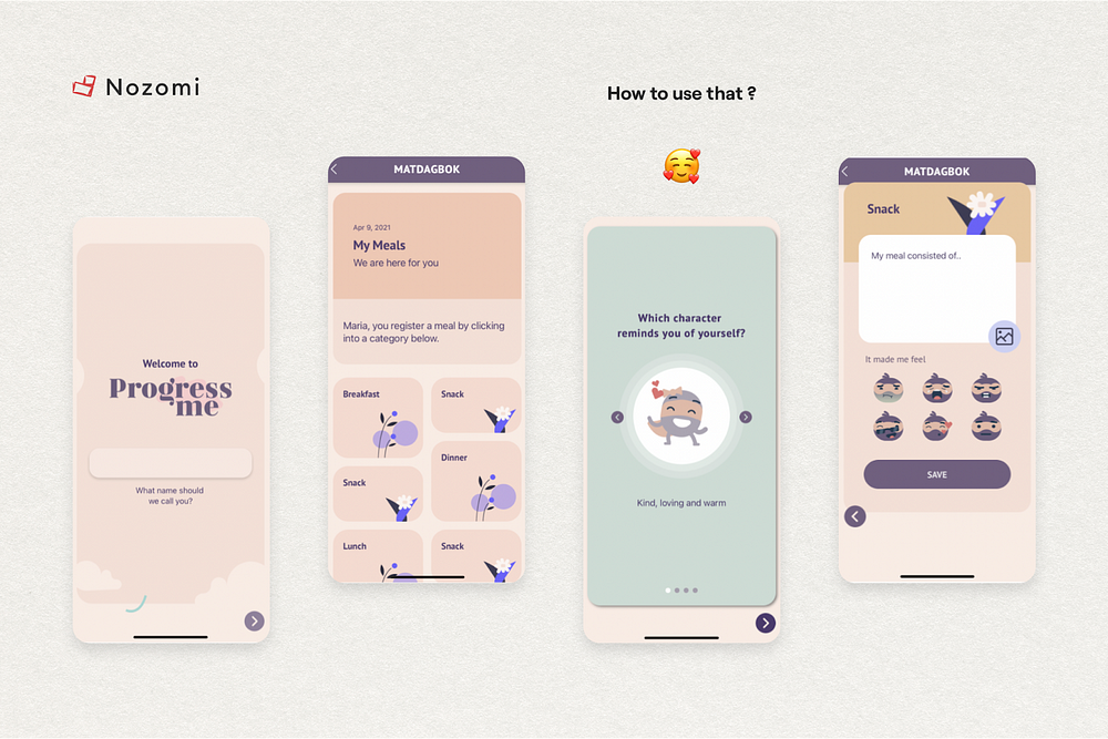
Let’s now take a look at the added footer and how we’ve created a proper user path that fits within 3 clicks. For example, a person clicks on “Modules” in the footer menu (1), then selects the desired module (2) and clicks “Let’s Start” on the picture with a brief description of the module (3).
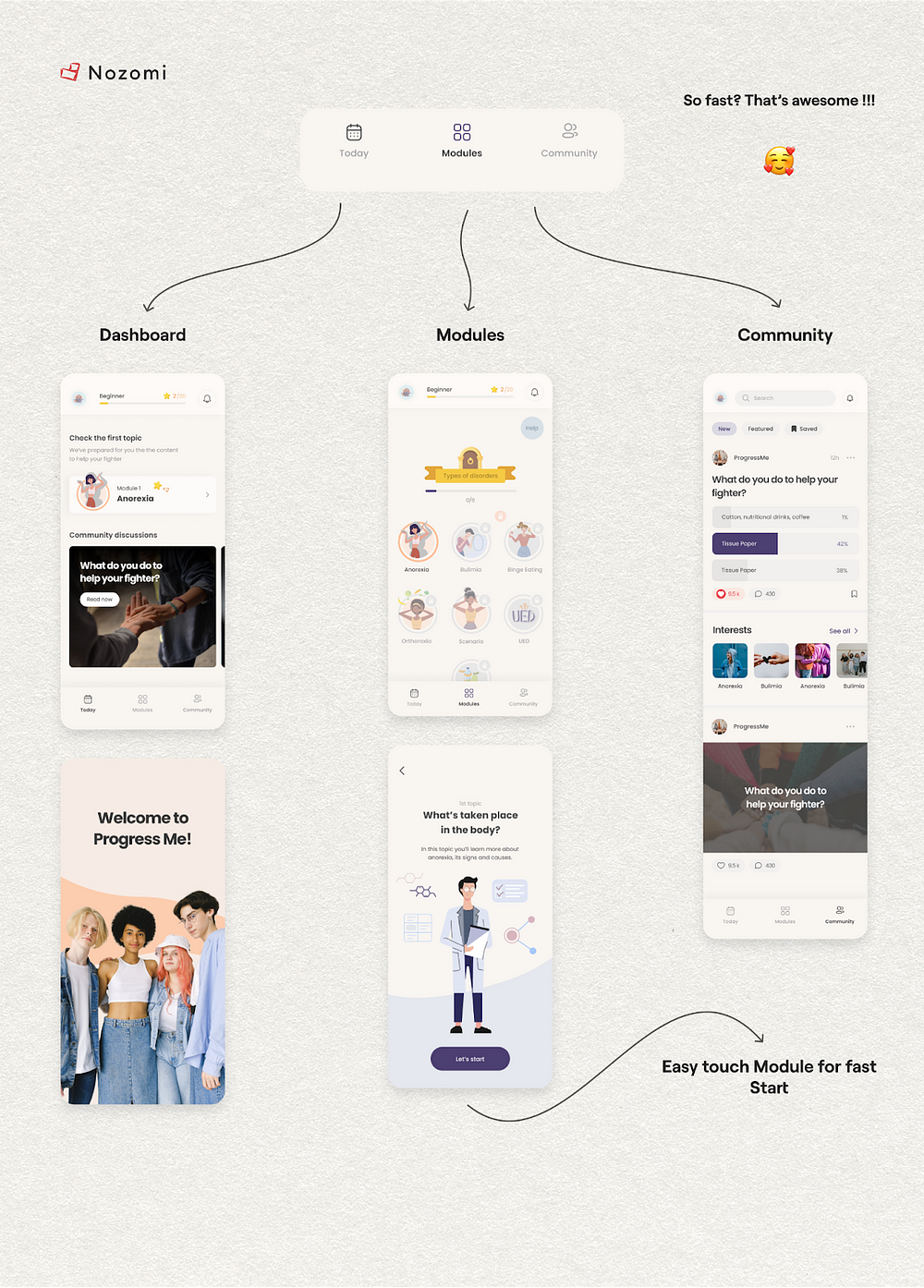
Note: a brief description is also necessary to reduce cognitive load, as the user must quickly understand what awaits them in the module.
And let’s finish Brand Identity problems with UI improvements
1. For a color scheme, there is a similar 3-point rule. You need to choose three colors:
1. Primary: the color of the brand, which focuses attention on itself and is responsible for the visual support of the brand.
2. Minor: usually a dark/black color that is responsible for the information on the page.
3. Optional: usually white, which is used as a background image.
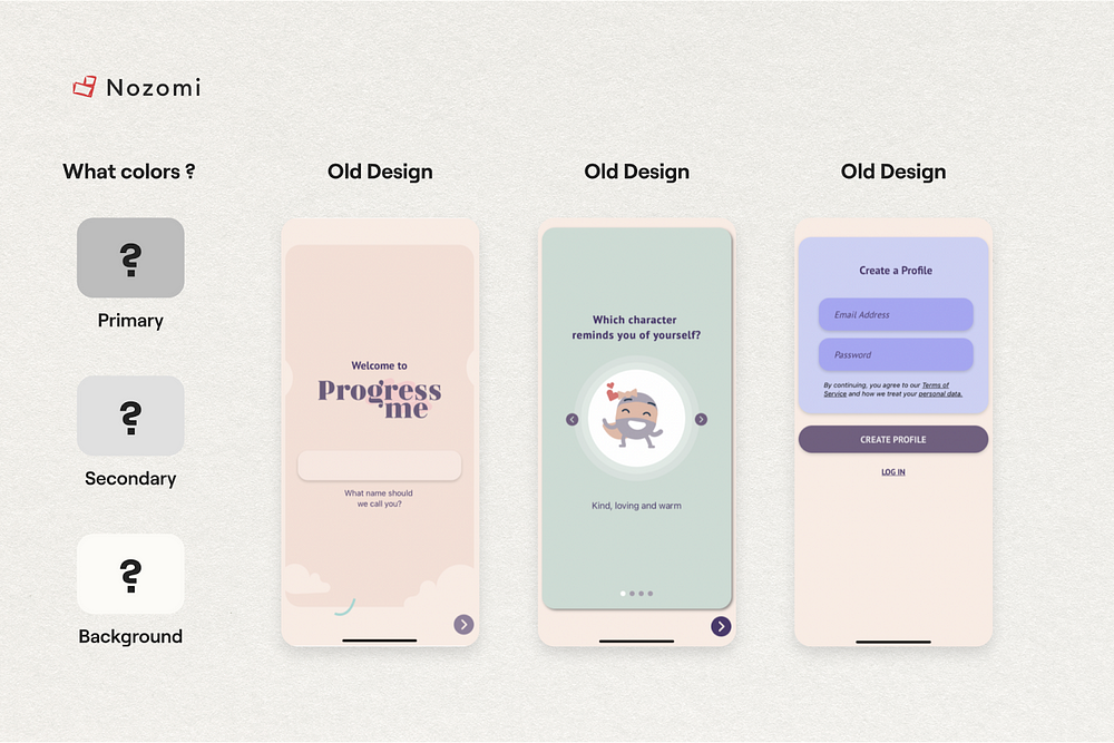
Many users were unable to identify the color palette of the brand, which can negatively affect the attention and responsiveness of users.
Let’s take a look at how this can be fixed. Important: functions highlighted with the main color are often used as hints for users inside the application for the convenience of obtaining information.
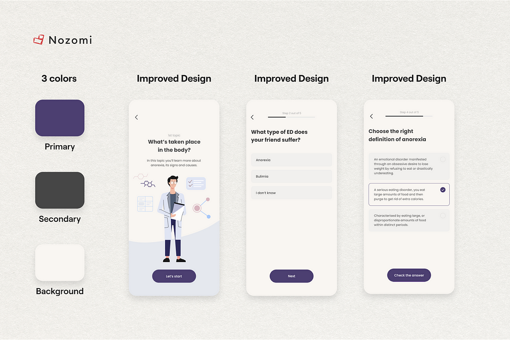
As you can see in the images above, we kept the brand identity and offloaded the visual part of the app. At the same time, focusing the user’s attention with the main color exclusively on the functional parts of the application.
2. “Childish” Illustrations?
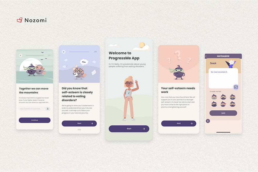
The partners asked us not only to keep the current variety of illustrations but also to improve them, to make them more “Adult-appropriate”.
The thing is that the past feedback from the audience (more than 20%) of the product identified a problem: pictures are associated with the entertainment of the application and cause distrust of the information received.
Yes, there are teenage groups among the target audience of the application. However, parents of these teenagers are also a significant part of daily users. Moreover, have you noticed that teenagers, on the contrary, reject everything childish and strive for something more adult?
In the example below, you can see our version of the illustrations, which, looking ahead, was well received by the current audience and received positive feedback.
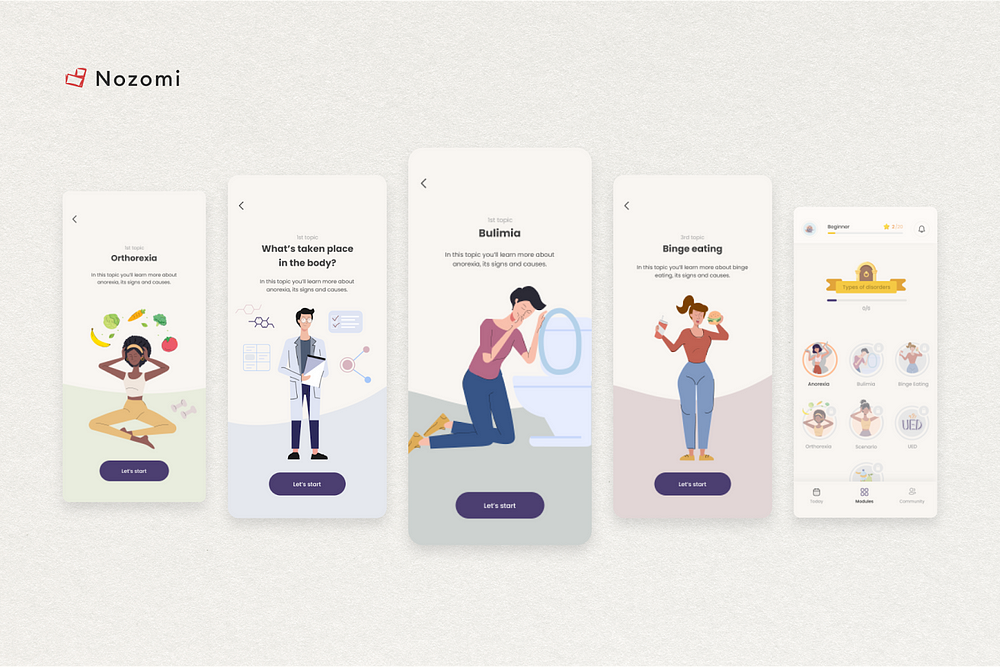
Pictures have become more detailed but retained their simplicity. The classic illustration style is more associated with the quality of the information provided, which has led to an increase in user confidence.
Also, now the illustrations correspond to the meaning of textual information, which greatly simplifies perception.
So why do we need illustrations?
Illustrations are added to a project for the purpose of visually explaining the current blocks of information.
For example, people first pay attention to visual elements and only then read the text. And in most cases, they don’t even read, because they don’t want to waste time and strain to get information once again.
That is, the ideal design in terms of the load is a design without text, consisting only of visual elements.
Unfortunately, however, this is almost impossible to do. But you can’t leave only text, otherwise, it will greatly overload users and they will leave the application in search of something simpler.
Then what should be the illustrations?
Illustrations should follow the color palette of the brand and the app itself, and match the level of detail required for the purpose of the app.
For example: if the goal of the application is to be as simple as possible and the target audience is school-age children, then the illustrations should be simple in detail.
Can illustrations be different?
The level of detail and style of the image should be consistent/consistent throughout the application, this is important as users will experience a uniform cognitive load throughout the application. That is, do not ride the waves of ease and difficulty, which negatively affects perception.
However, illustration colors may vary. This is necessary to visually separate information modules, which will speed up and simplify obtaining the necessary information.
The above reasons for speeding up and simplifying the reading of information affect the successful completion of onboarding (Total amount of Registrations), conversions to product subscriptions, User Engagement and Retention rate.
In conclusion, let’s talk about User Tests once more
So, we redesigned the application based on the experience of real users and world design standards.
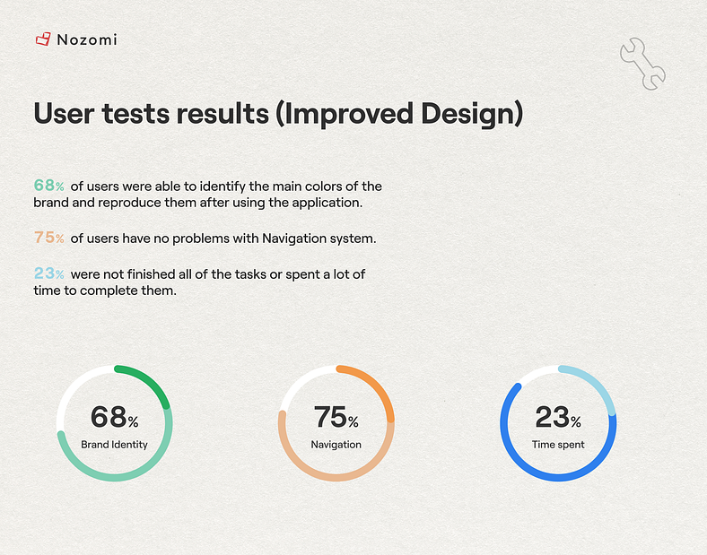
But to make sure that we did everything correctly, we will repeat our User Tests on the new version of the application.
1. The killer solution in the form of gamification allowed users to return to the application more often, as they were stimulated by an exciting process, “achievements” and unwillingness to lose progress.
The number of users who completed all the tasks and did them much faster increased by 65%. We were able to increase their motivation!
2. In addition, according to testing, the ease of navigation increased by 50%, which directly affects User Engagement in the daily use of the application and reduces the user churn rate.
Users no longer need to spend a lot of time and effort to find the information they need and perform the action they need.
3. As we can see from the test results, the visual identity of the brand has increased by 47%. We have kept a large variety of illustrations with different colors to separate information blocks.
However, users were still able to identify the primary colors of the brand as the 3 color rule was followed.
Thus, the following issues were solved:
1. Thanks to the introduction of gamification: the Retention rate and user retention were increased by 41%.
2. Due to the navigation improvements: the churn of users was reduced and the number of registrations increased by 194%.
3. Due to Brand Identity improvement: User Engagement has increased by 34%.
And here’s a review of our work from the ProgressMe Team:
“In the new app, we notice that features are now self-explaining and usually don’t need to be guided. The users understand what to do in the app. In customer meetings and from user feedback, we very often get comments on how good it is looking and how easy it is to use. This is the result of good UX and self-describing UI features…”
Basically, there are two main takeaways from the UI/UX design approach:
1. Improvements/Changes in the design should be based on analytics (user needs), and not on the personal desire of the Product Manager/owner or the Application Designer.
2. It is necessary to know the general world design rules in order to minimize the risks of problems when using the application.
As you can see, this design review helped to discover a lot of business problems. And we can solve these problems for you too.
Now, our Nozomi team has decided to conduct an experimental format of Free Design Reviews for everyone.
We will be finding errors that cause an outflow of users, poor Retention or poor conversions to purchases.
If you’d like us to provide you with a free Design Review of your Health app or landing page, don’t hesitate to contact us at m@nozomihealth.com
We’d love to learn more about your product 🙂
All you need to do is send us a link to the product/landing page.