What does it mean to be a good consumer healthcare company? In the past, it was measured by a combination of good products and effective marketing.
However, nowadays, the relationship between consumer health companies and their customers has undergone a profound transformation. Consumer engagement in healthcare is crucial, as customers are now highly discerning and expect convenience from applications, websites, or any other form of product.
Healthcare consumer behavior has evolved, and if the digital experience is poor (despite effective marketing and quality health products), the consumer will turn to a competitor who has more engaging experience.
Therefore, modern development of such platforms requires an immediate focus on a user-centric approach with an emphasis on healthcare customer engagement.
Consumer engagement in healthcare is not just about having a fancy app or website. It’s about truly understanding your customers and their needs, and then tailoring your products and services accordingly. This could mean anything from personalized treatment plans to educational resources that empower patients to take control of their health. And that’s what we’ll discuss now.
1. Make your platform accessible to all groups (must-have!)
A person may have various issues: poor vision, color blindness, or weak hearing. Moreover, issues with vision and hearing, in particular, are quite common among the elderly, who often constitute the customer base for health products. Healthcare consumer behavior varies across different demographics, so it’s crucial to design platforms that cater to diverse user groups.
How can we ensure we don’t lose such individuals? Let’s delve into the four main principles of WCAG (Web Content Accessibility Guidelines).
1.1 Perceivable: here we talk about alternatives
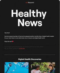
The first is lack of audio alternatives: some websites and apps may not provide an audio alternative to the text content displayed on the screen for those with visual impairments. Just imagine a scenario where the primary information on health products is written in small font.
To avoid this, we should utilize an audio track for these sections. Furthermore, if you have a blog section, you should also provide alternatives. For example, in the Medium app, where there is a substantial amount of text and we don’t have the ability to enlarge it, we offer an alternative to the user:
Source: GSK
Opposite point – lack of visual/textual alternatives or subtitles: for example, if your products have video description, вам стоит добавить субтитры к таким видео.
1.2 Operable: make the navigation intuitively understandable
1. Use clear and structured section headings (preferably accompanied by images, if possible).
2. After clicking on a heading or product position, provide the user with context about the topic or purpose of the page.
3. Show how many information blocks need to be navigated to find the needed block.
4. If you have a link within your medicine description or content, it should be evident from the context or link text what the link leads to.
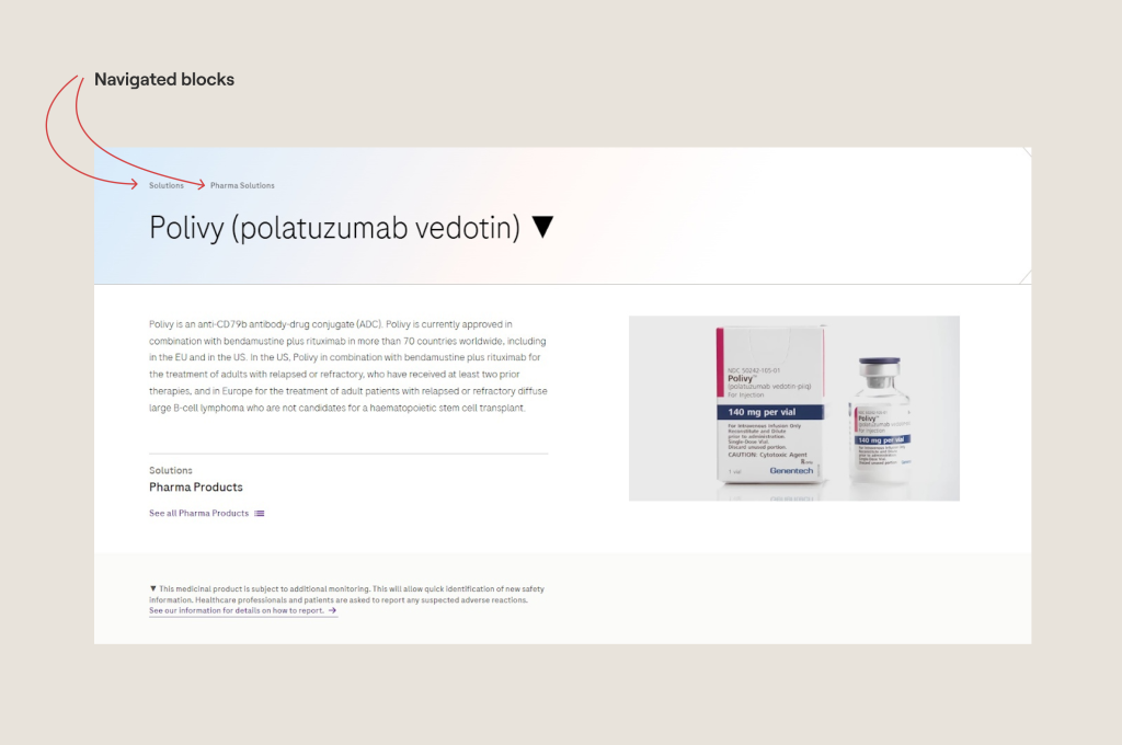
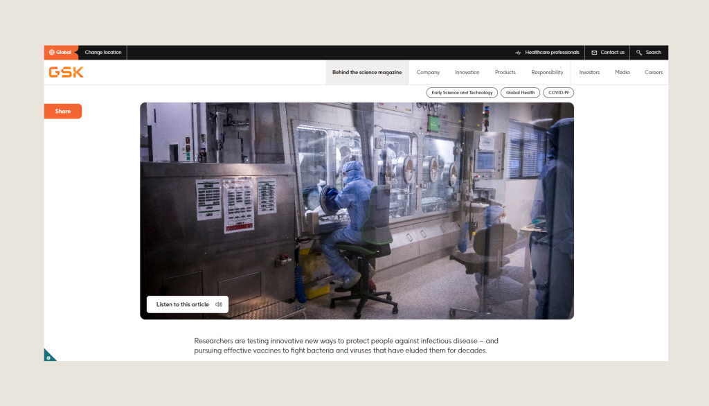
Source: Roche
1.3 Understandable: all information on interfaces should be accessible and easy to perceive for any individual, regardless of their health condition.
Prioritize readability: emphasize key words in bold, offer the option to enlarge text, and steer clear of abbreviations or slang that might be unfamiliar to your target audience.
And don’t forget to incorporate multilingual support: consider including language choices and localization features to cater to users from various linguistic backgrounds. Without this, users may face difficulty in navigating the app or website.
Provide input assistance: implement clear and informative error messages and feedback for tasks like form validation or crucial actions. This aids users with disabilities in comprehending and resolving issues efficiently.
A simple example from daily practice is when you encounter a message saying, “You entered the password incorrectly, check if Caps Lock is on.”
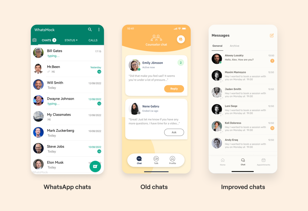
Make predictability: users don’t want interfaces to surprise them. They want everything to behave as expected. Therefore, it is important to better understand the applications that your users are using.
For instance, if your app or website includes telehealth features like chat or video call functionality, it is more effective to adopt a user experience similar to that of WhatsApp rather than reinventing the wheel.
1.4 Robust: ensure that your code is well optimized.
For example, if your application’s code lacks proper opening and closing tags, the content of the application may be:
– displayed differently on various devices;
– not displayed at all;
– or appear unreadable.
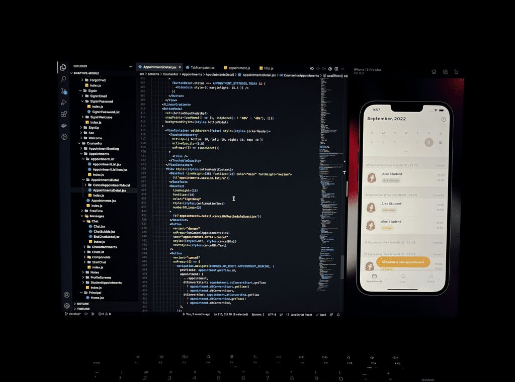
A correctly formatted HTML code, adhering to all markup language specifications, ensures that the structure of accessible content remains as intended on all platforms and devices.
Important! Additionally, there are accessibility levels chosen based on the balance between complexity and the desire to accommodate as many groups as possible. You can read our full article about all WCAG standards and its levels Here.
2. Simplify UX/UI for clear navigation
2.1 Prioritize information
The concept of visual hierarchy involves arranging design elements based on their significance, simplifying user navigation and information retrieval. Using clear and concise language is vital for conveying intricate ideas and enabling users to make well-informed choices.
During these instances, it’s beneficial to promptly inform the user of their current stage in using the app or website, along with specific actions they should take.
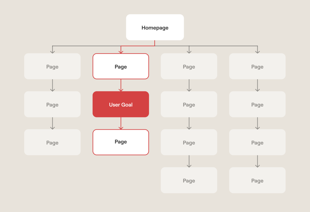
2.2 3 Click rule
Introduced by Apple, the core concept behind this is that users should be able to reach essential information within three clicks of opening the application. If a user requires more than three clicks and still can’t accomplish their intended action, it leads to an increased cognitive load.
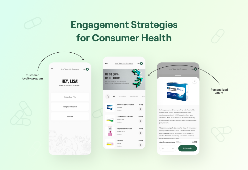
Let’s show scenario. User goal: find detailed information about medications “Painkillers”.
Homepage (click 1): the user lands on the homepage and sees a prominent search bar and navigation menu.
Search for medication (click 2): the user enters “Pain” in the search bar and the search results page displays various medications, including “Painkillers”
Access medication details (click 3): the user clicks on the “Painkillers” result and is directed to the dedicated page for “Painkillers” where they find detailed information, dosage instructions, side effects, and more.
2.3 Simplify related components
By adhering to the principle of Prägnanz, we can elevate the user experience by streamlining associated components. Our brains tend to perceive visual elements as cohesive entities rather than individual parts. By categorizing content into distinct groups, users can effortlessly digest and engage with the information.
To signify that content is part of a particular group, there are several effective techniques at our disposal. We can implement dropdown menus to consolidate related items, employ consistent background colors or borders to visually link elements, or utilize similar styles and sizes for menu icons.
For instance, how it can be. Scenario: user goal is to navigate through different categories of medications for specific conditions.
Homepage (visual perception): the user lands on the homepage and sees a clear navigation menu with categories like “Cardiovascular Health,” “Mental Wellness,” “Digestive Health,” and more.
Selecting a category (dropdown menu): the user is interested in cardiovascular health, so they hover over the “Cardiovascular Health” category in the menu. A dropdown menu appears, displaying related sub-categories like “Blood Pressure Medications,” “Cholesterol Management,” and “Heart Health Supplements.”
Exploring sub-category (consistent design): and the user clicks on “Blood Pressure Medications.” They are directed to a page listing various medications for blood pressure management. Each medication listing maintains a consistent design, including similar font sizes, colors, and icon styles.
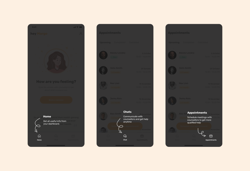
More simple example: in the picture below, on the left, we wrote the word “Journal” below the icon so that the user would understand its meaning in the future. And on the right side of the interface, we repeated the same-sized icon without the label.
In later stages, detailed descriptions of familiar elements become unnecessary for the user. With each interaction in the app, we not only maintain manageable cognitive load but also diminish it.
3. Use emotional techniques to capture customers
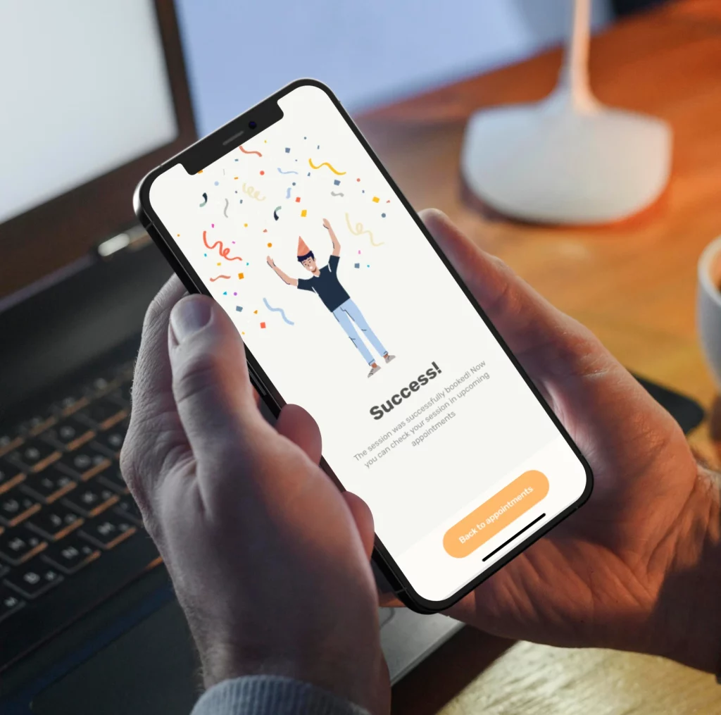
3.1 Haptic feedback: a powerful technique to enhance healthcare customer engagement is through the use of haptic feedback. By integrating tactile sensations like gentle vibrations or touch responses, digital health apps can offer a more interactive and captivating user experience.
For example, for one of products, we implemented vibrations for different scenarios:
1. Upon task completion, users feel a prolonged yet gentle vibration, signifying their achievement of a positive milestone.
2. In the case of an error, a sharp vibration prompts the user to take notice of what needs to be corrected.
3. A gentle vibration is used for important buttons like “buy button” or “submit form” in a section.
3.2 Sound design: it is pivotal in establishing the atmosphere and forging emotional bonds. Carefully selected sound effects, soothing tunes, or uplifting prompts have the power to evoke positive feelings and foster a deeper connection with the app or website.
For example, using an increase in bright tones during the purchase of health products can elevate the overall user experience and promote emotional healthcare customer engagement. Or another example: if you want to calm down users you should use matching calm sounds.
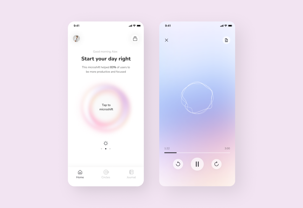
3.3 Illustrations and animations: they help not only make the app/website beautiful and attractive but also do something more — tell a story and trigger emotions.
Images possess the power to convey and accentuate messages. At times, an illustration can convey far more than spoken words. It has the ability to mirror users’ emotions, show empathy, and celebrate their achievements.
Illustrations play a crucial role in conveying brand values. They assist in articulating and expressing brand principles in a non-verbal manner to users. A brand embodies a personality, and appealing illustrations help bring this personality to life, leaving a lasting and distinctive impression.
It’s widely believed that a more complete aesthetic experience can be achieved by engaging three additional senses. The harmonious integration of sound, haptic feedback, and visuals can render the user experience truly unforgettable.
4. Engage with data-driven approach
In an era defined by data, the pharmaceutical retail and consumer healthcare industries are leveraging the power of analytics to gain profound insights into healthcare consumer behavior and preferences.
Data analytics has become the compass guiding companies toward a deeper understanding of their customers.
Here, we explore how data analytics is transforming the landscape of consumer health and enabling companies to offer more personalized and effective services.
4.1 Sorting data for customer insights
We can collect vast amounts of data from various touch points like purchase history, and customer demographics. This wealth of information provides a treasure trove of insights waiting to be unearthed.
To begin harnessing data analytics effectively, companies need to identify the key metrics and data sources that matter most to their operations. Customer data is often derived from multiple channels:
Purchase history: analyzing what products or medications customers have purchased can reveal their health needs and preferences.
Demographics: understanding the age, gender, location, and other demographic factors of customers helps in tailoring services.

Online interactions: tracking user behavior on websites and mobile apps provides insights into their interests and pain points.
And these different customer data we can use for improving features (for example, if we see that elderly people leave a shopping basket, we can fix the payment and do it easily), marketing campaigns and personalized offers in an app/website.
Yep, personalization extends beyond addressing customers by their names. It involves offering personalized product recommendations, health tips, and exclusive promotions based on individual preferences and needs.
Again, consumer engagement in healthcare is not a one-size-fits-all approach. By analyzing data on customer demographics, purchase history, and online interactions, companies can tailor their engagement strategies to specific customer segments.
For instance, a customer who regularly purchases allergy medication may receive notifications about pollen forecasts and discounts on relevant products.
Or even for big pharma apps: data analytics can help in delivering tailored health tips, exercise routines, and dietary suggestions based on an individual’s health history and goals.
Thus, thanks to the correct sorting, we understand in which places digital health engagement is required. Also you can use user tests: it’s the big one. In this technique, we give a prototype to users and evaluate their behavior. We even write about how to make this in a separate article 🙂 You can read it Here.
4.2 Predictive analytics for patient outreach
Pharma retail and consumer healthcare companies are leveraging predictive models to identify high-risk patients, tailor outreach strategies, and ultimately improve patient outcomes.
The foundation of predictive analytics lies in historical data. Companies accumulate vast datasets encompassing patient demographics, prescription history, medical conditions, and more. By harnessing this data, predictive models can identify patterns and correlations that might escape human analysis.
One of the primary applications of predictive analytics is identifying high-risk customer groups. By analyzing historical data, algorithms can pinpoint patients at risk of medication non-adherence, disease exacerbation, or hospital readmission.
Because of this we can create medication adherence programs that are tailored to individual patients. Patients at high risk of missing doses receive personalized reminders and support, enhancing adherence rates.
Or we can understand predicting health trends and risks. Predictive models can foresee health trends and potential risks. For example, during flu season, the system may anticipate an uptick in respiratory medication demand. Companies can then stock inventory accordingly and communicate proactively with at-risk patients.
And we prevent health issues before they arise. For chronic disease management, predictive analytics can help prevent health issues before they escalate. High-risk patients may receive personalized care plans, telehealth consultations, or lifestyle recommendations to keep their conditions in check.

Conclusion
We hope this article was useful for you!
Who we are? We are a digital health product studio, who transforms healthcare digital experiences and sets new standards for delivering digital healthcare in a way that positively impacts people’s lives.
We assist healthcare startups in designing and developing digital products, while also helping healthcare organizations undergo transformative changes.
If you are interested about our experience check our portfolio with case studies by the link or you can read more about us here.
And write to us now on m@nozomihealth.com and we will discuss how we can help ensure that your product brings real benefits