One of the reasons why we created Nozomi was because we wanted to make things easier for people. Easier to get treatment, easier to manage chronic conditions, and easier to monitor their current state. Digital health trends are all about making healthcare more accessible and user-friendly, you know?
We understand that even the smallest issue still requires effort from a person. But what does it take to minimize that effort? Making the product highly adaptive: this involves conducting customer development/user tests, utilizing global UX practices, and refining onboarding.
However, these are the basics that everyone knows. In this article, we’ll go further and touch on new product trends, so that in addition to the usual foundation of a digital health product, it gains distinctiveness in the market (meaning competitiveness).
By the way, before we dive into our article, for keeping track of emerging digital health trends, you can explore our selection of 100 resources (books, guides, websites, and influencers) about Product Management, UX, Technology, Healthcare market trends, and Product Marketing.
Download List of 100 resources for digital health startup founders & managers
This way, you’ll always stay in the loop of the industry and cover all the fundamental aspects needed to create a Digital Health product.
I. AI companions
Another effective strategy to engage and retain patients involves implementing a data-driven approach to achieve personalization, but with automatization. How to do this?
Use personalized algorithms: AI companions. This is one of the hot digital health trends these days, leveraging AI to deliver tailored care.
In fact, artificial intelligence often possesses a wealth of information beyond our human capacity. AI translates into treatment or rehabilitation plans that are statistically more effective. By analyzing the outcomes of other patients with similar patterns and issues, AI can customize programs accordingly.
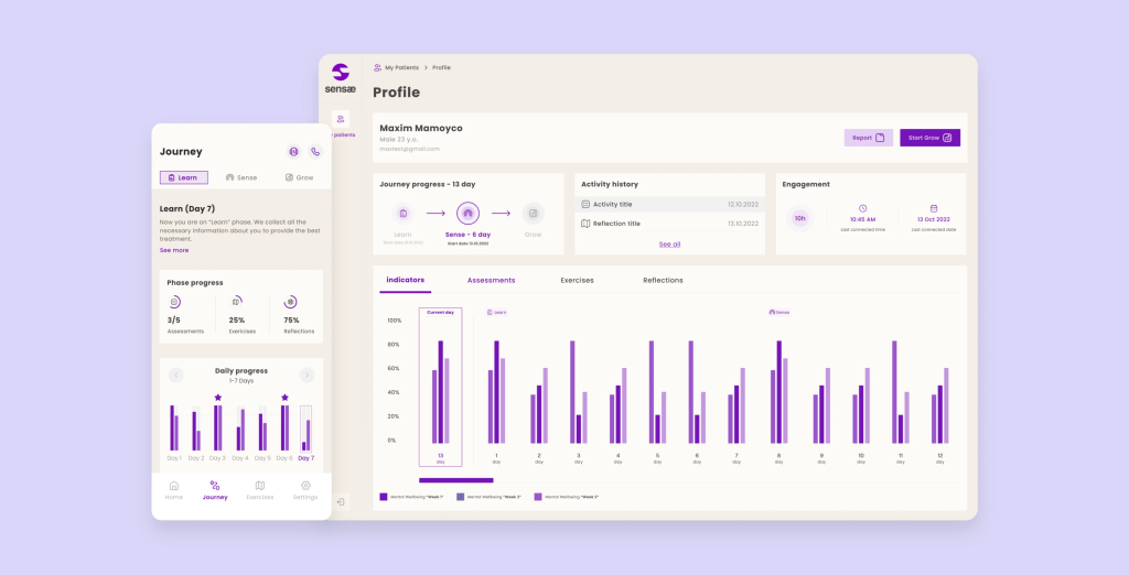
For instance, we engineered an AI-powered application for Sensae that meticulously evaluates the user’s current condition and offers tailored recommendations for subsequent actions.
Here’s a bit of context: Sensae, a Danish mental wellness company, assists individuals in managing stress and anxiety by utilizing AI to interface with emotions through personalized haptic biofeedback.
What’s more, AI doesn’t solely rely on user responses and completed exercises within the application for data collection. Users also wear devices during app usage that track metrics like pulse, heart rate variability (HRV), and various other vital signs.
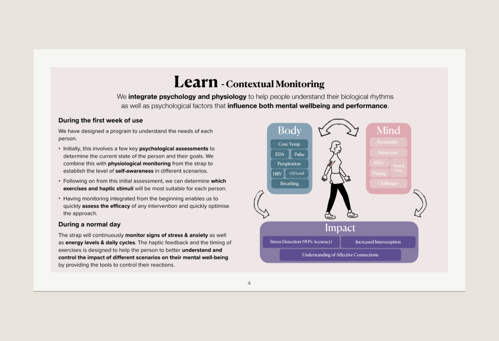
This data is then processed by AI, generating analytics that assess the user’s present state and provide recommendations for further steps.
Subsequently, doctors can interpret these analytics during user visits, or users can independently access and review the results.
Learn how we’ve built AI health platform for Danish company
Also with the power of AI algorithms, specialists can analyze complex medical data with unprecedented speed and accuracy. These algorithms can detect patterns in imaging, predict disease progression, and suggest treatment.
And we can see benefits for companies: operational efficiencies and cost savings, ability of handling a larger volume of diagnostic work and competitive edge.
Well, what can we do with the received data for personalization in more detail?
II. Patient Health Journey
To guide patients through their evolving health needs, we must develop personalized care plans and implement a framework that encourages proactive steps. The patient journey should encompass the following elements:
2.1 Comprehensive health profile
Offer a holistic perspective of an individual’s health and requirements through continuous data collection, including health assessments, wearables, and objectives.
This extensive health profile consolidates vital information about the individual’s medical history, current health status, lifestyle choices, and specific health objectives. By integrating data from health assessments and potentially wearables, alongside individual health goals, the platform can generate precise insights.
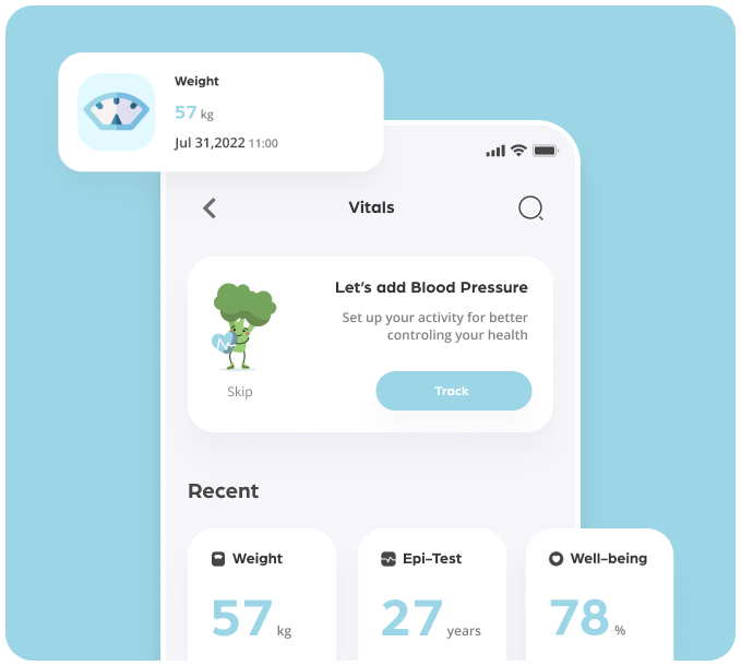
The ongoing data collection ensures the profile remains dynamically updated, mirroring the individual’s ever-changing health journey. This current information becomes pivotal in tailoring interventions, suggestions, and care plans.
It empowers both users and healthcare providers with an in-depth understanding of the individual’s health trajectory, enabling more informed decisions and targeted support.
In this manner, the digital health product will be adept at enhancing patient outcomes and bolstering patient engagement.
2.2 Tailored care plan
To formulate such a plan, you can employ personalized tasks in various formats that guide users along their journey. This creates a structured path.
Certainly, if your target audience includes elderly individuals, routine tasks in the form of notifications will be suitable. These notifications will contain specific reminders based on the personalization obtained through the health profile. For instance:
Drug interaction alerts. Furnish warnings regarding potential interactions between prescribed medications and over-the-counter drugs or supplements.
Dose adjustments. Recommend precise dosages based on factors like age, weight, gender, and specific health conditions.
However, for more robust engagement, we require an engaging pathway, and tasks fulfill this role.
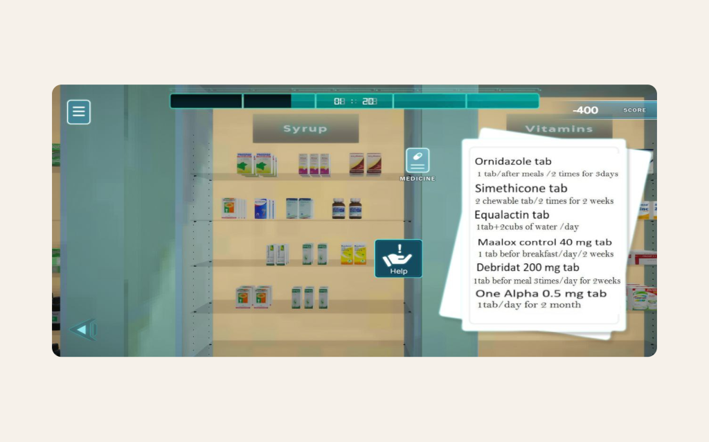
Gamified tasks acknowledge the user’s dedication and effort in completing the test by offering them a meaningful reward. For instance, you can employ gamification and provide users with “+N experience points” in a game. This recognition is crucial in appreciating their commitment and motivation.
Alternatively, we may subtract -400 points for non-compliance or incorrect task completion:
Source: Pharmlator
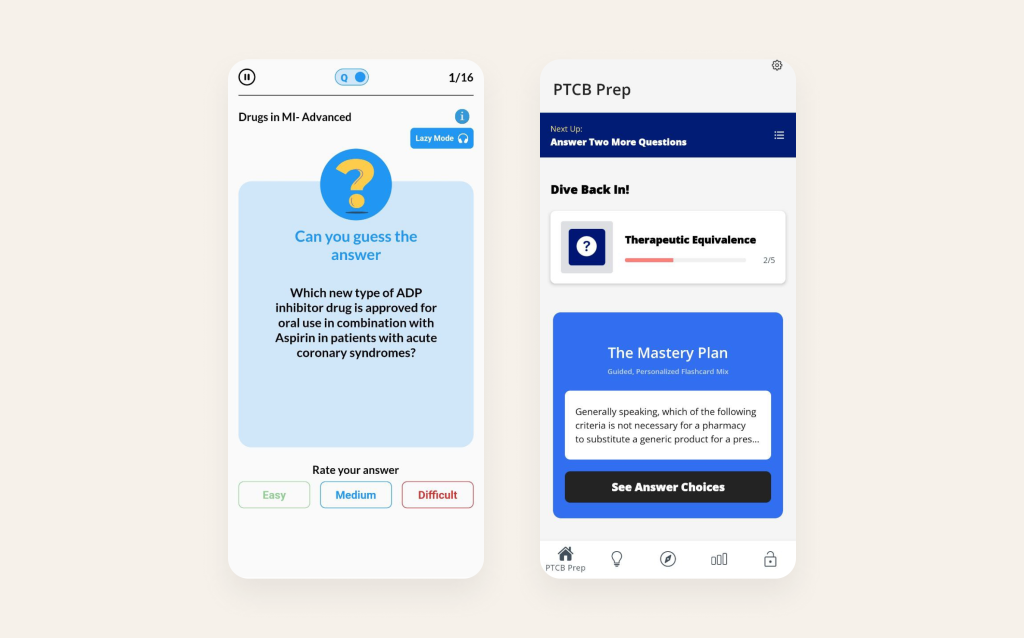
Furthermore, every completed task contributes to your progress, indicating the number of tasks completed out of the total:
Source: Medipuzzle & PTCB Exam
For story-based tasks, let’s showcase an example from our company’s internal platform:
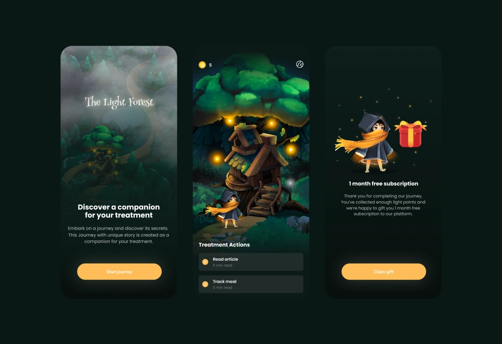
In our internal project, we’ve adopted an innovative approach to involve patients in their treatment process by integrating it into an engaging narrative.
Rather than following a traditional treatment plan, patients embark on a mini-quest inspired by a captivating storyline, which leads them through the tasks outlined in their treatment plan.
These tasks include educational materials. This addresses the challenge of maintaining consistent illness management, a crucial daily requirement that is often overlooked, resulting in less-than-optimal retention and adherence.
2.3 Tracking user progress
What keeps people engaged in tasks and gamification in consumer healthcare products? It’s because they have already amassed significant progress that they’re unwilling to relinquish.
They’ve invested considerable time, recognizing the effort put into attaining a high level or rank, and they can even compare it with other users (which undoubtedly fills them with pride).
For instance, you can introduce levels for medical intakes or exercises.
As an aside, we can also provide an example from a completely different industry: Habitica.
It’s a platform that gamifies task completion in the style of MMORPG quests, granting levels, armor, and weapons for their completion. Some members of our team use it to record fitness and other activities as well. And using this approach we can gamify consumer healthcare products.
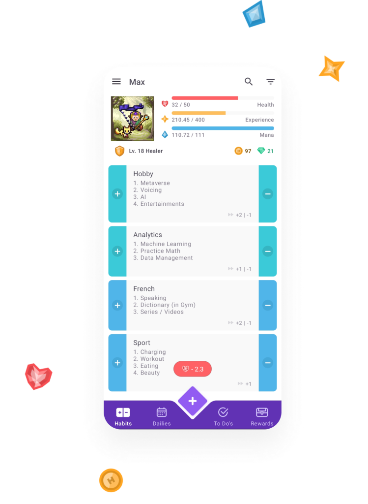
In essence, negative motivation is at play: if the user fails to complete a quest, they stand to lose their level and health.
III. Interactive Education
One of the initial steps in our approach is to ensure that users leave with a profound understanding of their health.
It equips them as more informed and engaged patients, preventing them from feeling lost during their journey towards conversion. In certain cases, it may be beneficial to include detailed descriptions of diseases and/or recommended supplementary medications.
Conversely, providing patients with the opportunity to educate themselves and gain deeper insights into their health concerns can significantly enhance their engagement.
And the best way to involve users in learning is to use interactive. Here are examples of digital health apps from our practice that successfully utilize interactive educational features:
3.1 Microshift Is a Swedish mental health platform which helps people shift into a reflective state and make a habit of doing more of what matters most.
In the app, we implemented audio content selection on the home screen that is tailored to address specific user problems.
Moreover, in addition to the simple audio track with a guiding voice during meditation sessions, users also focus on a circle that further indicates the specific actions required from the user at that particular moment in time.
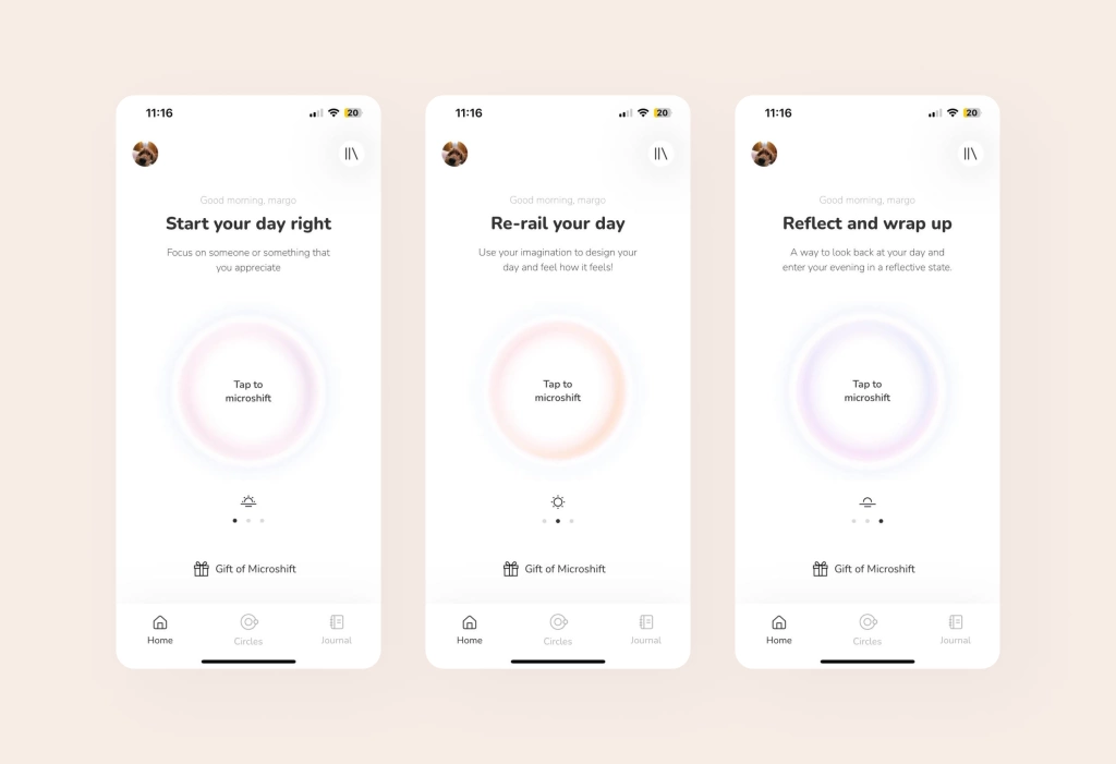
3.2 Incorpo Studio is a swiss brand, which offers online restorative exercise, personalized and intuitive, with professional guidance, anytime and anywhere.
Here we provide personalized health information and video lessons based on user-input symptoms, pains and fitness levels. The app engages users through interactive questioning, providing tailored information about potential health concerns.
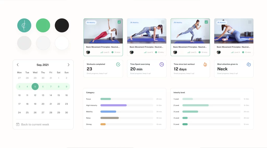
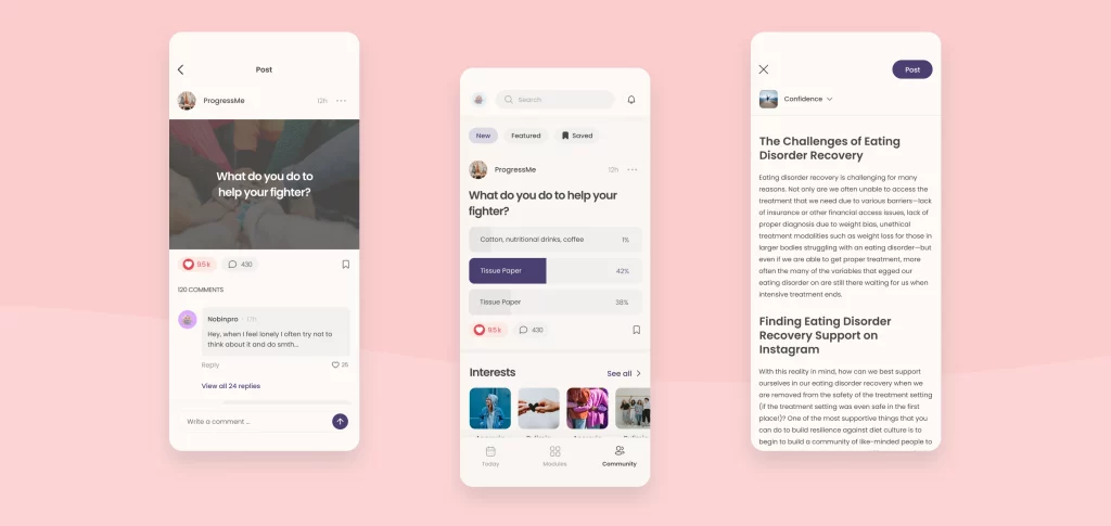
3.3 ProgressMe is a Swedish company that helps young people who are suffering from an eating disorder, contributing with a simplified app for good help.
Learn how we’ve built platform for eating disorder treatment
Here we introduced functionalities like creating polls and generating content, complete with comment sections for discussions.
Remember, social networks have gained worldwide popularity for a reason. After all chances are, you’ve encountered situations where adversity strikes. Yet, when you come across someone who has faced the same challenge, there’s a sense of relief, as if things suddenly seem more manageable.
To evoke this effect, it’s crucial to cultivate a community of genuine individuals within the app: a space for communication, support, and sharing triumphs in their journeys to recovery.
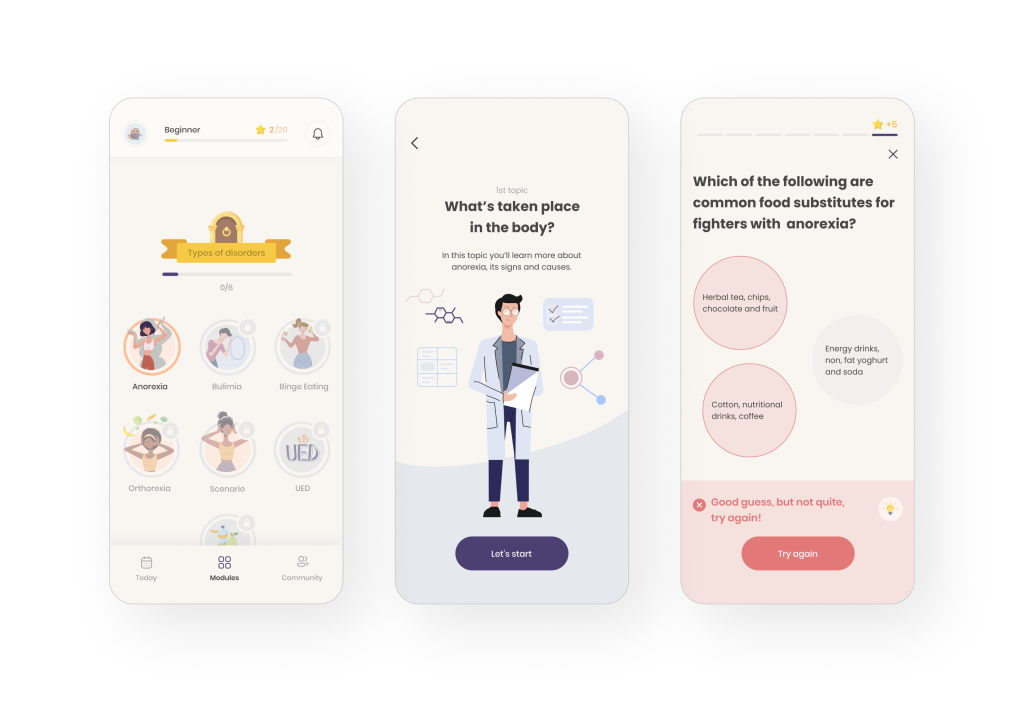
But we went further and created working progress with a gamified educational journey (like in Duolingo). We see the entire journey that needs to be completed and earn XP, which motivates us to take on more quests and improve us.
Moreover we made small education challenges because gamification should be enjoyable while also promoting educational goals.
These apps succeed in engaging users through interactive educational features because they:
1. Provide personalization: they offer content that is tailored to the user’s specific needs, preferences, and health goals.
2. Offer practical guidance: they provide actionable advice, exercises, or techniques that users can apply in their daily lives.
3. Encourage regular use: the interactive nature of the content encourages users to return to the app for ongoing learning and support.
4. Promote positive behavioral changes: by educating users about healthy practices, these apps inspire them to make positive lifestyle changes for better health outcomes.
Overall, the combination of interactivity, personalization, and practical guidance makes these apps effective in educating and empowering users to take control of their health and well-being.
IV. Gamification for Enhanced Digital Health Experience
Gamification techniques have the power to transform digital health apps, making them not only functional but also enjoyable, and boosting user motivation.
Elements like challenges, badges, levels, and rewards turn health-related tasks into engaging activities, greatly enhancing the emotional and UX design aspects of mobile health apps.
Beyond the fun factor, gamification provides users with a sense of accomplishment, progress, and healthy competition. This emotional connection serves as a powerful motivator for users to continue using the app and maintain healthy habits.
For example, in the ProgressMe app, designed to support individuals with eating disorders, we implemented gamification elements to create a dynamic and immersive user experience. This involved integrating reward systems, achievements, leaderboards, and rankings.
For instance, as shown in the image below, users have the option to personalize their avatars, instilling a sense of ownership and personal progress. Additionally, we established a system of rewards and achievements that users can earn by actively participating in the community, such as creating topics and providing answers.
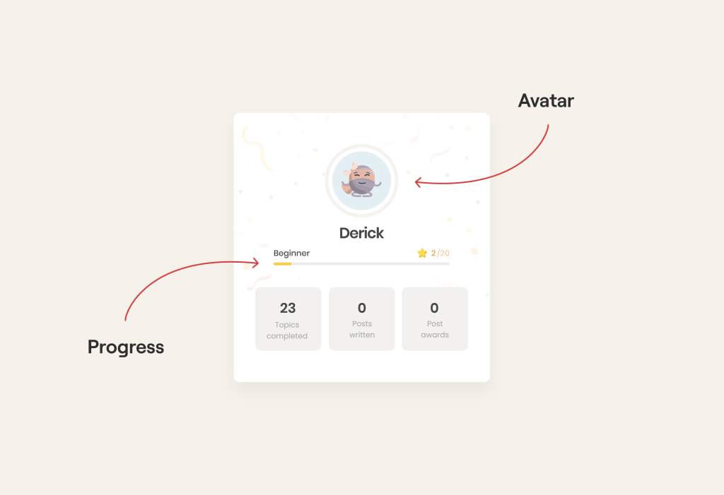
By enabling users to craft their avatars and fostering a sense of ownership, we bolster User Engagement. Simultaneously, through their valuable contributions to the community, users are more likely to revisit the app, ultimately enhancing overall Retention.
Now, let’s delve into the intricacies of the reward system depicted in the image:
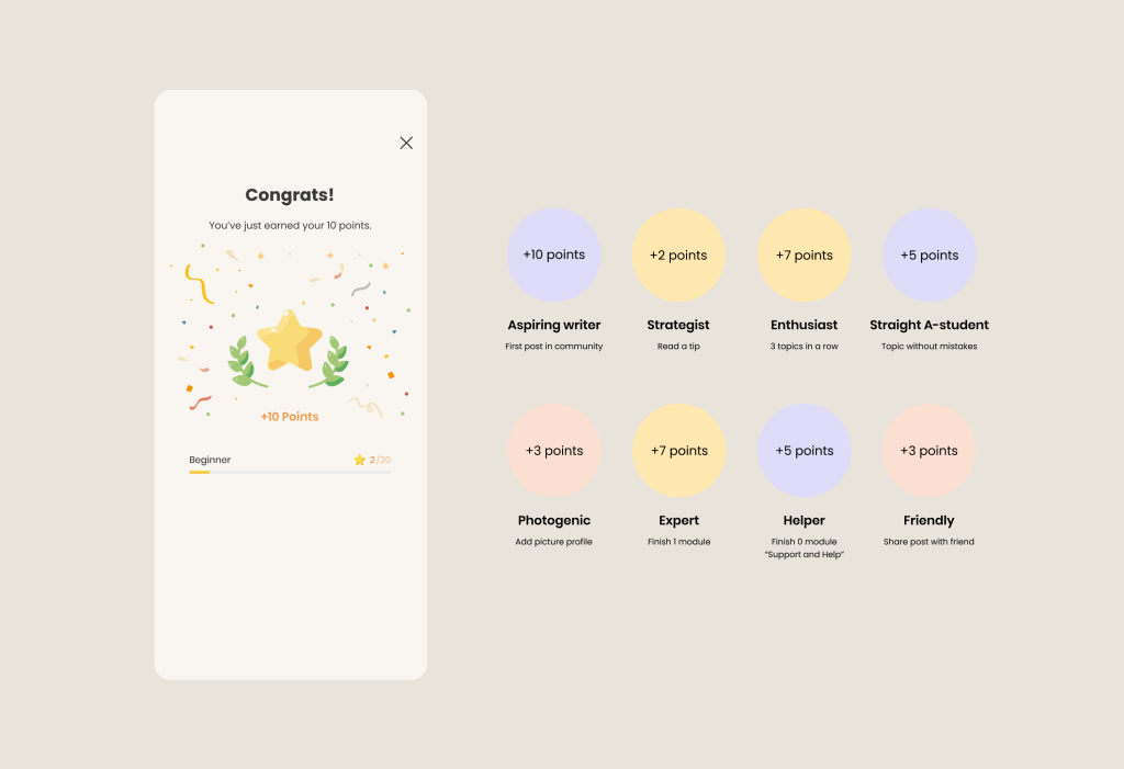
We’ve implemented a comprehensive system that acknowledges and rewards users for advancing their own progress. As you may know, avid gamers often replay games solely to attain a coveted “achievement.”
The key here lies in the fact that in order to make progress and earn an “achievement,” users need to engage with the product regularly. Therefore, it’s imperative for boosting the Retention rate and related metrics that influence revenue, such as LTV and ARPPU.
V. Partnerships for better competitive advantage
And finally, the most effective startups aim to collaborate with other services to quickly and maximally address user needs. Because while it’s great if your product tackles the issue of poor health through exercises, the competition might also deliver medications on top of that.
How can you swiftly resolve this? Through collaboration. Let’s explore the types of collaborations that exist.
1. Marketplaces: a Digital Health platform could partner with various healthcare providers, offering users a centralized platform to access a wide range of health services, from booking appointments to ordering medications.
Marketplaces consolidate diverse healthcare services, providing users with a one-stop solution for their healthcare needs. This streamlines the user experience and grants them access to a variety of services within one ecosystem.
2. Complimentary services: a fitness tracking app could potentially partner with a nutrition app to offer users a comprehensive health and wellness experience by integrating diet and exercise tracking.
Integrating complimentary services enriches the user experience by offering a holistic approach to health. Users can seamlessly combine different aspects of their health journey, leading to more comprehensive and effective outcomes.
3. Data sharing and integration: health apps could collaborate with wearable device manufacturers to integrate data from wearables, providing users with a more comprehensive view of their health metrics.
Data sharing and integration enhance the accuracy and depth of health information available to users. This can lead to more informed decision-making and personalized health recommendations.
4. Telehealth partnerships: telehealth platforms could partner with healthcare providers to facilitate virtual consultations, expanding access to medical services.
Telehealth partnerships extend the reach of healthcare services, especially to underserved or remote areas. It enhances accessibility and convenience for users seeking medical advice.
And remember, successful partnerships in digital health should focus on enhancing user experience, providing valuable services, and ultimately improving health outcomes. Each partnership should align with the app’s core mission and cater to the needs of its target audience.
VI. Behavioral Design for better habits
To achieve positive outcomes in digital health solutions, it’s crucial to assist users in forming beneficial habits. Ultimately, such an approach leads to improved retention.
BD often involves making gradual and consistent changes over an extended period. But how do we ensure our app becomes a new habit for users?
Behavioral design offers solutions to this question. The most common approaches include:
1. Promoting consistent actions, such as through push notifications or gamification (CAR model).
2. Highlighting social proof, demonstrating that others have succeeded, and so can you (MINDSPACE approach).
3. Substituting one motivation with another (Fogg Model).
4. Introducing the app gradually over a few months, so users don’t feel overwhelmed by its persistence (Transtheoretical model).
But which strategy is right?
The answer lies in the nature of your product and the specifics of the Digital Health field. For managing chronic conditions, the “CAR model” proves to be highly effective, while mental health applications can benefit from the MINDSPACE approach.
Let’s delve into a practical example of a behavioral model using our partner Microshift. Microshift is a Swedish mental health platform designed to guide individuals into a reflective state through short, 3-minute audio sessions, helping them cultivate habits aligned with their core values.
In collaboration, we implemented the CAR model to help users establish a routine of engaging in daily “shifts”. The CAR model encompasses a cycle involving Cue, Action, Reward, and Investment.
After users experienced this cycle repeatedly, the habit of regularly opening and using the app became deeply ingrained. Internal triggers were activated, propelling the user toward significant personal transformation.
On these slides we explained this model in more detail. And if you’re curious to learn more about behavioural models, check the full article Here.
And if you want to delve in common trends: here we wrote about Healthcare Technological Trends


