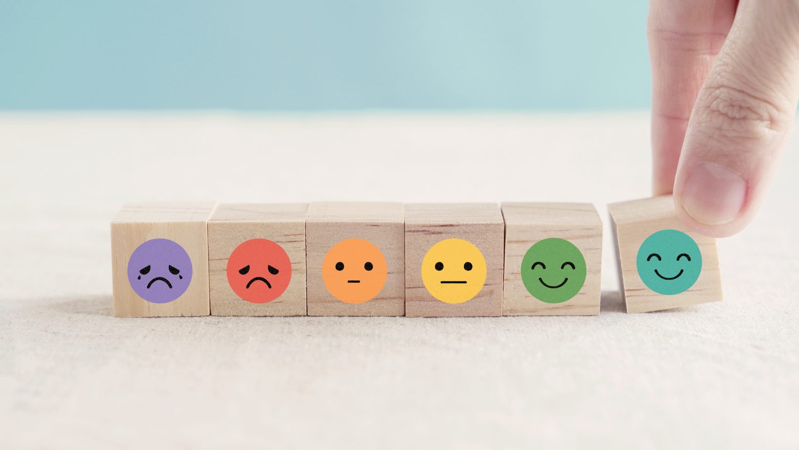
Healthcare UX isn’t just about making apps look good—it’s about reducing stress, improving adherence, and guiding patients effortlessly through their health journeys. A well-designed experience can be the difference between a patient following through with treatment or dropping off entirely.
But what if UX could do even more? Imagine interfaces that predict needs before patients ask, use haptic feedback to influence subconscious behaviors, or turn therapy into a rewarding quest.
In this article, we explore unexpected ways UX is reshaping patient experiences, making healthcare more engaging, intuitive, and even comforting.
By the way, we’ve also included a list of additional tactics focused on engagement, retention, and other key metrics—check it out below!
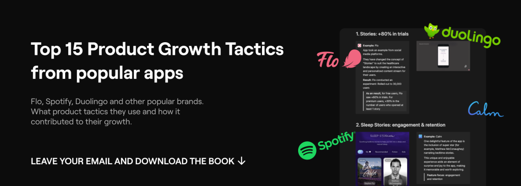
Top 15 Product Tactics that use popular Digital Health Brands for Growth
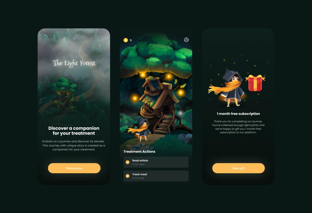
1. No More Meaning… unless you set a Goal.
Gamification Meets Therapy. Sometimes, it’s hard for patients to stay engaged with exercises if they don’t see the bigger purpose.
So why not bring the addictive mechanics of mobile games into healthcare? Imagine a mental health app where patients level up by completing therapy exercises, unlock new mindfulness techniques, or earn rewards for tracking their emotions. Even chronic disease management apps could use progress bars and achievement badges to improve adherence.
For example, in our internal app, we created an entire storyline where every healthcare task feels like a meaningful step in the journey.
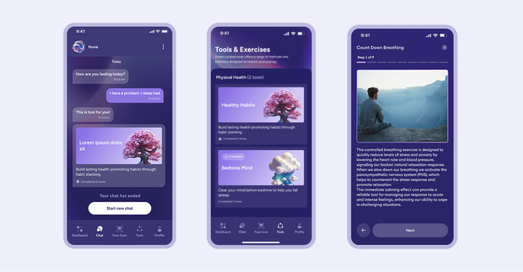
2. Predictive UX? Yes, for Personalized Care Paths
Users are overwhelmed with countless options and won’t always take the time to navigate an app. But an AI companion can instantly provide what they need.
For example, in the mental health app Nuna, we built an AI-powered chat that delivers exercises and tools directly—no searching required. Plus, everything is personalized to the user.
3. Influencing the Subconscious Mind: Haptic Feedback
Telehealth often lacks the human touch—literally. But what if your smartwatch or smartphone could simulate the feeling of a doctor pressing on your abdomen, testing reflexes, or checking muscle tension through haptic feedback? This could enhance remote examinations and create a more immersive diagnostic experience.
For example, we implemented this in the mental health platform for students Allbry.
We implemented vibrations for different scenarios:
1. When a task is completed, there is a long but smooth vibration that emphasizes that the user has accomplished something positive.
2. When an error occurs, the vibration is sharp, which prompts the user to pay attention to what should not be done.
3. A gentle vibration is used for important buttons like “submit form” in a section. The goal is not yet fully achieved, but a positive foundation has been laid 🙂
This approach makes the user more conscious and therefore more engaged. And it reduces the risk of high user churn.
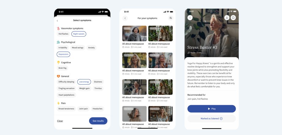
4. Emotionally Aware UX Design
Healthcare apps should not just be efficient—they should feel human. Subtle animations, reassuring micro-interactions, and even the tone of language used in alerts and messages can significantly impact how a patient feels when engaging with a digital health platform.
Moreover, the key is to match user needs with the right content.
For example, in the Singapore-based Spring of Life menopause platform, we used personalized recommendations, including treatment options, videos, audios, and articles.
This feature offers a solution by curating content—based on user specific symptoms and lifestyle. This ensures you receive relevant, actionable insights to manage the menopause journey effectively, without the frustration of sifting through generic advice.
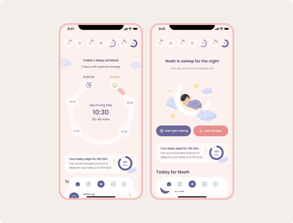
5. More Than Just Aesthetic
Circles are a powerful UX design element, often used to create a sense of continuity, focus, and flow. Unlike sharp edges, circles feel natural and inviting, guiding users seamlessly through an experience.
For example, we realized this concept in the Sweden BabyNaps app. Only what the user needs: we’ve reduced a significant amount of information and buttons that could increase user cognitive load, and added a calendar for easier tracking.
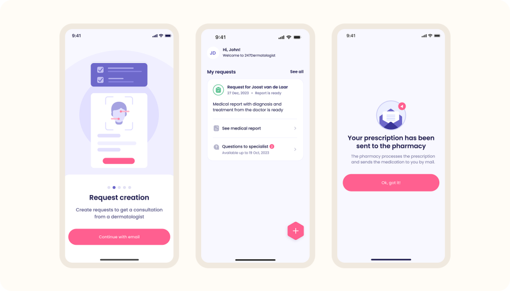
6. Loop-Based
And the last: instead of overwhelming patients with multiple choices, use looped design where decisions flow naturally.
Example: In a medication adherence app, instead of asking “Did you take your pill?” the UX simply nudges the user until they confirm.
In the example below, we realized this principle in dermatology app dermatologist247.
Who we are? We are a digital health product studio, who transforms healthcare digital experiences and sets new standards for delivering digital healthcare in a way that positively impacts people’s lives.

We assist healthcare startups in designing and developing digital products, while also helping healthcare organizations undergo transformative changes.
If you are interested about our experience check our portfolio with case studies by the link or you can read more about us here.
And write to us now on m@nozomihealth.com and we will discuss how we can help ensure that your product brings real benefits.