Alright, let’s dive into something you might find shocking: did you know that in the U.S., only about 4% of adults use digital health apps in emergencies? Even more surprising, just 5% use these apps to track illnesses and medications, and a mere 8% use them to monitor health metrics. Yup, that’s it!
Now, you might be wondering, “Why so low?” Well, it boils down to one major hurdle: poor adoption rates.
Our team member once tried to use a medical app to check some symptoms, but was overwhelmed when the app suggested 17 possible diseases. Faced with a confusing interface, he nearly gave up to seek traditional medical advice instead. This kind of user experience can drive people away from potentially helpful digital health tools.
That’s why simplicity in digital healthcare app design is crucial. A straightforward interface reduces frustration, builds trust, and enhances app performance, making it easier for users to engage with and benefit from the app.
To help you create a better user experience, we’ve compiled some practical tips and examples on optimizing healthcare app UI design and UX to make your product simpler and more user-friendly.
And here’s a little nugget for you: simplifying complexity is just one of the five key principles of UX design we swear by in our development practice.
We’ve also detailed the roles of the other four healthcare app UI design and UX principles specific to healthcare app development in our book. Feel free to download it using the link below and dive deeper into making your app as effective as it can be 🙂

Book: Nozomi UI/UX Rules for Effective Digital Health Apps
I. Prioritization of Information
Alright, let’s dive into the world of healthcare mobile app design, especially when you’re tackling a beast of a problem! It’s all about getting your priorities straight. Bombarding users with too much info right off the bat? That’s a recipe for confusion.
So, what’s the game plan here? Think about guiding your users with a visual pecking order. This approach lays out your content in a way that users can easily digest the most crucial bits first.
Visual hierarchy is your best friend—it lines up your healthcare app design elements by their level of importance. This setup not only makes your app a breeze to navigate but also helps users zero in on what matters the most, swiftly and efficiently. Using clear, direct language is key to breaking down complex ideas and helping users make choices that feel right.
Right when users fire up the app, they know exactly where they are in the process and what they need to do next. For example, check out these two visuals: the left ones are a hot mess, right? Hard to tell where to look. But the ones on the right? They’ve got a clear hierarchy that makes the user journey smooth and understandable.
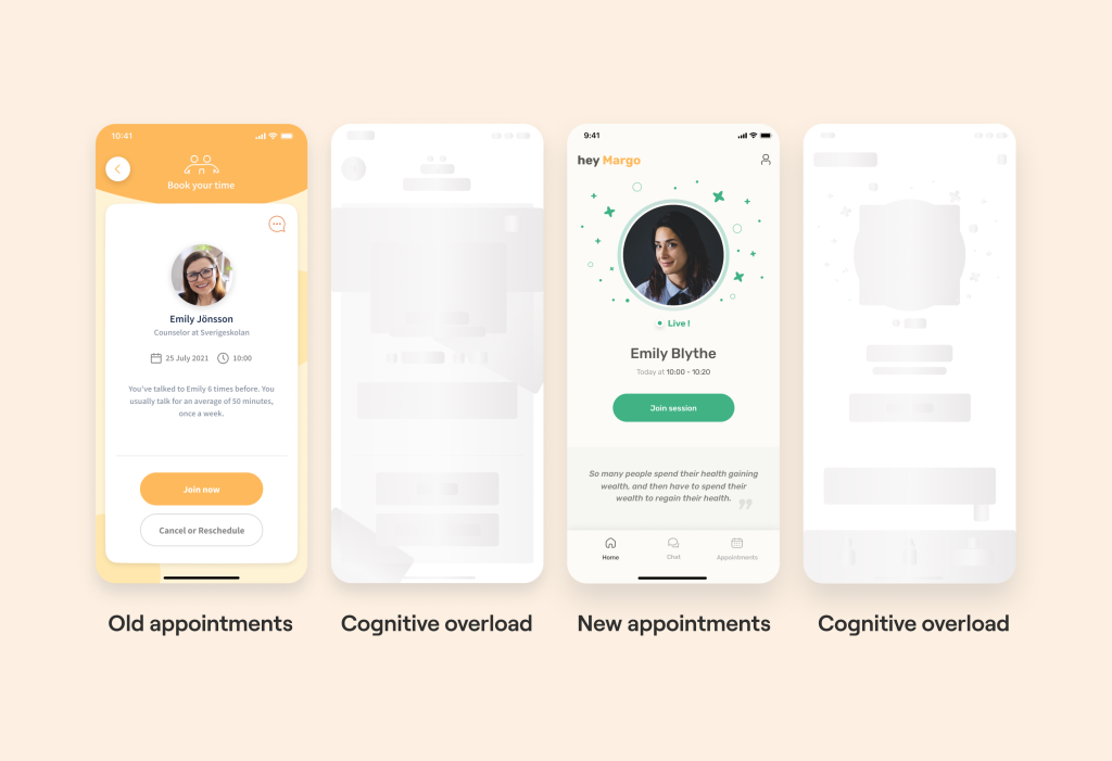
With a healthcare mobile app design that’s easy on the eyes and brains like the right-hand example, users can navigate effortlessly, making it a cinch to get the medical help they need.
Here’s another nugget for you: as users trek towards their goals, they hit certain milestones that are critical for moving forward. It’s super important to spotlight these moments. How? By making them stand out—think bold fonts or eye-catching colors. This helps them stick in the user’s memory.
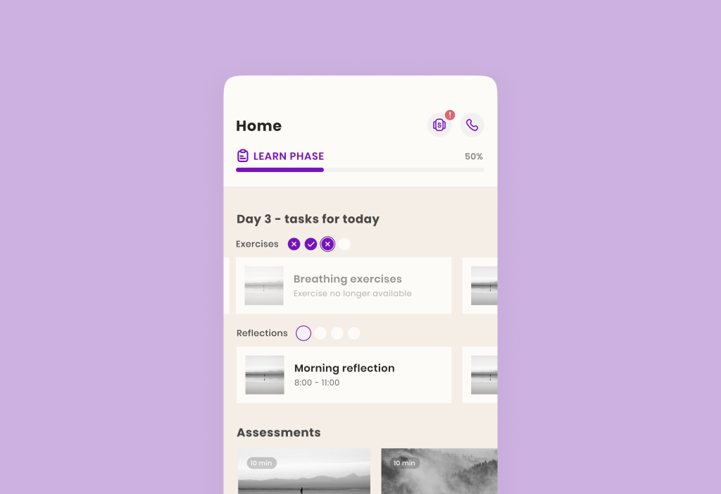
Take Sensae’s app as an example—we’ve used purple checkmarks to show progress. What’s done and what’s not is clear as day, keeping users hooked and pushing them to take better care of their health, one step at a time.
Remember, setting up your information hierarchy is crucial right from the start, especially during onboarding. Want to see how we nailed it and show more healthcare ui design and UX examples? Check out our Figma file right here for some insider tips on crafting a killer user introduction 🙂
II. The Right Navigation
Navigation in your app isn’t just about making it look good; it’s about steering your users right where they need to go without any fuss. And let’s be honest, when we’re using an app, we want to zip around from one screen to another like we’ve got a map etched in our minds.
Now, imagine being in an app where you’re never lost. You know exactly where you are, how to backtrack, or dive deeper into different sections. That’s what top-notch navigation does.
Navigation elements to design a healthcare app:
- a neat hamburger menu
- a tidy tab bar
- a crisp topbar
- clickable UI cards
- easy-on-the-eye tabs
- and even gesture-based navigation for that extra slick user experience
And ever heard of the 3-click Rule? It’s like a secret recipe for user-friendly navigation. Pioneered by Apple, the gist is pretty straightforward: users should hit the info or feature they need in no more than three taps. If they’re tapping away like there’s no tomorrow and still can’t find what they’re looking for, that’s a headache waiting to happen.
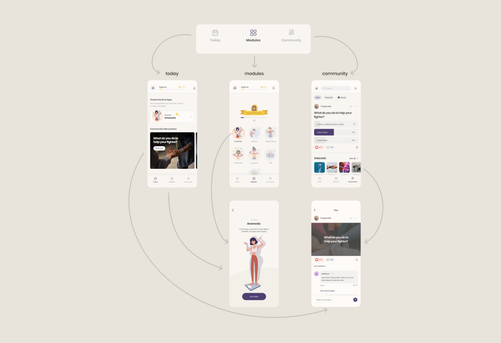
Let’s break down a real smooth navigation flow. Over at ProgressMe, for instance, users tap on “Modules” in the footer (that’s one), pick the module they fancy (two), and hit “Let’s Start” on its snapshot (and boom, three).
Just like that, they’re right where they need to be, no endless back-and-forth. This approach slashes the mental gymnastics needed and boosts the chance for successful treatment outcomes. So, when you design a healthcare app don’t remember about simplicity.
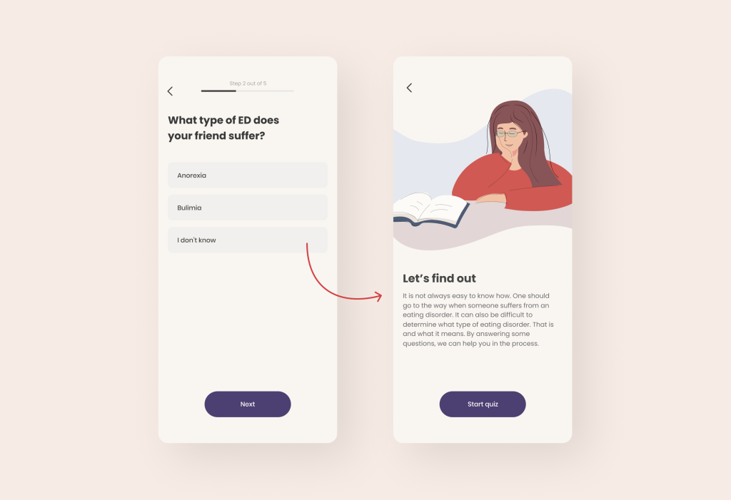
And help users with a choice! When users face too many options, it increases their cognitive burden and complicates their decision-making process.
In designing the ProgressMe app, we initially presented users with choices. However, to assist users who were uncertain, we included an additional feature: a diagnostic test. This allowed users to confirm whether their symptoms aligned with a specific illness, simplifying their journey within the app.
III. Accessibility
When we dive into the world of healthcare ui design and UX, there’s one thing we just can’t gloss over—accessibility. It’s all about opening up our apps to as wide an audience as possible. When we ensure our apps play nice with built-in accessibility features on Android, iOS, WatchOS, and iPadOS, we’re not just ticking a box; we’re inviting everyone to the party, and that’s how you create loyal users.
Accessibility shouldn’t be an afterthought; it should be a key player right from the start. Whether it’s making your app the go-to for everyone by default or syncing up seamlessly with APIs for enhanced modes specifically designed for people with disabilities. Thanks to strides made by the big tech players like Apple and Google, integrating these inclusive features has never been simpler.
So, what are some hot tips on how to design a healthcare app with accessibility:
- Opt for high-contrast color schemes and steer clear of color combinations that cause visibility snags.
- Don’t just rely on colors; throw in some handy symbols to convey information, too.
- How about spicing things up with audio cues? They can make navigating your app a breeze for users with visual impairments.
- Make sure your app supports those essential visual and motor accessibility tweaks.
- Notifications and alerts? Make them accessible on devices like the Apple Watch, without forgetting those nifty complications.
- If your app’s got animations, offer options to tone them down for those who prefer less motion.
- And let’s not forget the power of VoiceOver, speech-to-text, and captioning features to bridge communication gaps.
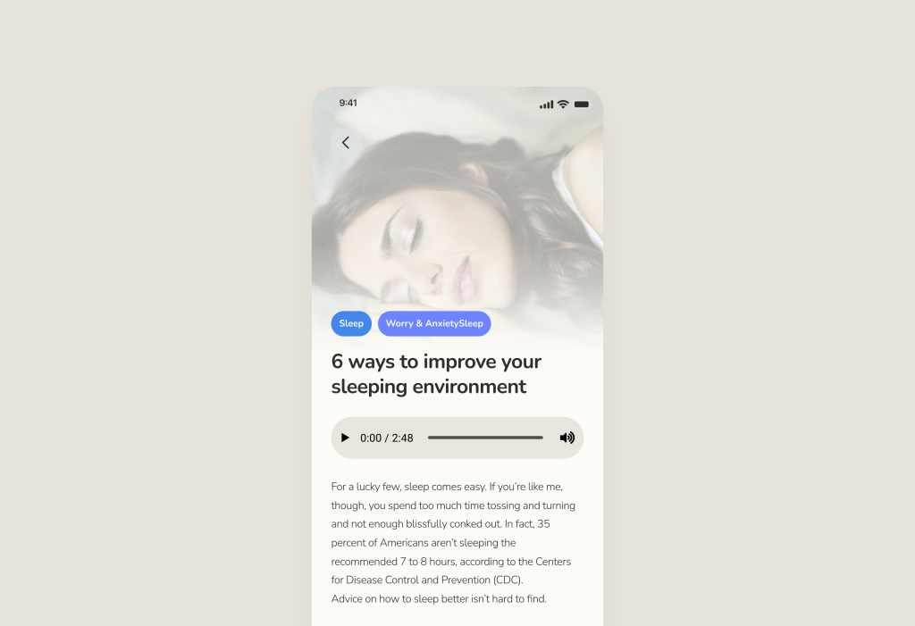
Example of Accessibility: audio/subtitles for the hearing/visually impaired
By the way, we’ve penned a detailed piece on mastering Accessibility and aligning with WCAG guidelines. Check it out here for a deep dive into making your app universally welcoming!
Conclusion
We trust you found our article insightful and learned how to design a healthcare app! At our core, we’re dedicated to assisting healthcare startups in crafting digital products and steering healthcare organizations through significant changes.
Curious about our past work? Explore our portfolio of case studies here: https://studio.nozomihealth.com/work
Feel free to drop us a line at m@nozomihealth.com, and let’s chat about how we can make your product truly impactful.