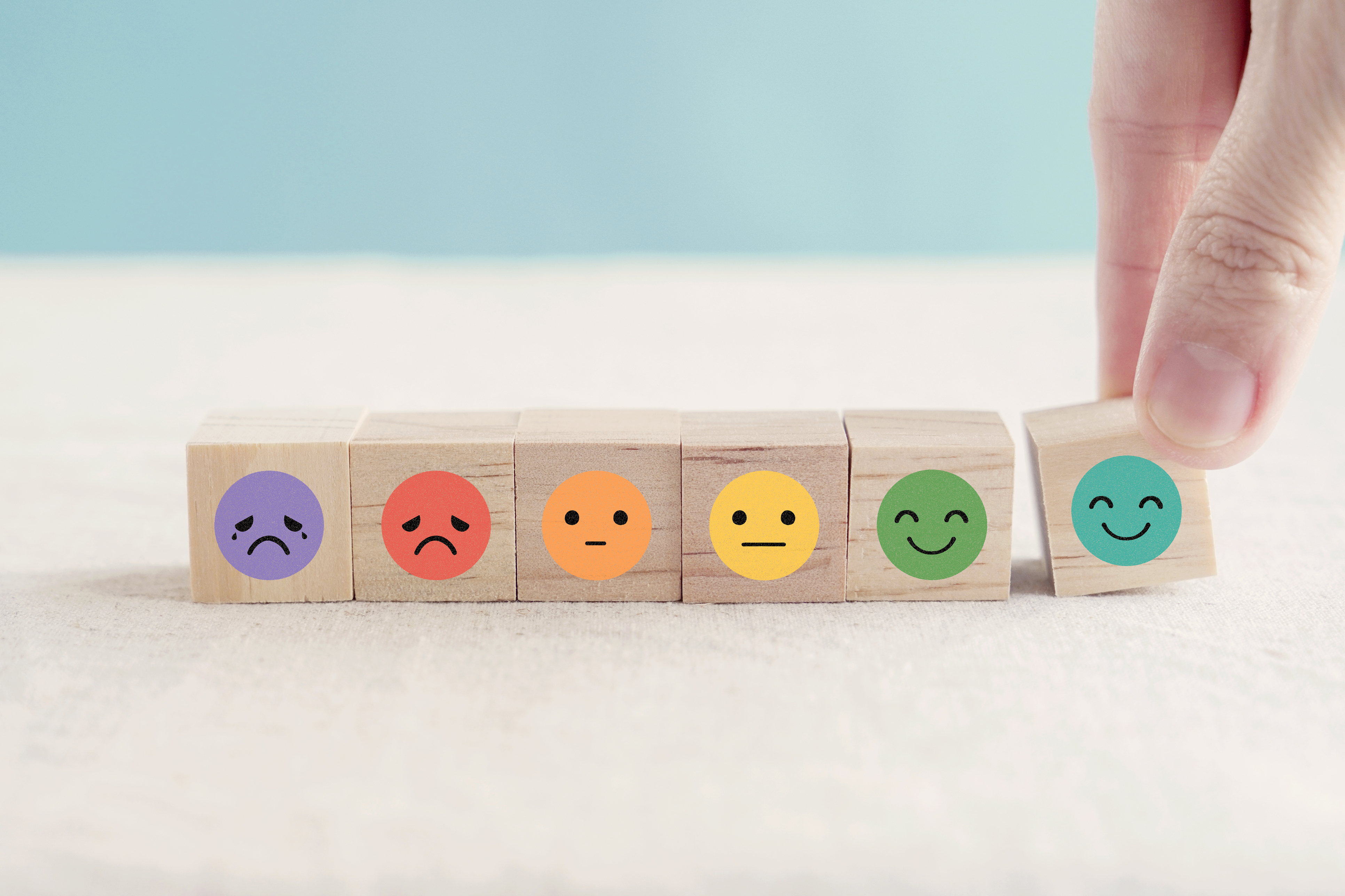
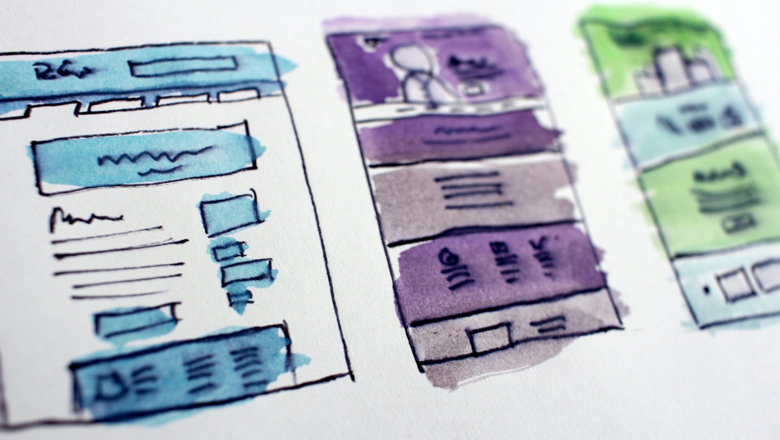
Admit it: we all live for emotions. We choose jobs that evoke emotions, we attend entertainments that elicit an emotional response, and we avoid anything that brings negativity.
Why are we saying this? No matter what the user’s need is, whether it’s to heal or become a better version of themselves through a digital health app, they will gradually lose enthusiasm and interest.
And that’s because the “journey” and digital experience created by the product should evoke a smile or at least excitement (that you’re about to conquer your illness).
There are many apps in the market that forget about this. The reason behind it is that the approach of “there’s a problem and there’s a feature that will solve everything, and we shouldn’t overload the product” is currently popularized.
However, many simply don’t try to think about how this will work in the Digital Health sphere (in SaaS, for example, you can do without emotional design in mobile healthcare application). The path of healing or self-improvement is always a lengthy process, which can be associated with negativity (not everyone enjoys being sick). That’s why specificity requires the creation of emotions.
That’s where incorporating emotionally engaging techniques into your UI/UX design can make all the difference.
So how to create an emotionally engaging health app experience?
By creating a narrative that connects with your users emotionally, you can improve user engagement and retention while creating a deeper connection with your audience.
And remember: for deeper connection you need to create a user-oriented development process.
This development is based on User Tests with rapid hypothesis validation to precisely understand how to establish a deep connection with a specific target audience.
If you want to delve a bit deeper into development, process and UI/UX topics, we’ve also created the best Product Growth Tactics from popular digital health brends:
1. Best CX (UI/UX) practices to make an app not just used but loved
2. Product strategies to drive retention and engagement
3. Best Engineering practices to build scalable solutions
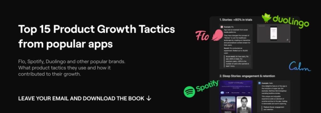
Download Free Actionable Insights from the best Digital Health Brands
So now let’s go through the points and learn how to create an emotionally engaging health app experience.
I. Be Invisible: interaction experience
Speaking about interaction experience, we mean not only default animations that are used in every app. Everyone already knows their importance — they provide feedback, improve navigation and user engagement.
We want to dwell on small interactions and tricks which help to humanize the app. There is not much to say here — examples speak for themselves.
1. Haptic Feedback: one effective way to engage users on a deeper level is through haptic feedback. By incorporating tactile sensations, such as gentle vibrations or touch responses, digital health apps can create a more immersive and engaging user experience.
For example, for Allbry, we implemented vibrations for different scenarios:
1. When a task is completed, there is a long but smooth vibration that emphasizes that the user has accomplished something positive.
2. When an error occurs, the vibration is sharp, which prompts the user to pay attention to what should not be done.
3. A gentle vibration is used for important buttons like “submit form” in a section. The goal is not yet fully achieved, but a positive foundation has been laid 🙂
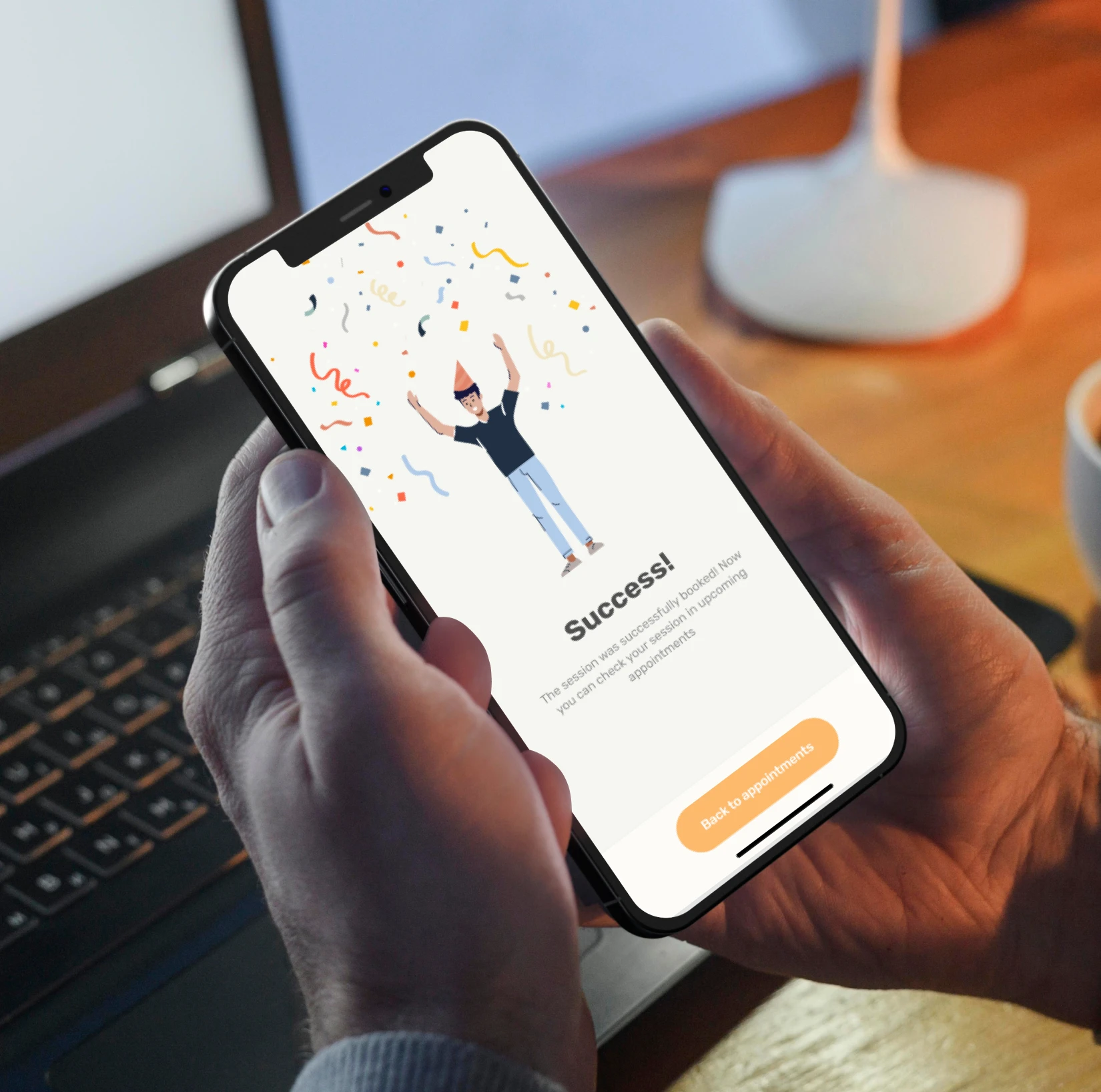
This approach makes the user more conscious and therefore more engaged. And it reduces the risk of high user churn.
2. Sound Design: this is the second technique of emotional design in mobile healthcare applications and it plays a crucial role in setting the mood and creating emotional connections. Thoughtfully chosen sound effects, calming melodies, or motivational cues can evoke positive emotions and help users feel more connected to the app.
For instance, incorporating soothing sounds during meditation sessions or cheerful tones when users achieve milestones can enhance the overall user experience and foster emotional engagement.
It’s considered that a more full aesthetic pleasure can be reached by influencing 3 more senses. The right combination of sound, haptic feedback and visuals will make the user experience unforgettable.
When these elements are combined in the right way, they create an immersive user experience that is truly unforgettable. For example, you can use Behavioural Design methods for this. And if you’re interested in exploring how to incorporate these aspects into your product, you can learn more about it here.
II. You’re Not Alone: social moment
In the world of digital health, trust is a vital element, especially when it comes to trying something new. Users often seek validation and assurance before committing to a new app or program. This is where the social moment comes into play and really improves emotional design in mobile healthcare applications.
1. User Success Stories: apps feature blocks or sections during onboarding or on the paywall that highlight real-life success stories from users. These stories demonstrate how the app has effectively addressed specific challenges and helped individuals achieve their health goals.
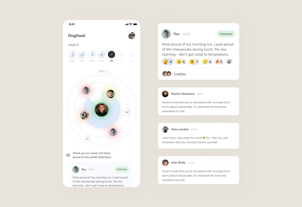
By sharing these positive experiences, apps build confidence and inspire trust in potential users. This feature increases the total amount of registrations and decreases user churn.
2. Expert Credentials: in the domains of mental health, nutrition, and fitness, apps often emphasize that their content is developed by certified professionals such as psychologists, nutritionists, or fitness coaches. By showcasing the expertise and qualifications of these professionals, apps reinforce the credibility and reliability of their content, giving users peace of mind that they are receiving expert guidance.
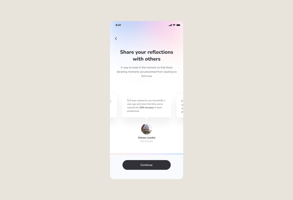
It makes emotionally intelligent design in mobile healthcare apps. Users feel more confident in their decision to engage with the app, knowing that others have benefited from it and that the content is backed by qualified experts. Social proof serves as a powerful tool to alleviate doubts of users and this improves conversion of the customer journey.
3. Collaborative Challenges: another good example of emotional design for healthcare apps is engaging with other users (or even friends) in challenges and leaderboard competitions, because it amplifies motivation and user success. Having a support system boosts your determination, while friendly competition ignites a drive to win.
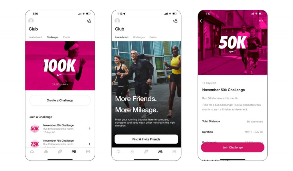
Image Credits: Nike Training Club
With collaborative features and leaderboards, these apps foster camaraderie and inspire a user to push harder towards achieving health goals. And of course this improves Retention rate. By the way, if you want to delve deeper into the topic of Retention, we wrote about it here.
III. Let’s play: gamification
Gamification techniques can make digital health apps more enjoyable and increase user motivation. By introducing elements such as challenges, badges, levels, or rewards, apps can transform health-related tasks into engaging activities. It really simplifies work with the emotions and ux design in mobile health apps.
But gamification not only adds an element of fun but also provides a sense of achievement, progression, and healthy competition. This emotional connection can motivate users to continue using the app and maintain healthy habits.
1. Simplifying journey and education: in our internal project (disease management app that is still under development 🙂) instead of an ordinary treatment plan, we engage patients in their treatment through a compelling story.
The process is simple: instead of just following a treatment plan, patients embark on a mini-quest based on an engaging story and complete tasks outlined in their treatment plan.
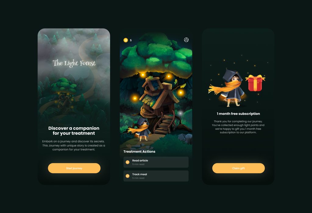
These tasks include educational materials and serve as reminders for taking medication. They address the problem of managing illnesses, as it needs to be done daily, and many people simply forget (resulting in poor retention and adoption).
2. Identification: improving the character = improving oneself. The approach of creating and leveling up a character was implemented in Moksha.
Essentially, the desire to purchase new “armor” or compare the number of rewards with other users creates additional excitement and a sense of purpose in life.
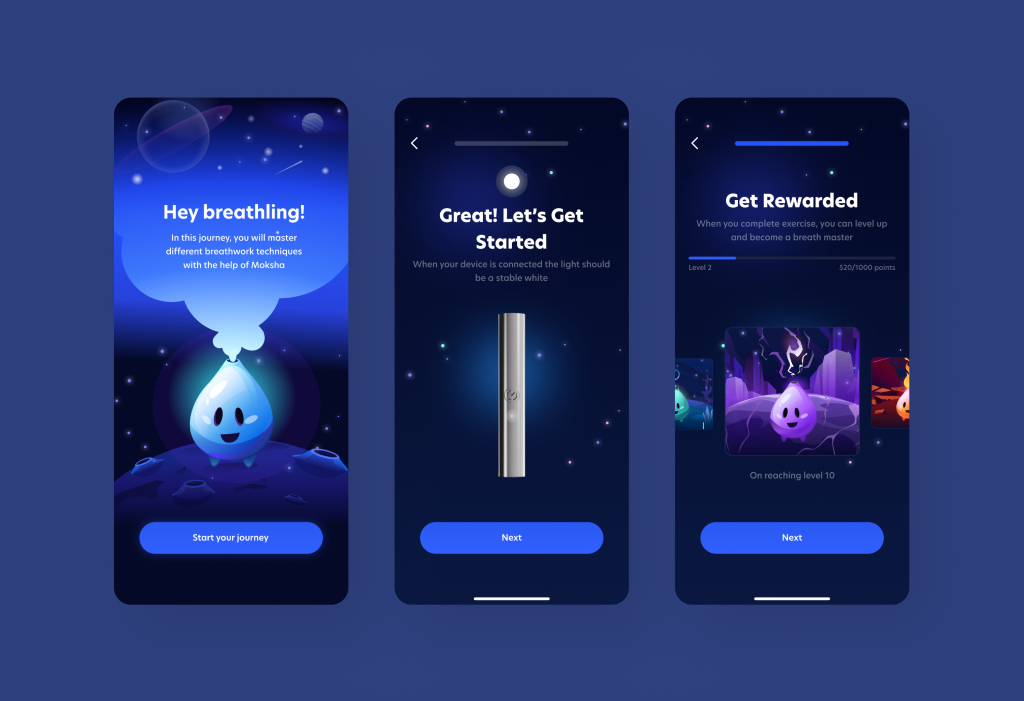
Thus, the existential question is immediately resolved, and the user is hooked on the daily development of their character, naturally developing themselves and improving the retention of our applications.
By the way! We even conducted a Design Review with in-depth User Tests for gamification tailored to user progress (aiming to improve engagement and retention). You can read about how we identified the need to implement such an approach here.
IV. Tell me a story: humanize the brand
Present your product in a way that shows the user that you care and are committed to improving their outcomes.
Delivering valuable and personalized content is essential for creating emotional design in mobile healthcare applications. By offering relevant educational materials, articles, or tips tailored to users’ specific health interests and goals, apps can establish themselves as trusted sources of information and support
1. Content Personalization: personalization plays a crucial role in enhancing user engagement and trust in digital health apps. By customizing content based on individual preferences and characteristics, apps can deliver a more personalized and impactful user experience.
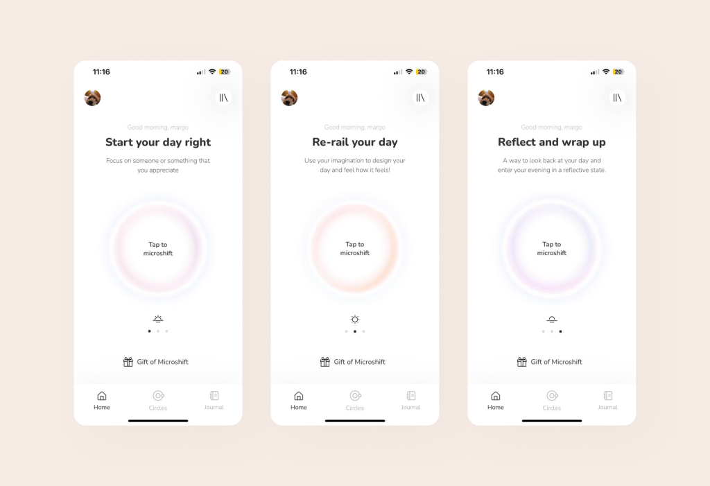
For example, in the Microshift app, we implemented audio content selection on the home screen that is tailored to address specific user problems.
2. Deep communication & the right acquaintance: digital health companies should stop viewing patients simply as consumers and trying to make a sale.
There are several ways to connect with your consumers on a personal level:
1. Adding a face/mascot of your company as a brand ambassador (like in the previous gamification example with “Moksha”).
2. Creating stories and behind-the-scenes content to build a sense of trust.
3. Providing examples from the experiences of ordinary people/professionals (depending on the target audience of the content).
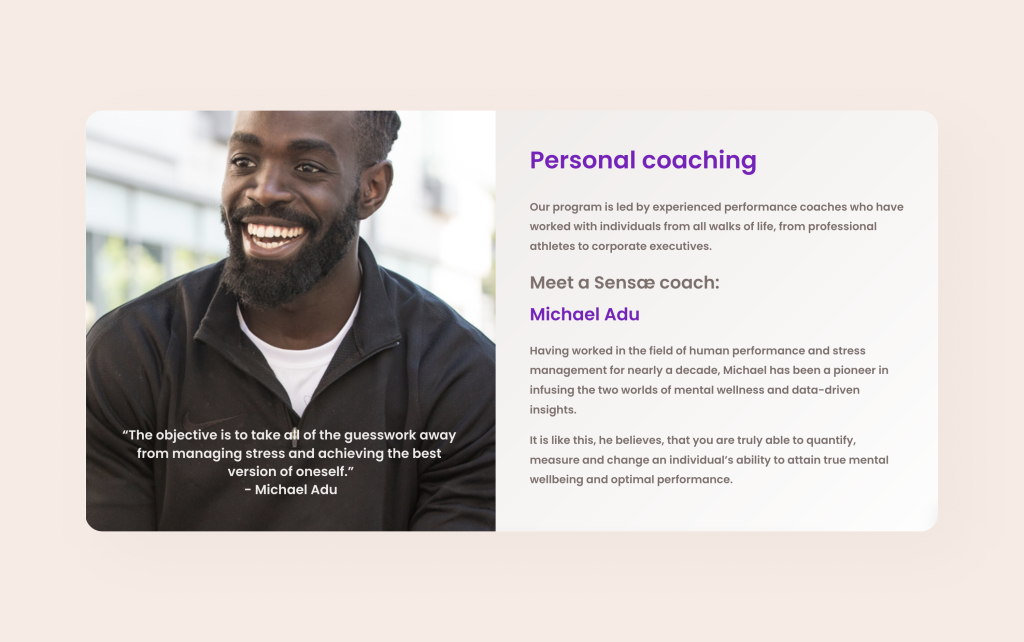
For example, on the website of Sensae, a company we worked with, there is a mini-story and an example of an expert’s experience.
4. And last: you can use a fun approach. For instance, we used humor in the development of a mobile application for health.
Such simple things improve engagement and make users “lose” their time in your content. This way, your Brand Identity improves, and after such experiences, users won’t forget you anytime soon 🙂
3. Illustrations and animations: they help not only make the app beautiful and attractive but also do something more — tell a story and trigger emotions.
Illustrations have the ability to communicate and emphasize. Sometimes, an illustration can say much more than a human voice. They can reflect users’ emotions, express sympathy and rejoice in their success. This is why illustrations and animations are so popular among health apps, where empathy and support are most important.
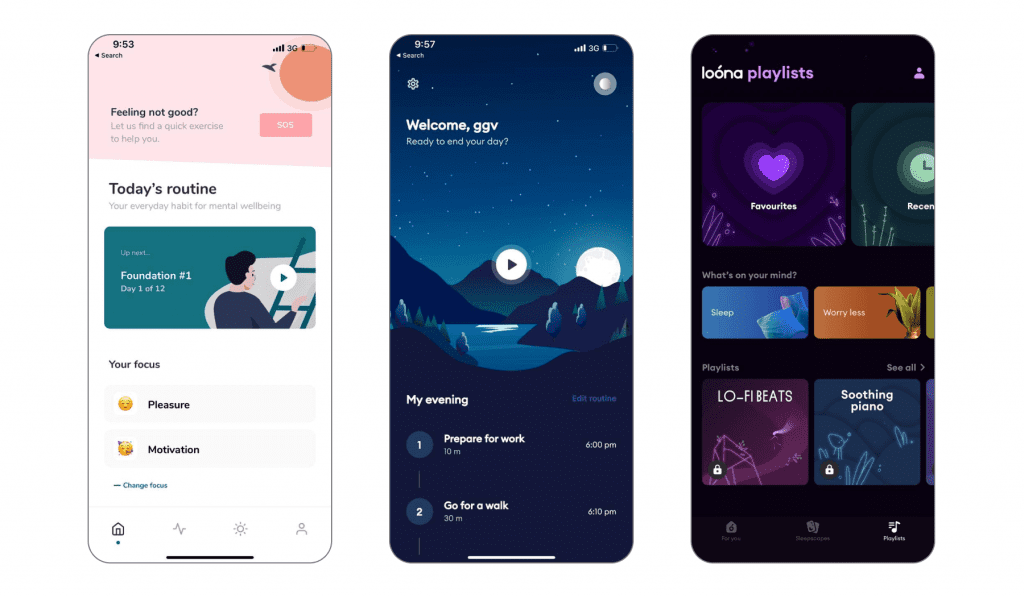
Image Credits: Loona
Illustrations help convey brand values. They help to articulate and communicate brand values on a non-verbal level to users. A brand is a personality, and nice illustrations help to reveal this personality, make it memorable and unique.
And now you’re probably thinking: how can I understand which illustrations will appeal to users, what sound design will engage app users, and how to create effective gamification? It’s true, tips are helpful, but putting them into practice can be challenging.
How to use emotional design in your health app to engage users
If you lack experience in developing digital health products, it can indeed be difficult to tackle certain aspects without external assistance or partnerships. However, text content elements and social mechanics can be implemented independently if you work in the medical industry and understand how to engage with communities.
To understand what specifically appeals to your target audience in your niche, conducting user tests and following global best practices is crucial. To achieve this, it’s important to establish the right user-oriented development process from the beginning. But if you have little or no experience in developing digital health products, it is better to work in partnership with someone to achieve this.
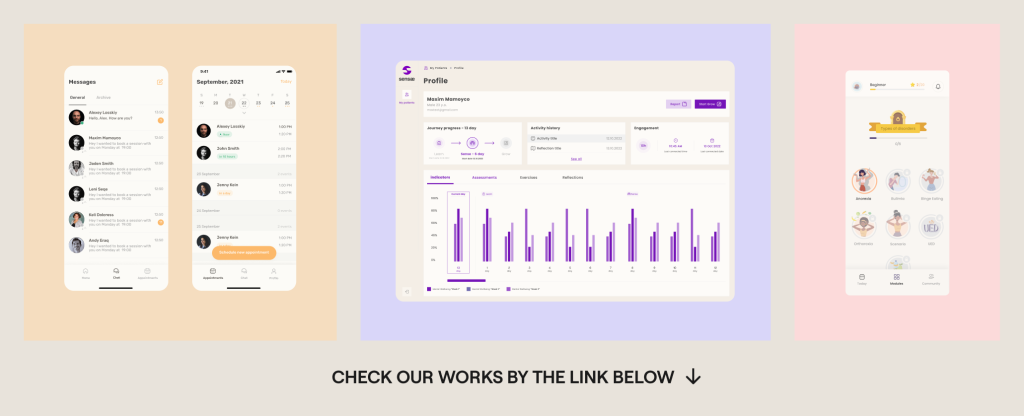
If you’re interested in how we’ve helped partners to build a new generation of digital health products, you can see our case studies: https://studio.nozomihealth.com/work
Or write to us now on m@nozomihealth.com and we will discuss how we can help ensure that your product brings real benefits


