It’s easy to feel hopeful on a beautiful day like today.
But in the end we all face difficulties.
Everyone has dark days when they feel alone, lost and buried.
And the most powerful things that helps us move forward is ahope
And we want to become a hope for those who need it most
Secrets from the Best Brands: making popular Chronic Disease Apps
Jul 05, 2024
4 min read

Given that chronic conditions require lifelong treatment, such apps must have a high retention rate and be well-received by users.

However, not all apps become popular, and it’s not just due to market competition. The issue lies in poor user engagement and feature adoption.

Having medical professionals involved doesn’t always help. Sometimes, users are even against them (!).

In fact, according to a study we’ll discuss shortly, self-management statistically yields better results than working with a doctor 🙂

What’s needed is medical expertise in the field and an understanding of which features and UX techniques to use. That’s what we’ll explain to you now.

Before showing how specific solutions address these problems, let’s first look at the three best representatives on the market that we will be showcasing later.

There are several app examples that are popular in the market and truly effective:

1. MyCOPD: the most comprehensive and intuitive COPD management app available on any device. It offers complete online pulmonary rehabilitation programs, allowing users to access top-tier COPD therapy from the comfort of their own homes.

And it really works. Just look at this study.

Outcomes: in a recent study, 41 patients hospitalized with severe COPD exacerbations were divided into two groups. One group continued their regular treatments, while the other group received their usual treatment plus access to the MyCOPD app.

The findings, published in the journal NPJ Digital Medicine, revealed that over three months, the group using the app experienced nearly half the number of exacerbations compared to the group receiving only the usual treatment (18 versus 34).

Additionally, incorrect use of inhalers dropped by approximately 80% among MyCOPD users, compared to a 30% reduction in the control group.

Interestingly, the average age of the app users was over 65. Despite not being regular internet users, all participants were able to adapt to the new technology.

And the main reason is the right features: self-management activity diary, weather and pollution forecasting, and a unique COPD Checklist.

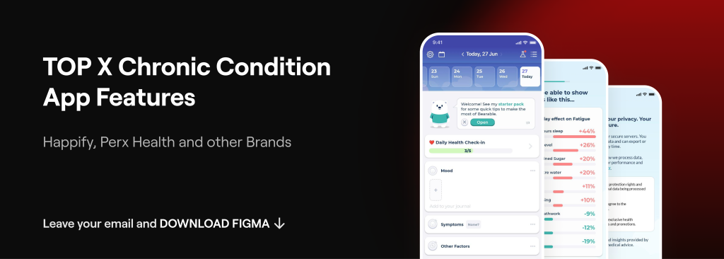
How can we select the most appropriate features for other apps in this field? To help with this, we have also compiled our top X features for chronic condition apps.
DOWNLOAD FIGMA WITH TOP 10 CHRONIC CONDITION APP FEATURES

2. Bearable: all-in-one app designed to track various emotions, mental health conditions, and the intensity of symptoms such as pain, fatigue, and both acute and chronic illnesses.

It offers valuable insights into factors like mood, sleep, exercise, diet, and medication. With its high level of customization, Bearable provides tailored solutions to meet the unique needs of each user.
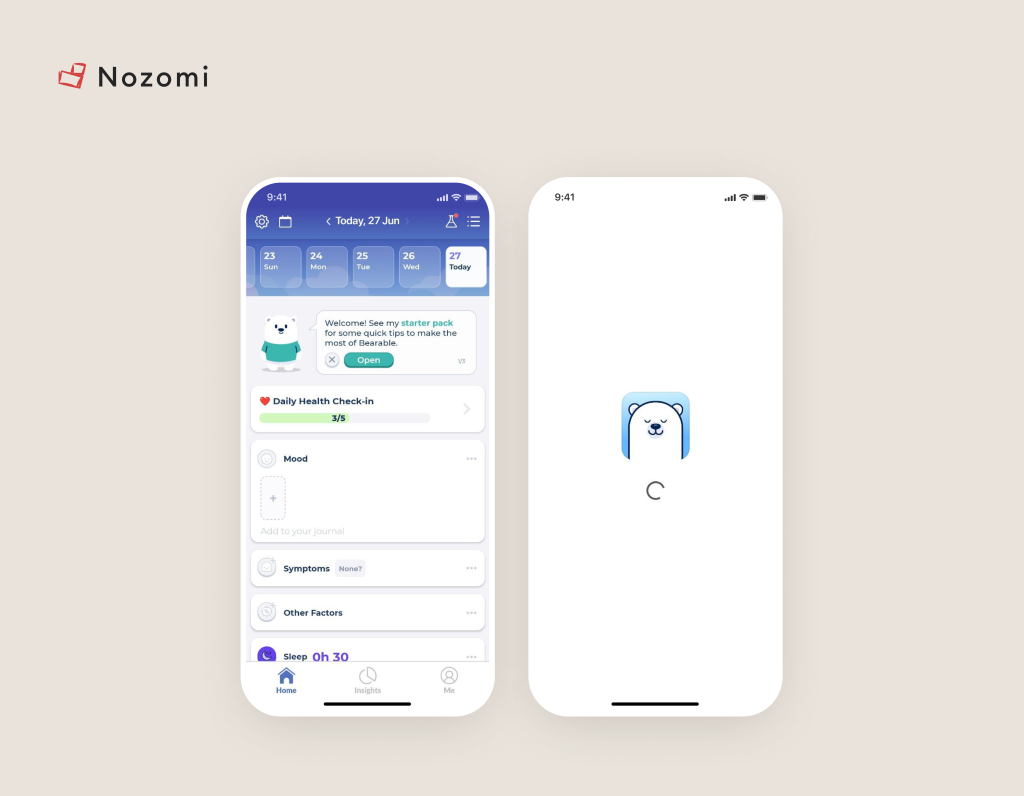
Image credit: Bearable


Outcomes: a large number of reviews and threads on Reddit and other sites speak for themselves. User testimonials suggest improved symptom tracking and management.

3. Curable: this is a top app in the pain management field, employing a biopsychosocial methodology.

It delivers scientifically supported chronic pain lessons and integrates pain science education with research-based strategies.

Image credit: Curable

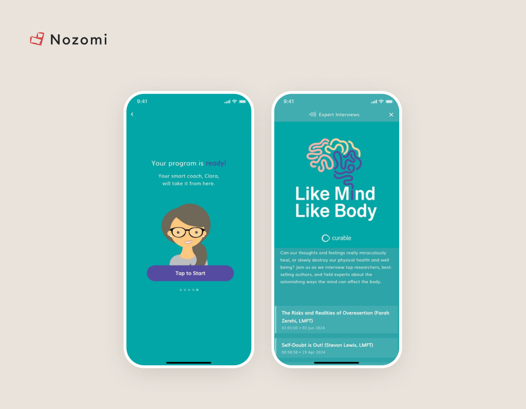
The app features a virtual pain coach named Clara, who evaluates user inquiries and offers 5-20 minute exercises, including guided meditations and visualizations, as well as educational sessions, to assist users in effectively managing their health.

Outcomes: users have reported improved pain management and a better understanding of their condition through guided meditations and visualizations​. A survey of Curable users shows that about 70% experience some degree of relief from their physical symptoms after 30 days of continued use.

User Problems and Product Solutions from Popular Brands

What drives users to engage with chronic condition apps? How can you make your own chronic condition app engaging?

To address this, we decided to examine popular features and UI/UX strategies through the lens of common user problems.

What problems do we have?

1. Patients want Self-Management (No Collaborative Decision-Making!)

Yes, users want to manage their own care with minimal involvement from doctors. Is this a paradox? Will the treatment be less effective?

No. According to this study, users who managed their own care with chronic condition apps achieved better results than those who engaged in collaborative decision-making.

So, what can you do? Allow users to perform tasks within your app without the intervention of a specialist.

For example, let them record results and conduct self-analysis:


Image credit: Bearable


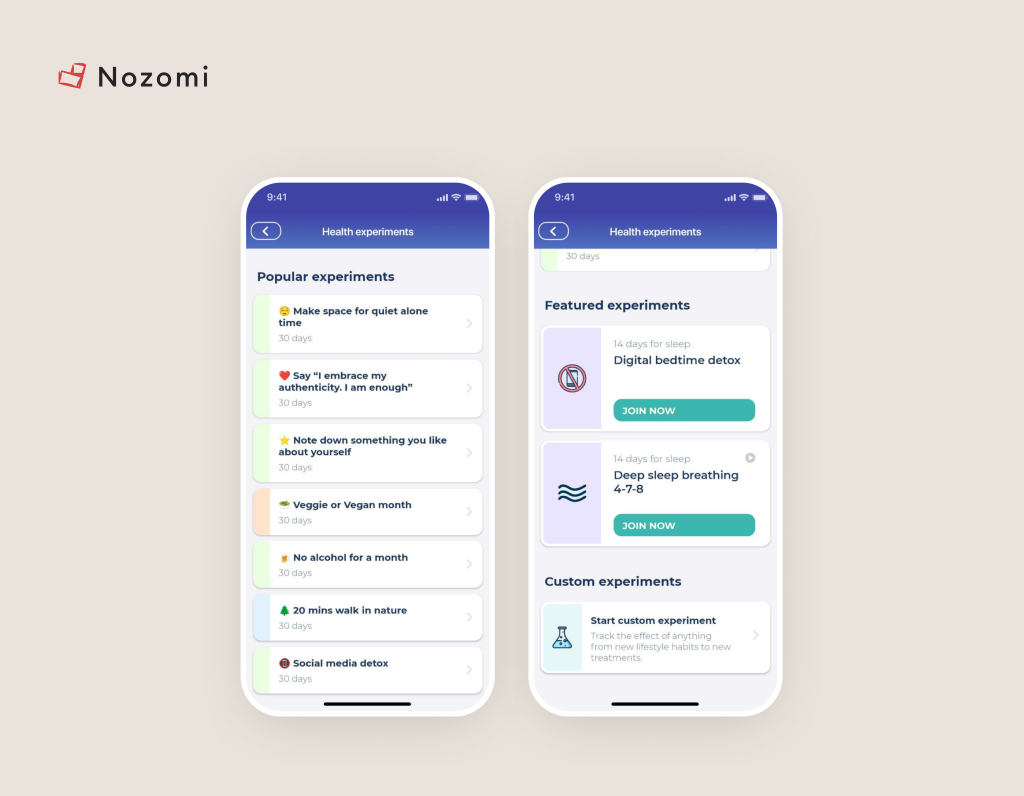
Or conduct experiments themselves. Check out this unique killer feature:


Image credit: Bearable

2. No sense of attachment/mission

Why is going to the gym with a friend always more interesting?

Because of support and communication. A community of friends in healthcare is one of the key killer features.

Let’s take the example of the gym and transfer it to a digital health app: besides increased interest for the user who will interact with the community, there will be a sense of responsibility.

They won’t stop exercising because they don’t want to feel awkward in front of their digital friends. As a result, their health outcomes improve, and the app experiences a higher retention rate.

And the main side effect: a sense of mission. Have you noticed that when many people are involved in something or belong to a movement, a person’s motivation increases?

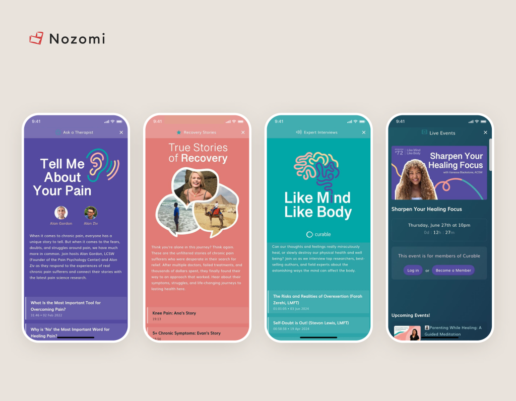
So give the user: a forum (where they can create their own stories and comment/like/share them), expert articles, the opportunity to consult a “Guru” (doctor, expert), and some events.


Image credit: Curable


3. Lack of clear instructions or support Users may struggle with understanding how to use the app or interpret its data without adequate tutorials, guides, or customer support.

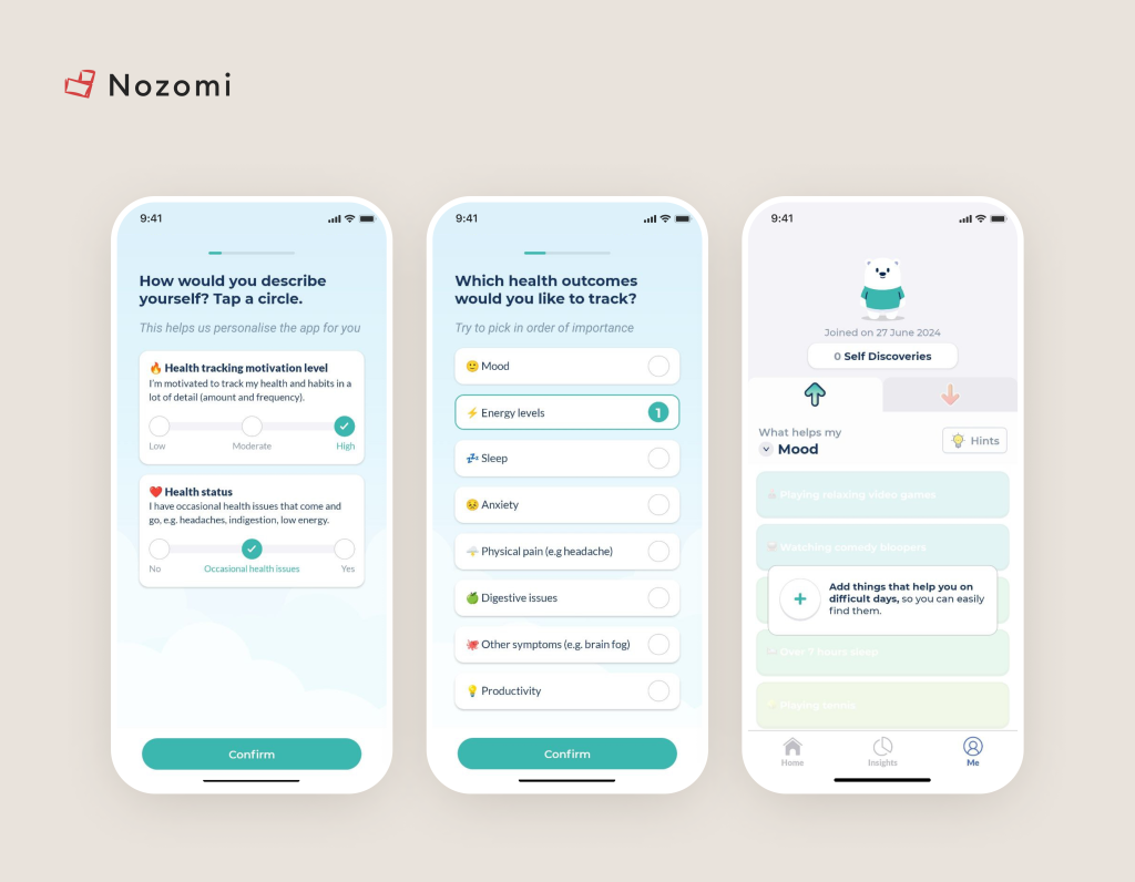
Here, the problem is solved with a good onboarding process, which includes several things:

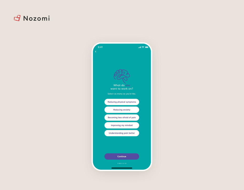
1. Avoid long questionnaires. People get confused and abandon them, resulting in a high percentage of user churn.

In the example below, only one question is asked, while the rest of the data is collected either through AI or during the app usage when the user logs their results after completing exercises.


Image credit: Curable


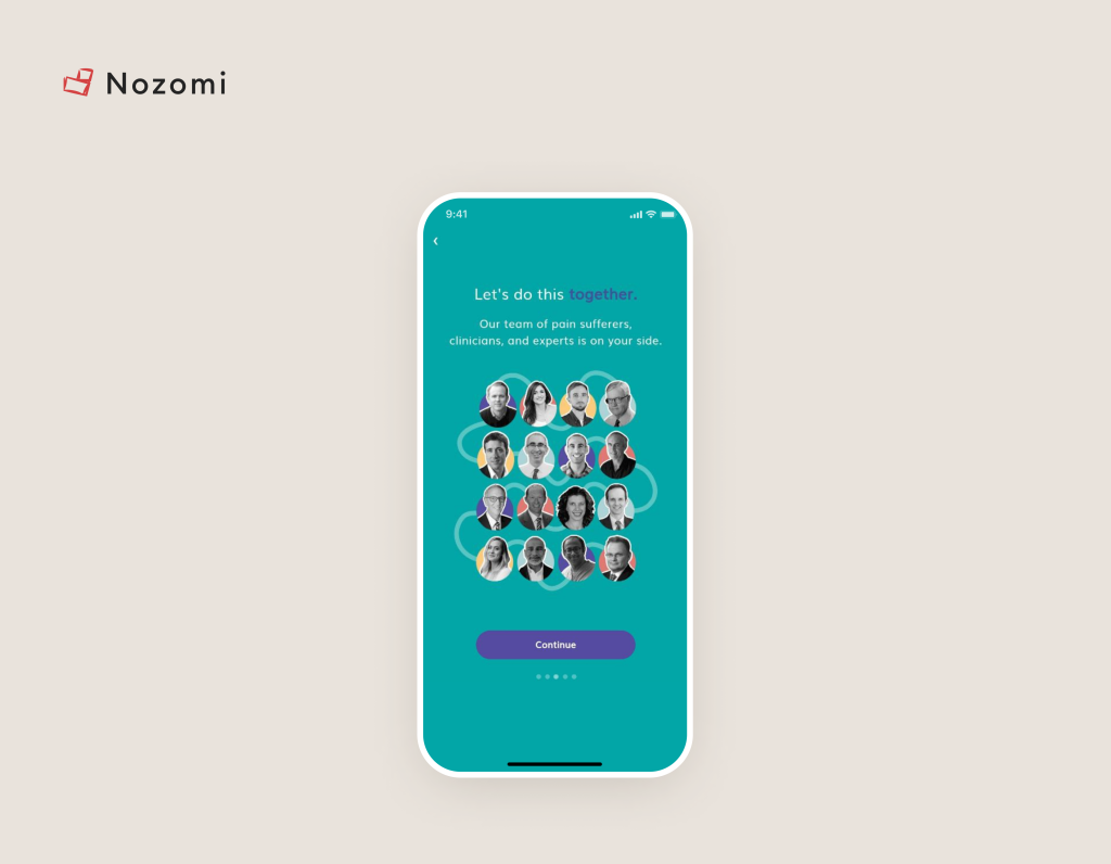
2. Show that you have experts (that this is a scientifically validated app)


Image credit: Curable

3. Highlight the training elements


Image credit: Bearable


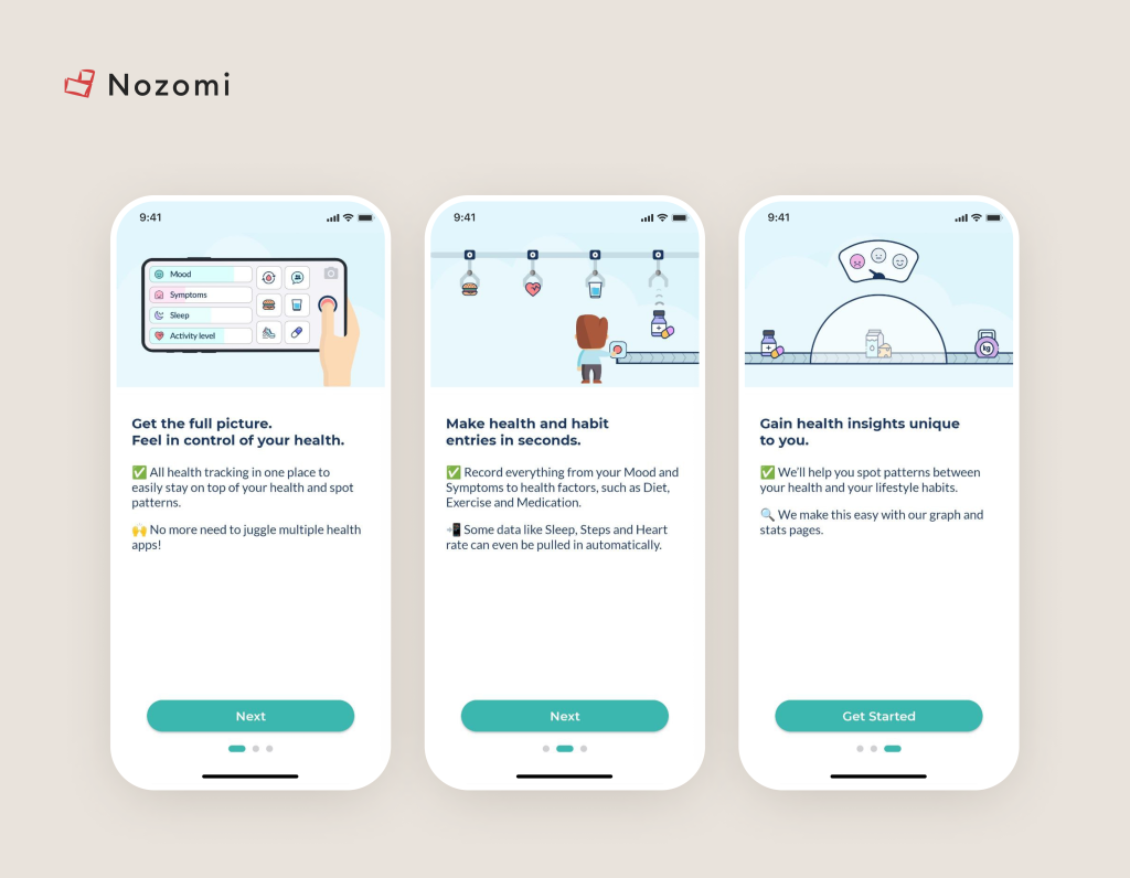
4. And the base: use short descriptions with illustrations.

Note that at the bottom of the example they have a logical UI continuation.


Image credit: Bearable

Is there anything else..? Yes, AI 🙂

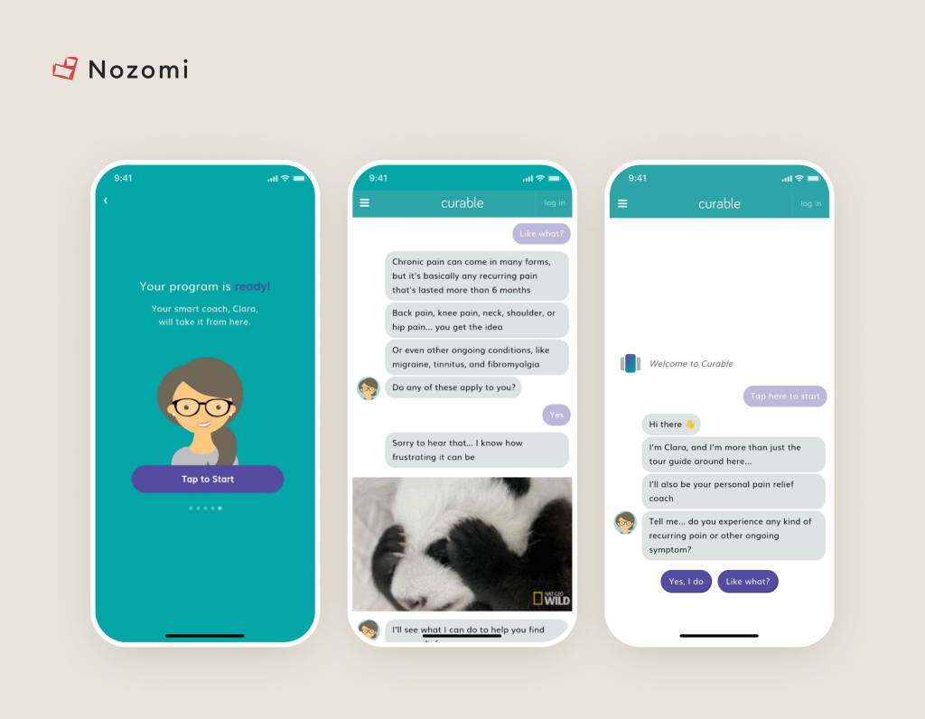
5. Let AI help


Image credit: Curable

Note how the examples above immediately address three issues:

1. Users don’t need to worry about navigation. Cognitive load in the app is minimal. AI guides them, analyzes, and provides an action plan.

2. Emotional connection: AI uses engaging visuals. There’s no feeling that you’re interacting with a lifeless machine.

3. Speaking of lengthy surveys… they’re not needed 🙂 By the way, if you’re interested in checking out our top X features for chronic condition apps, download our new Figma file.

DOWNLOAD FIGMA WITH TOP X CHRONIC CONDITION APP FEATURES

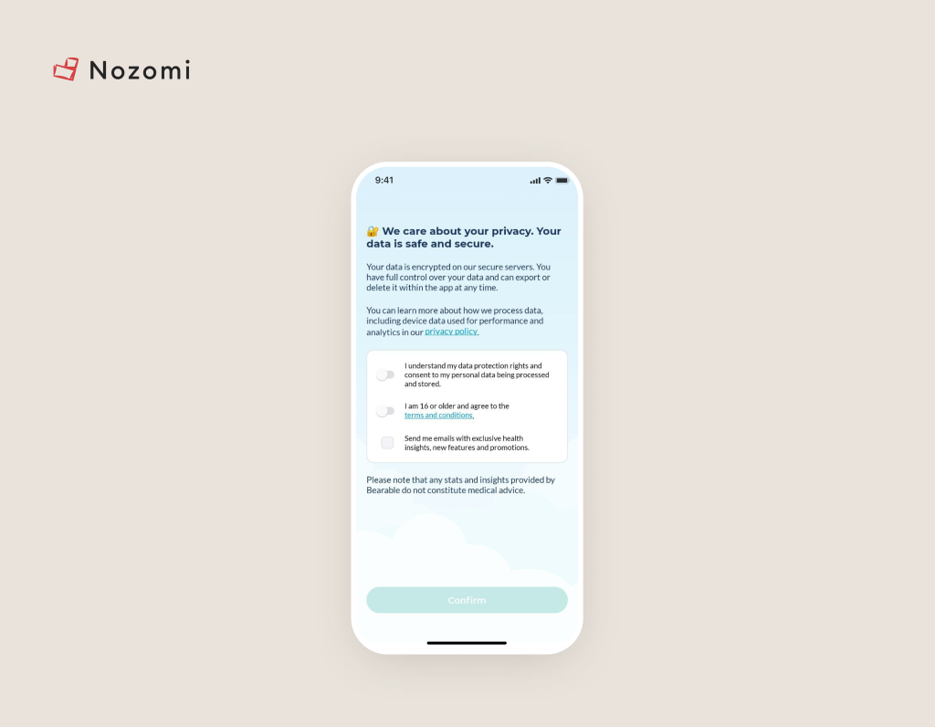
4. Privacy and security concerns

Users may be worried about the security of their health data and how it is being used or shared.

Everything is simple here. Specify why you will collect the data, that it can be deleted at any time (GDPR requirement) and that it will be securely protected:


Image credit: Bearable

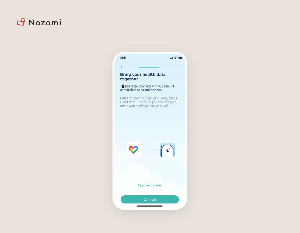
5. Poor integration with other systems

Chronic disease apps often fail to integrate smoothly with other health systems, such as electronic health records (EHRs), wearable devices, or other health apps, resulting in fragmented data and inefficiencies.

The topic of integration is quite broad, so we’ve created a step-by-step article on how to conveniently integrate medical devices with applications.

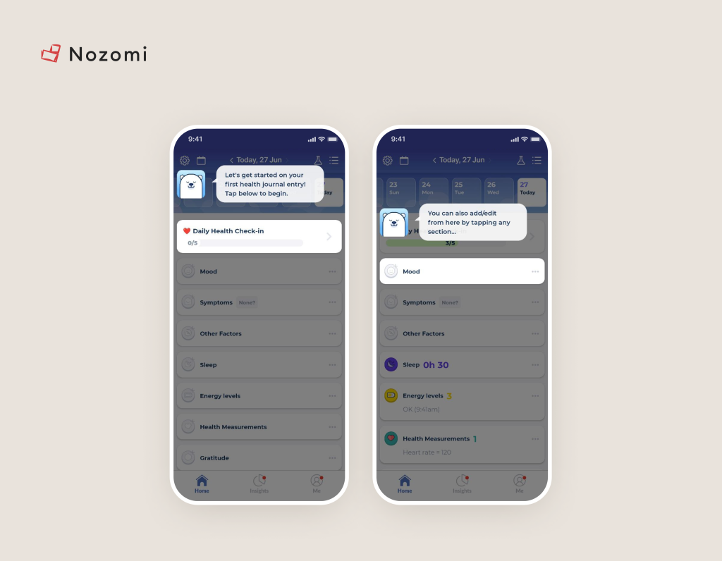
From a UX standpoint, simply provide the option to connect during onboarding. This will make navigation easier for the user.


Image credit: Bearable
6. Data overload

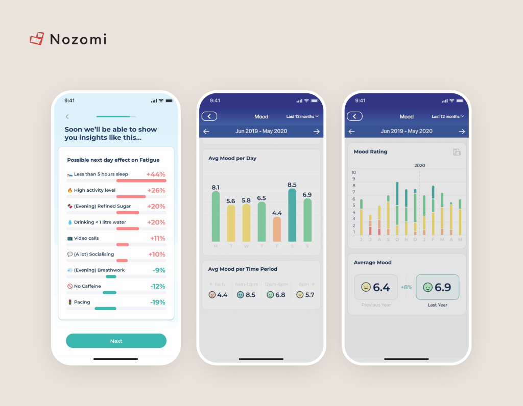
Users can be overwhelmed by the amount of data presented, especially if it’s not organized or simplified. This can make it difficult to understand and act on the information.

Examples of how you can do:


Image credit: Bearable
7. Just Forgot

And finally, so that the user does not forget to use the application, use Push Notifications. But please create the feeling that this is a necessary feature even in the onboarding process:

Image credit: Bearable
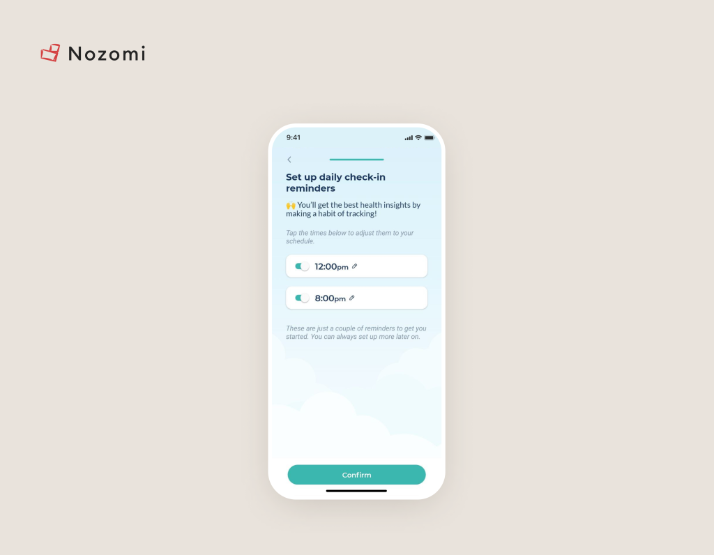
There is even a specific time for sending notifications, which gives the impression that this is not another spam.

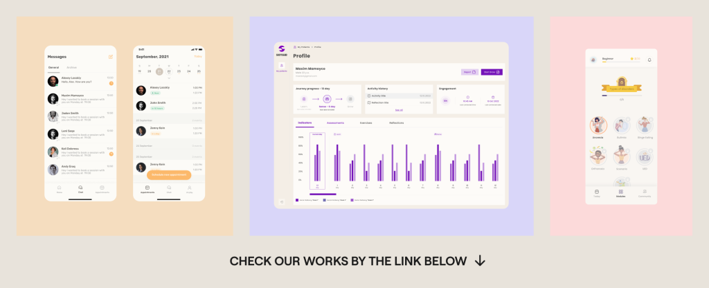
If you’re interested in seeing more case studies and their improvements, check out our case study library below 🙂

We are a digital health product studio, who assists healthcare startups in designing and developing digital products, while also helping healthcare organizations undergo transformative changes.


nozomi works

If you are interested about our experience check our portfolio with case studies: https://studio.nozomihealth.com/work

Or write to us now on m@nozomihealth.com and we will discuss how we can help ensure that your product brings real benefits

Other posts from our blog
Research lab
5 min read
04.01.2024
3 Things to Know About Wearable App Development
Apps connected with Wearable Devices are more valuable than you think. But not all people realize their significant impact. After all, while speaking with various people, we noticed that they perceive the creation of products like "app and wearables device integration" as rocket science. In reality, if we try to break down what the development of such applications consists of, it turns out to be quite feasible and impact is really crucial.
Research lab
4 min read
26.06.2023
Emotional Design in Mobile Healthcare Apps: why it improves Product Metrics
Admit it: we all live for emotions. We choose jobs that evoke emotions, we attend entertainments that elicit an emotional response, and we avoid anything that brings negativity. Why are we saying this? No matter what the user's need is, whether it's to heal or become a better version of themselves through a digital health app, they will gradually lose enthusiasm and interest. So let's go through the points and learn how to create these very emotions.
Subscribe to your monthly dose of Digital Health insights
Nozomi Newsletter
Subscribe
Subscribe to your monthly dose of Digital Health insights
Nozomi Newsletter
Subscribe
Link copied to clipboard
Subscribe to your monthly dose of Digital Health insights
Nozomi Newsletter
Subscribe
Subscribe to your monthly dose of Digital Health insights
Nozomi Newsletter
Subscribe
Subscribe to monthly dose of Digital Health insights
Nozomi Newsletter
Subscribe to your monthly dose of Digital Health insights
Subscribe
Nozomi Newsletter
Subscribe to your monthly dose of Digital Health insights
Subscribe