To bring positive outcomes with digital health solutions, we need to help users build positive habits. This will usually require consistent changes over a long period of time.
And engaging patients in apps, especially those related to chronic diseases, can be quite challenging. Entering the app, tracking their metrics, and learning to navigate it essentially require forming a habit.
As we can see, positive habits are difficult to instill. To assist users in achieving desired outcomes, we apply a behavioral model in design process in order to instill these habits, improve patient outcomes and business metrics.
And for that, we will dive into behavioral psychology.
We can apply Behavioral Psychology in Design for Desired Outcomes
Do you want to learn how to read minds? We will teach you.
Behavioral psychology studies why we do what we do, what we like, and how we think. And if we apply this concept to design and also call it behavioral, what happens?
In that case, when applied to product creation, behavioral psychology (or behavioral design) helps us understand why your users do what they do and can help us create experiences that they enjoy.
The core objective of behavioral design is to influence human behaviors in order to achieve specific business outcomes.
Whether it’s encouraging users to make a good onboarding, upgrade the user journey, or adopt a new feature, behavioral design techniques are employed to facilitate these desired actions. This approach is grounded in a systematic framework that draws from research, experimentation, and data analysis, rather than relying solely on psychological principles.
The document shows:
1. Which specific metric each feature has influenced and how the company achieved growth.
2. Concrete examples to draw inspiration from. Among the list are popular brands such as Flo, Calm, MyFitnessPal.
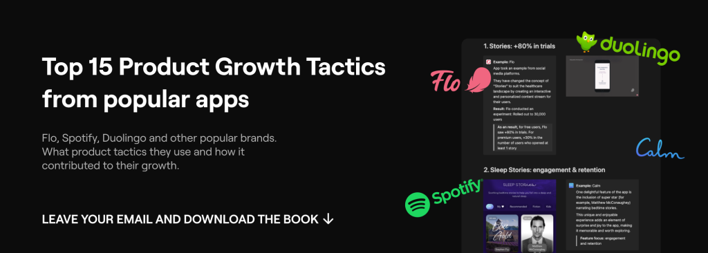
Top 15 Product Tactics that use popular Digital Health Brands for Growth
Now let’s talk about 4 Behavioural Design Models.
1. CAR model: for nudging behavior
Behavioral design leverages nudges, which are subtle changes in the environment that influence user behavior without restricting their freedom of choice. These nudges can be visual cues, microinteractions, or personalized messaging that gently guide users towards desired actions.
We use the CAR model for it. This model – is a way of describing a user’s interactions with a product as they pass through four cycle stages: a cue to begin using the product, an action to satisfy the trigger, a reward for the action, and some type of investment that, ultimately, makes the product more valuable to the user.
As the user goes through these phases, he builds positive habits in the process. Let’s explore these cycle stages on the example from our partner Microshift – a Swedish mental health platform which helps people shift into a reflective state with 3 min audio.
1. Cue: also known as a trigger. It’s something that usually comes in the form of a reminder to open and engage with the app. In Microshift as a trigger, we used push-notification to make the user open the app and make a “shift” – to get into a better state of mind in 2 minutes.
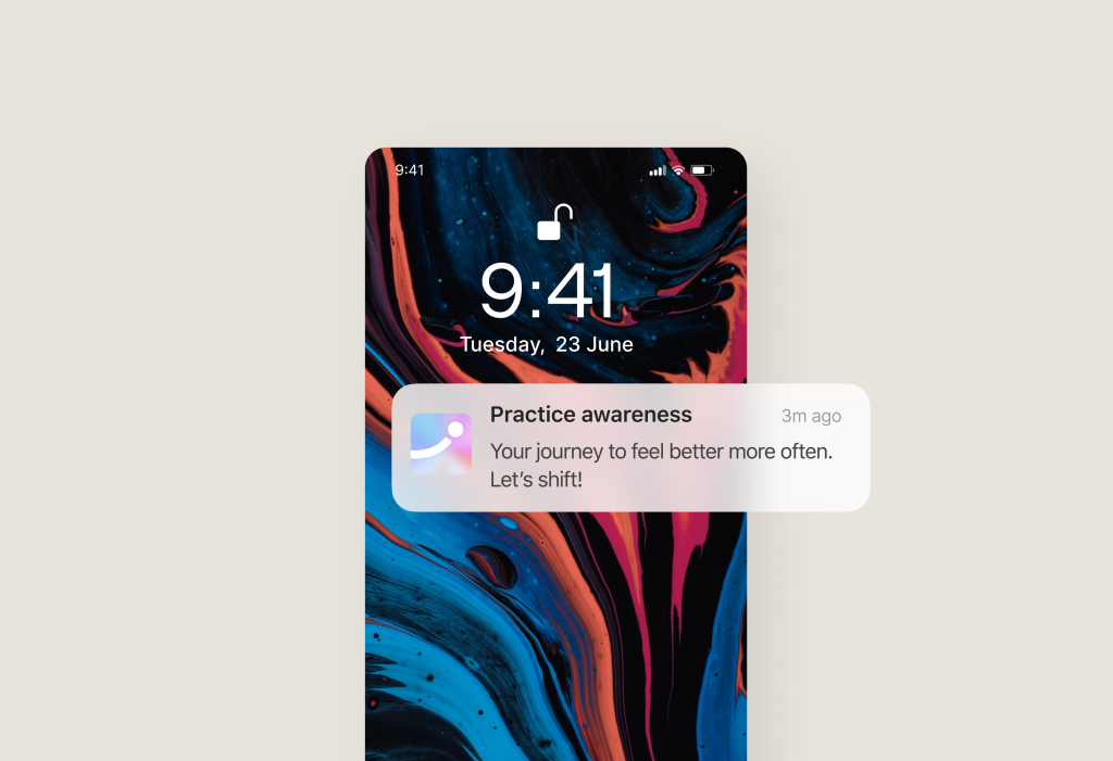
2. Action: the specific behavior you want someone to perform more often. If your triggers work, the user will take a specific action. In a digital health app, it may be entering your daily calorie intake.
The most important thing to remember when designing actions is to break any larger goals into the smallest actions possible. The action “shift” we divided into a small set of actions: listen meditative track + reflect.
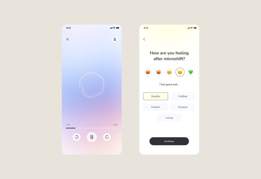
3. Reward: the positive consequence of performing the desired action. Receiving a reward for doing something increases the chances of us repeating the same behavior. The more unpredictable the reward, then the more likely we’ll form a habit. In digital health solutions it can be a badge or even free therapy session.
As a reward we used streaks, encouraging words and social rewards that involve connecting with others (likes, comments).
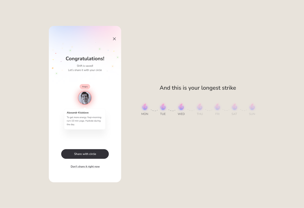
4. Investment: the reward encourages the user to invest in the product in anticipation of more rewards.
To finish the CAR cycle and make a user invest more in our app, we implemented “Reflective journey feature” inspired by Spotify “Wrapping up the year”. It gathers statistics from users’ meditations and reflections, creating an interactive journey of self-discovery with visually captivating infographics and timelines.
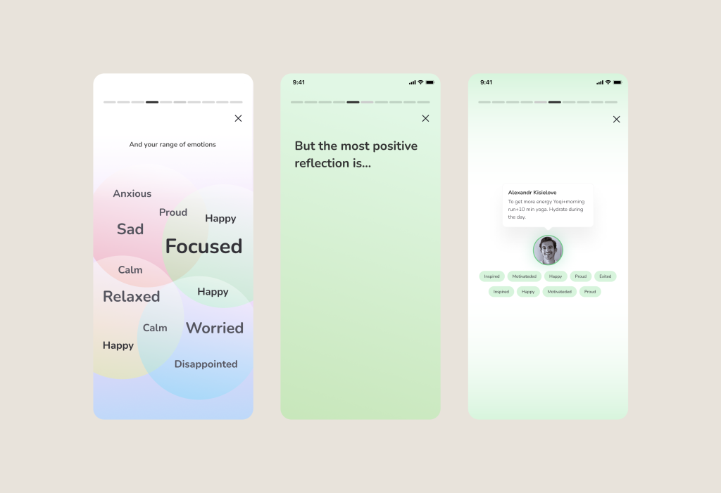
After users move through this cycle enough times, the habit of regularly opening and using your app should become ingrained, and internal triggers should kick in to keep the user moving toward meaningful change.
2. Fogg Model: look at motivation in a different way
BJ Fogg developed a practical model that explains how behaviors occur in the context of digital health solutions.
We need three elements to facilitate a behavior.
1. Motivation: the most important aspect to focus on here is motivation, as using a large number of triggers alone will not increase it. In this model, the key is to cultivate motivation with fewer triggers.
The reason is simple: if a nutrition app asks you to avoid sugar, frequent notifications will constantly remind you about sugar, leading to a decrease in motivation.
But let’s consider an example from digital health: ProgressMe (the app that helps with eating disorders). We have added an additional motivation to “pass the game” alongside the initial motivation of overcoming an eating disorder.
Simply relying on triggers related to the long-term effort of improving one’s health would not be effective in terms of reducing user churn rate.
Therefore, incorporating gamification elements such as levels, points, and rewards was the perfect solution to create reinforcing motivation alongside the primary motivation. This way, we increased the engagement and retention of the app.
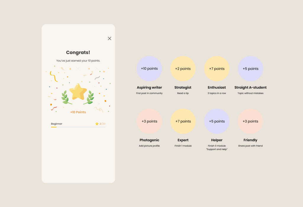
For example, in the image above we have added a complex system that rewards the user for increasing their own progress. You may have heard that computer game lovers very often replay games just to get an “achievement”.
And the trick here is that in order to increase this very progress and get an “achievement”, you need to go into the product more often.
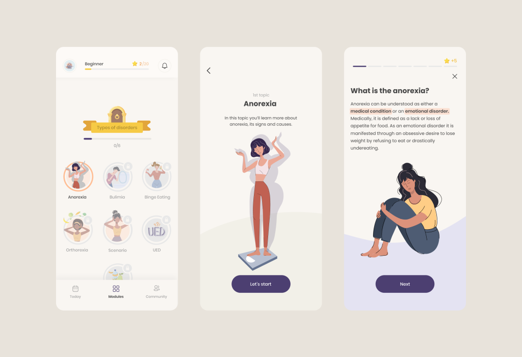
2. Ability: users must have the necessary skills and resources to perform the behavior. The easier the behavior is to perform, the more likely it will happen.
Here, we have broken down the exercises necessary for learning into small pieces. In other words, to learn something new about a disease, it is sufficient to quickly and easily scroll through a few slides and obtain the information.
3. Trigger: users need to be prompted or reminded to perform the behavior. Triggers can be internal (such as low energy levels) or external (such as notifications or reminders). In our case we used pop up notifications here.
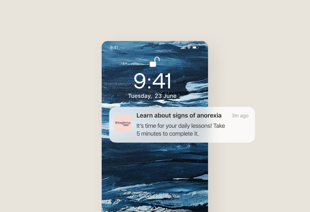
If any of these elements are missing, the behavior is less likely to occur. The relationship between motivation and ability is crucial, with emphasis on making the behavior as easy as possible to encourage engagement.
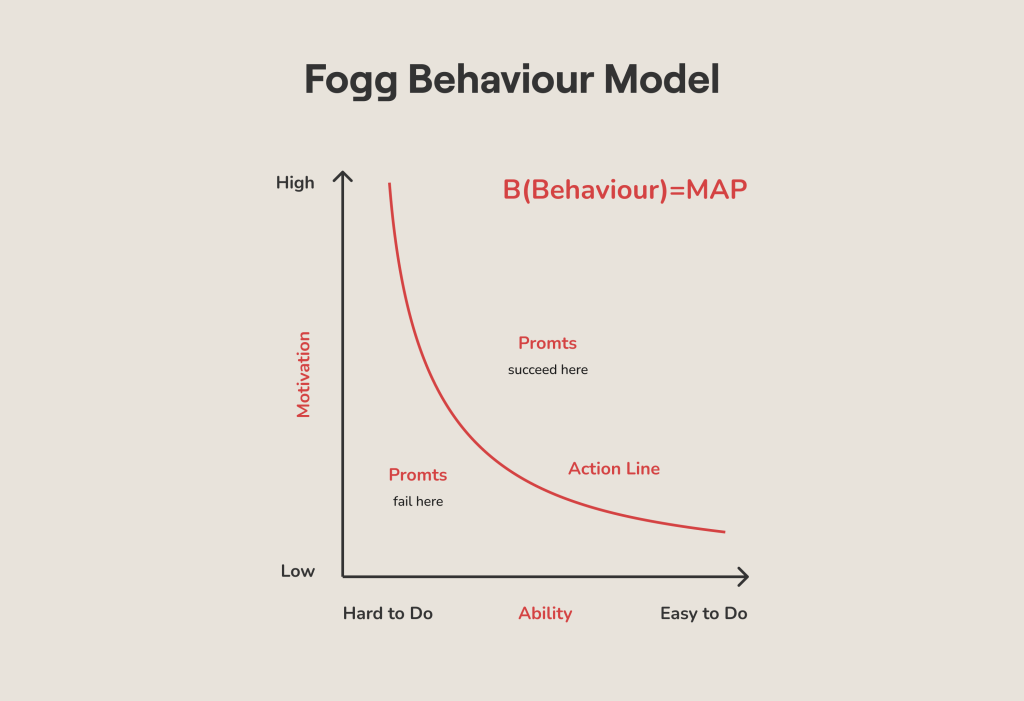
Image Credits: The Fogg Behavior Model
So by addressing motivation, ability, and triggers, digital health apps can effectively encourage desired behaviors while minimizing barriers and making it convenient for users to take action.
3. Transtheoretical model: increase the probability of conversion
One model that is crucial for understanding user behavior and conversion likelihood is the Transtheoretical model, which consists of five stages.
Identifying a user’s stage in this model helps us assess their readiness to convert. It is important not to push users to take action before they are prepared, as this could deter them from returning.
The Transtheoretical model stages are as follows:
1. Precontemplation: users in this stage have no intention of taking action within the next 6 months. They may lack awareness of the consequences of their current behavior or feel discouraged due to past unsuccessful attempts at change. Precontemplators are typically resistant and not ready to seek help. This stage is particularly challenging to address.
Let’s take an example of a digital health product for illustration. At this stage an app can offer motivational content, success stories, and tips for longevity like here:
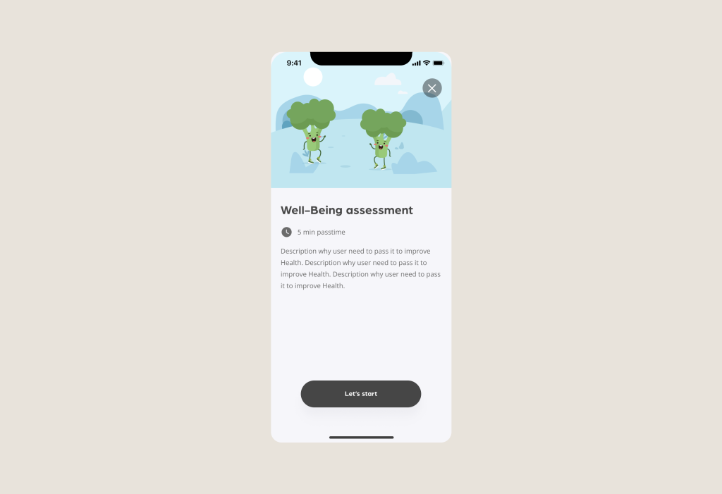
2. Contemplation: this stage involves users who recognize the need for change and intend to take action within the next six months. They are aware of both the advantages and disadvantages of taking action. However, if not careful, individuals can become stuck in chronic contemplation, prolonging this stage.
As we can see after 1st step an app can allow users to set goals, provides information on various exercise routines, and offers personalized recommendations to motivate users to contemplate starting or modifying their journey.
3. Preparation: users in the preparation stage plan to take action within the next month and may have already taken concrete steps toward change within the past year.
In other words, if at the previous stage the user still clicked on the exercise program of interest to him or even started doing exercises, then he moved on to the 3rd stage.
4. Action: during this stage, users have initiated the new behavior but have been practicing it for less than six months.
At this stage, you can use a demonstration of the user’s progress for self-monitoring, additional coaches for motivation/training and use push notifications.
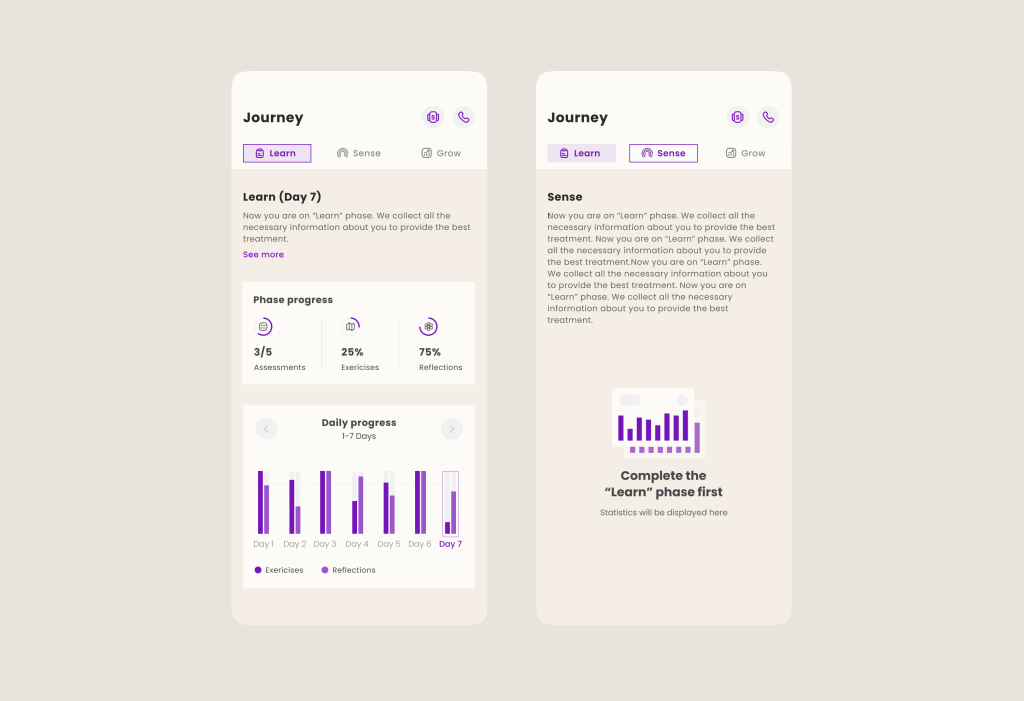
What progress might look like (right desktop part for coaches)
5. Maintenance: users in the maintenance stage have been consistently engaged in the behavior change for more than six months. Here you are not required to make any additional efforts, as it is a kind of characteristic that needs to be achieved after the 4th stage.
It is important to note that the Transtheoretical model also recognizes the possibility of relapse. Designing for users means considering their real-life events and setbacks that may hinder their progress.
The Transtheoretical model is particularly applicable to markets focused on outcomes, such as health and personal development, rather than simple opt-ins for purchasing products.
4. MINDSPACE approach: built social influence
People are influenced by the actions and opinions of others. Behavioral design incorporates social proof, social comparison, and social sharing features to tap into the power of social influence, encouraging customers/patients to engage in behaviors that align with their peers or role models.
For example, MINDSPACE approach gives 4 steps for good behavioral design built with social elements:
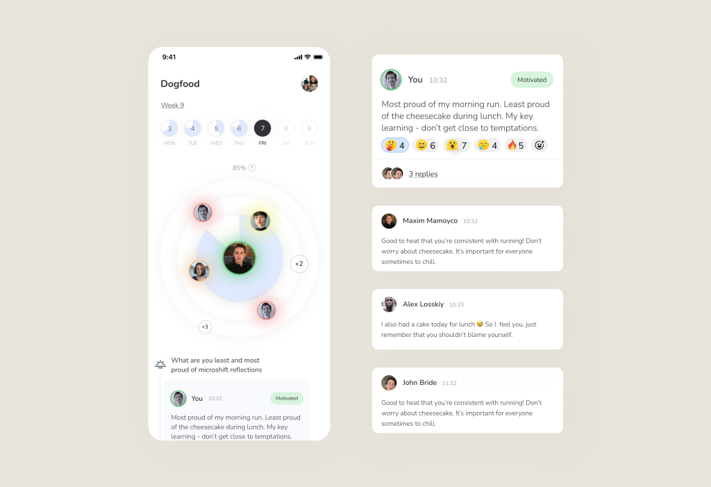
1. Messenger: when utilizing social proof in digital health apps, it’s important to consider the credibility and relevance of the messages from other users. Sharing success stories and testimonials from real users who have achieved significant health improvements can serve as powerful motivators for others.
In fact, you can even use not only the reviews of people with photos. For example, in Microshift we implemented a feature for sharing your well-being/success after doing exercises and it really went viral.
2. Incentives: offering rewards for desired behaviors and implementing penalties for undesired behaviors can influence decision-making.
It’s important to consider the concept of loss aversion, where people tend to perceive losses as more significant than equivalent gains.
For example, stickK is a habit tracker that offers to give money for missed exercises or other goals:
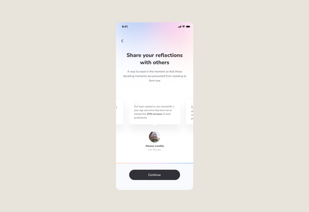
3. Norms: digital health apps can leverage social norms to influence user behavior. By providing data on how many users have adopted certain behaviors or achieved specific health goals, the app can create a perception of what is considered normal or desirable within the community.
This can motivate users to align their behavior with the perceived social norms, fostering a sense of belonging and encouraging healthier choices:
4. Defaults: social proof can be integrated into default settings within digital health apps. By highlighting the behavior that is most commonly chosen by users or recommended by experts, the app can guide users towards healthier options.
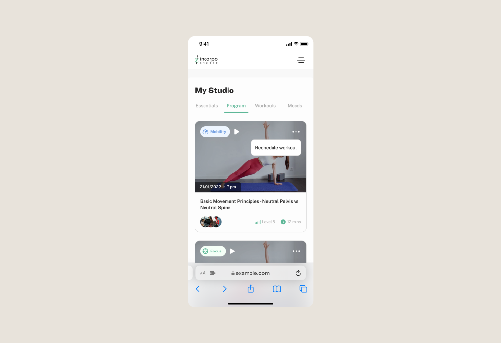
For example, setting healthier food choices as default options or showcasing popular workout routines can nudge users towards making positive choices without requiring additional effort.
Below we have shown our example with Incorpo: based on the personalization of the patient’s pain, we give the most suitable program for him.
By incorporating the principles of the MINDSPACE approach, digital health apps can effectively leverage social proof and behavioral design techniques to encourage positive behavior change and improve health outcomes
What Behavioral Design Models should I use for Improved Engagement in Digital Health?
Personally, we have used all four methods, but for different projects (you can see it from the screenshots of our various projects).
And as we demonstrated in examples, in our app development practice, all these methods have influenced Engagement and Retention rates.
But again, the question arises: how do we personally know when we need to focus on social proof and when on gradual nudges?
It depends on your product and the specifics of the Digital Health niche: for chronic conditions, the “CAR model” is ideal, while mental health apps can use the MINDSPACE approach.
If the disease is very severe, unfortunately, pretty pictures with rewards won’t help, but building Behavioral Design around user support is a must-have feature that will improve patient outcomes, engagement, retention.
How we make it in the practice? We are a digital health product studio, who transforms healthcare digital experiences and sets new standards for delivering digital healthcare in a way that positively impacts people’s lives.
We assist healthcare startups in designing and developing digital products, while also helping healthcare organizations undergo transformative changes.
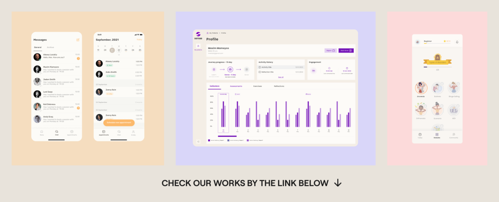
If you are interested about our experience check great case studies: https://studio.nozomihealth.com/work
Or write to us now on m@nozomihealth.com and we will discuss how we can help ensure that your product brings real benefits


