UX pioneer Don Norman said that UX design errors in the product onboarding healthcare process that we tend to find in other sectors can have much more devastating consequences in the Health industry.
“For example, I just spent 15 minutes trying to log into the website of a certain airline, because I was constantly getting error 403,” he explains. It’s not a scary example, but what if it was a critical app for managing chronic illnesses.
But why is User Onboarding is critical for Digital Health apps?
Onboarding healthcare apps is so important because during onboarding, users can easily get confused and make mistakes when they’re trying to understand how to navigate the app. Take, for example, someone using a diabetes management app who accidentally selects the wrong difficulty level and ends up overexerting themselves. Such situations can be avoided by providing clear explanations of the different levels at the appropriate onboarding healthcare stage. Healthcare onboarding experience should be smooth and user-friendly to ensure patient safety and engagement.
Motivated by these insights, we have put together a guide on how to create effective app user healthcare onboarding experience, specifically tailored for digital health apps. The guide includes compelling examples that are relevant to various healthcare domains.
Some examples were taken from our practice and illustrate the user interface of applications from different areas of healthcare, as they convey the example in the best way.
And attention before reading the article! For a better understanding, we recommend using our figma file by the link below, where we have collected 20 onboarding healthcare examples for digital health apps with explanations of how they work and what onboarding engagement metrics (like Retention, Total amount of Registrations, etc.) they affect.
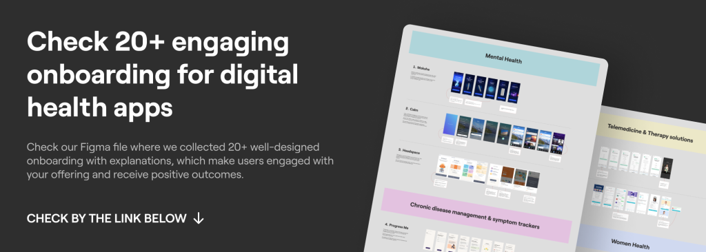
Check Figma with 20+ examples of engaging Digital Health Onboarding
1. Build trust
1. Balance the personalization. Some people leave the app after they start to get confused in navigation or lose trust due to incorrectly placed commercial blocks.
What is the reason? Clinical experts rarely have the experience, funding, or incentives to create a user-friendly health app. Commercial application developers rarely have the experience, interest, or incentive to conduct rigorous scientific assessments.
When launching the application, users are concerned about the data situation. 60% of app uploaders surveyed said they decided not to install the app when they discovered how much personal information was required to use it, while 43% deleted the app after downloading for the same reason.
That is why you need to ask for only important information about the disease or current state of health. Do not take all kinds of marketing data that you want to store in your databases. It is better not to let the user strain 🙂
Good example: an app MyFitnessPal asks users to complete no more than 6 steps, and on the 7th step, it openly explains the data it collects and specifically highlights the statement that data consent can be revoked at any time. Ultimately, this alleviates user concerns and increases the total number of registrations.
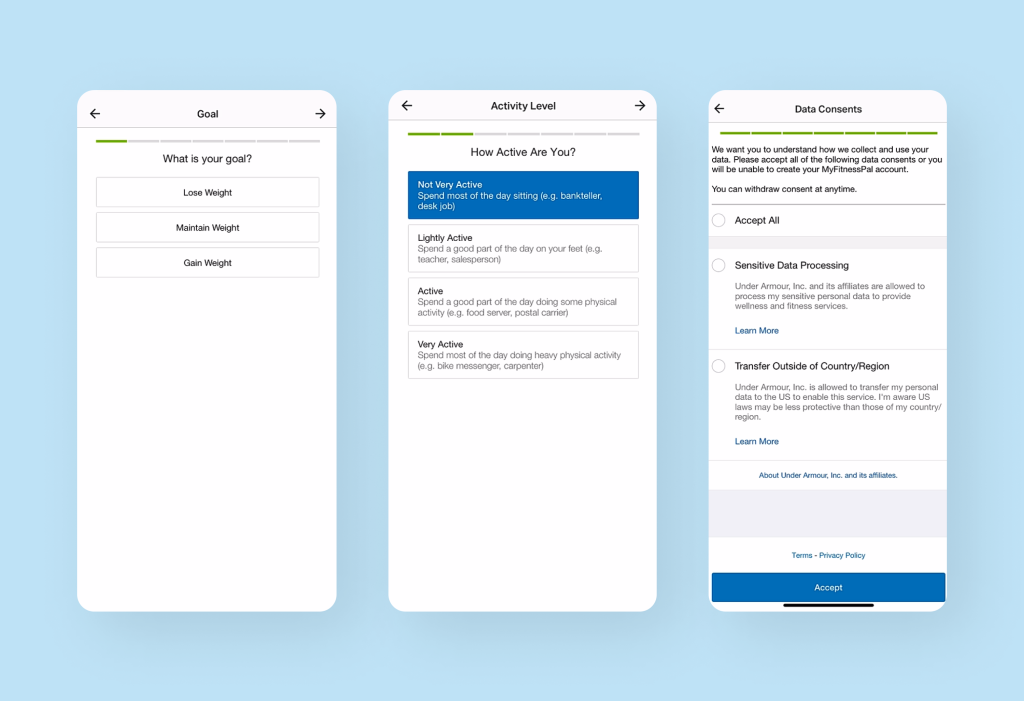
Image Credits: MyFitnessPal
2. Provide social proof. After realizing that collecting excessive amounts of data isn’t necessary, it’s important to focus on presenting your own data regarding success and satisfied users.
Because providing this information right at the beginning of the onboarding process convinces the user that if it has helped so many people, it will help them too.
Let’s even showcase an example with the Flo app. Right from the first message, the app demonstrates social trust by highlighting the large number of users. This approach aims to increase the total number of registrations and reduce user churn.
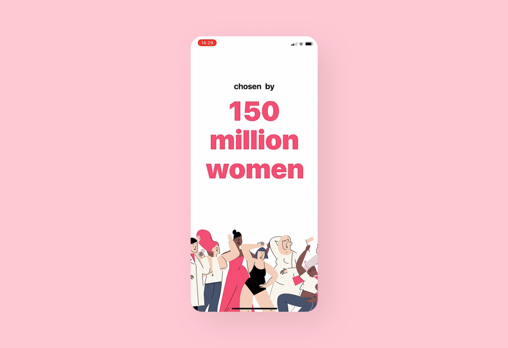
Image Credits: Flo
3. Connect with users on a deeper level. To make users fall in love with your app, you need to trigger right emotions.
For example, in an app that we made we use a mascot that reflects the essence of the product idea.
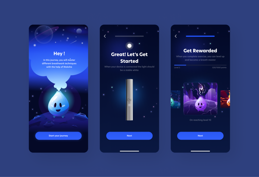
This creates an emotional connection with the user and increases engagement (one of the good user engagement strategies).
To summarize: how can we earn the user’s trust?
- Do not advertise: minimum of advertising messages.
- Do not require a lot of personal data on onboarding.
- Provide links to complete studies or links to reliable sources to confirm that the content represents objective data.
- Provide social proof with the help of figures and expert reviews (even if the end user is a child, it is quite possible that it will be important to parents that their children will use only a reliable application).
- Establish an emotional connection with users.
And a little bonus: enable social sign-in! Allow users to sign in or register using their existing social media accounts, such as Facebook or Google. This reduces friction during the onboarding process by eliminating the need for users to create new credentials. It also enhances convenience and accelerates the app’s adoption.
2. Now let’s move on to the content: be simpler
When we look at different applications, we often find the same problem: an app causes cognitive overload due to incorrect display of information.
What do you need to do to simplify?
- Use simple terminology and avoid clinical jargon.
- Improve the readability of the text: divide the text into paragraphs, highlight the quotation in italics and headings/subheadings.
- Avoid placing banners and advertising messages that lead to banner blindness and interfere with important information.
- Visualize information with pictures, infographics and animations. Clinical specialists love tables with counting numbers, and B2C (patients and other users) love interactivity.
Below, we present our example of effective text handling and simplification using the ProgressMe app, as well as an example from Fitbod that utilizes visual representations of problem areas instead of text.
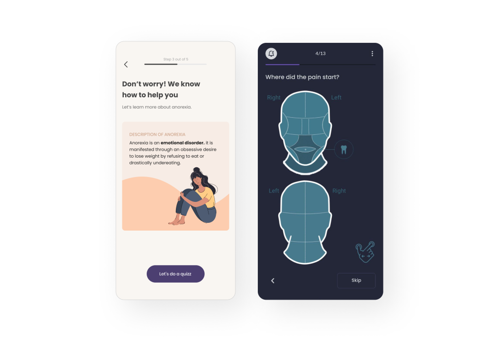
Image Credits: Migraine Buddy
Deeper tips for designing effective healthcare user onboarding experiences in Digital Health: accessibility
About 15% of the world’s population has some kind of disorder. There is a possibility that a certain% of people in your application may have other problems that need to be taken into account in the design.
That’s why it’s so important to make sure your product meets the highest standards of accessibility. You need to ensure accessibility and design according to WCAG 2.1 standards:
- The app must ensure the availability of color: there must be sufficient color contrast.
- Videos must contain subtitles (for people with hearing impairments). The text should have a larger font size and be easily enlarged (for people with visual impairments).
- The text should have a larger font size and be easily enlarged (for people with visual impairments).
- Don’t forget about Text Alternatives: provide alternative text descriptions for images, charts, and graphs, allowing users with visual impairments to understand the visual content through screen readers or braille displays.
- Error Handling and Feedback: implement clear and descriptive error messages and feedback for form validation or critical actions to assist users with disabilities in understanding and resolving issues effectively.
- Multilingual Support: consider providing language options and localization support to accommodate users from diverse linguistic backgrounds.
By incorporating these accessibility features, Digital Health apps can enhance usability, inclusivity, and overall app healthcare user onboarding experience for individuals with disabilities, ensuring equal access to healthcare resources and services.
3. Engage users with incentives
It seems that there should be no problem with motivation to understand the idea and features of a digital health app. But in fact, there is such a problem, it’s just not about rational motivation anymore. Here it is necessary to create conditions under which the user gets meaning and pleasure from actions.
How can we help this? Use tools that stimulate the motivation of the user: for example, you can show such features like a diary, a calendar of successes or just gamification during onboarding.
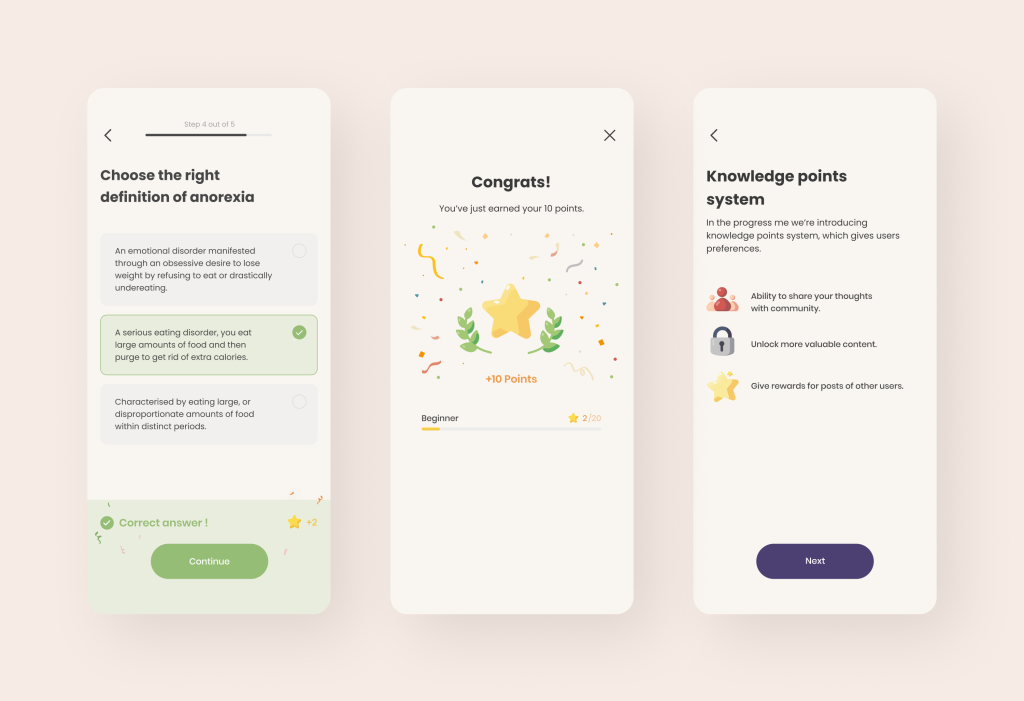
For instance, gamification can make the onboarding process engaging and enjoyable. Incorporate elements such as progress trackers, achievement badges, or challenges to motivate users and encourage them to explore the app further. By gamifying the onboarding experience, you can enhance user motivation and foster a sense of accomplishment.
For example, in the case of ProgressMe, we immediately awarded points to the user during the onboarding process and promptly explained the specifics of gamification and its benefits to the user.
4. Measure the success of user onboarding in Digital Health apps with User Tests
Here, we’ll be brief. After building the onboarding process, ideally, it’s recommended to conduct user tests to identify any left problem areas in onboarding based on real feedback (including onboarding funnel analysis).
User Testing is a process in which we ask real users questions while they perform onboarding tasks and capture various types of data (such as task completion time, incorrect focus of attention, and others). This process also includes app usability testing. In our practice, we have discovered issues related to navigation and the duration of onboarding tasks:
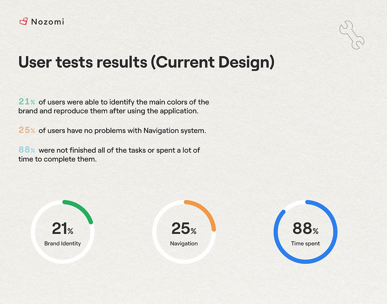
After improving onboarding based on user feedback, our results improved thanks to the introduction of gamified elements (users were stimulated by an exciting process, “achievements” and unwillingness to lose progress):

For these tests you should prepare questions and tasks, such as finding a specific button in the application or providing feedback on what is lacking in features. However, it is important to understand how many user tests to conduct (you may need to go through multiple iterations of improvements) and how to measure the results.
With this User-Oriented approach, you will be able to refine areas that are specific to your particular product. While we all draw inspiration from best practices in the market, each application is unique. Therefore, to maximize the potential of onboarding, it is crucial to address these specific aspects as well.
For the health app development of User-Oriented apps, we have written about our innovative approach, which involves continuous user feedback, a focus on metrics (Adoption, Retention, Engagement, etc.), and constructive criticism of ideas (as not all ideas may align with market specifics).
Thanks to our unique approach combined with our deep expertise in Digital Health, we have developed products for over 30 companies that effectively engage users (doctors, patients, or health enthusiasts) and have high retention and adoption rates. We have a clear understanding of this niche, its standards, and the behavioral patterns of different user categories.
If you are interested in how we helped partners to build a new generation of digital health products – download our book about user-oriented healthcare software development at the link below 🙂
The Future of Onboarding of healthcare apps: download a book about our approach
And if you want to see how we helped develop Digital Health products for our partners and what useful outcomes we brought them, then check out our case studies at this link.


